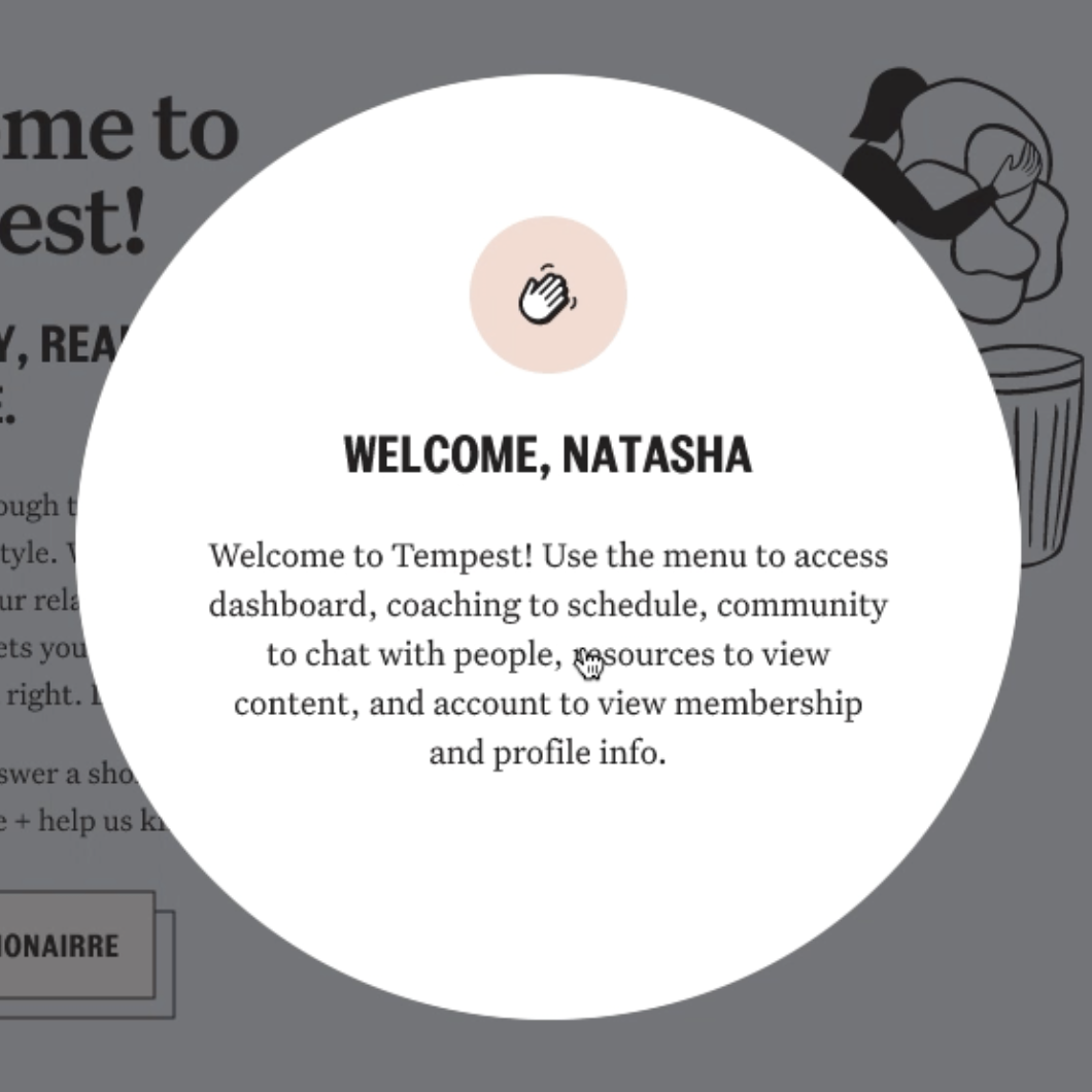
Hi, nice to meet you. My name is
I have been practicing the art & craft of product design, working on complex user flows and problem solving to build useful and meaningful experiences.
The Process
User research, card sorting, AB testing, strategic design planning, design documentation.

Responsive layouts, desktop and mobile web,
iOS, Android, native applications.
If it works, do it again and make it better.
If it doesn't, get creative.
Desktop Web, Internal Tools
Desktop Native & Web Collab
Zero to One Platform
Mobile Web, Desktop, iOS App
Design Sprints, Classes, Reviews
Design Systems and Patterns

New Feature for Engaged Couples
Mobile Web & Desktop
Digital Campaign and Branding

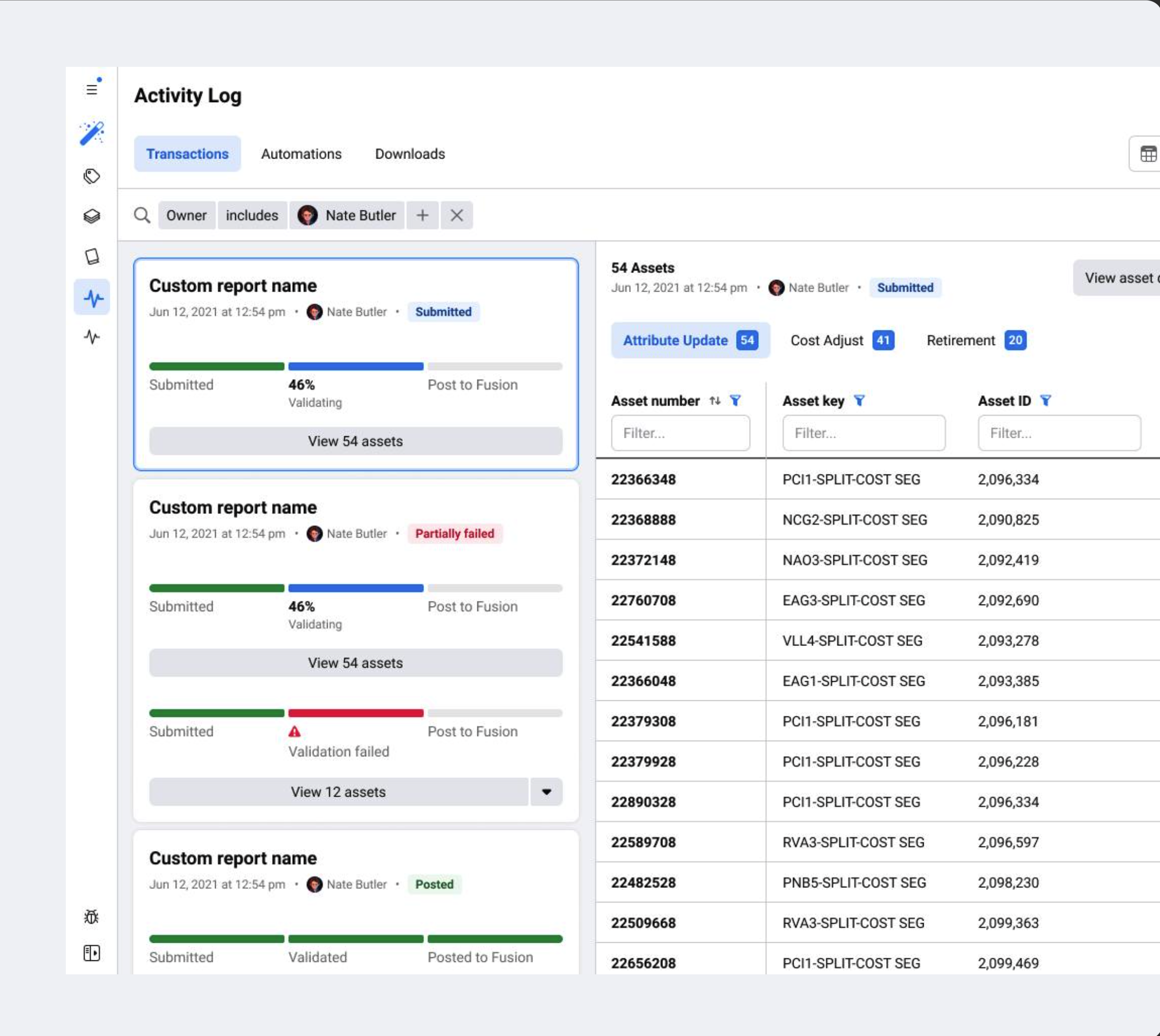
Design lead on 3 workstreams under Revenue operations
(Collection, invoicing, and disputes).
✅ Improve agents experience in their collections efforts
✅ Reduction of time per collections case (~4hrs per agent)
✅ Unlock $8M - $2Bil per year in Collections accounts receivable
Context
30 day revenue cycle: The existing tool was mainly used as a way to keep track of the revenue and credit cycle for Meta ad customers who used up their credits for ad spend. When their invoice is overdue after 30 days, it went into collections. Collection efforts: Our global agents struggled make collection attempts. There were many workflows and they had to keep following up with people internally and with customers. They had many other applications open to do their job.
Research findings
Agents had to comb through many different areas of this page to check on the status of the customer to determine next steps. They had to look for clues and piece together the story of the customer.
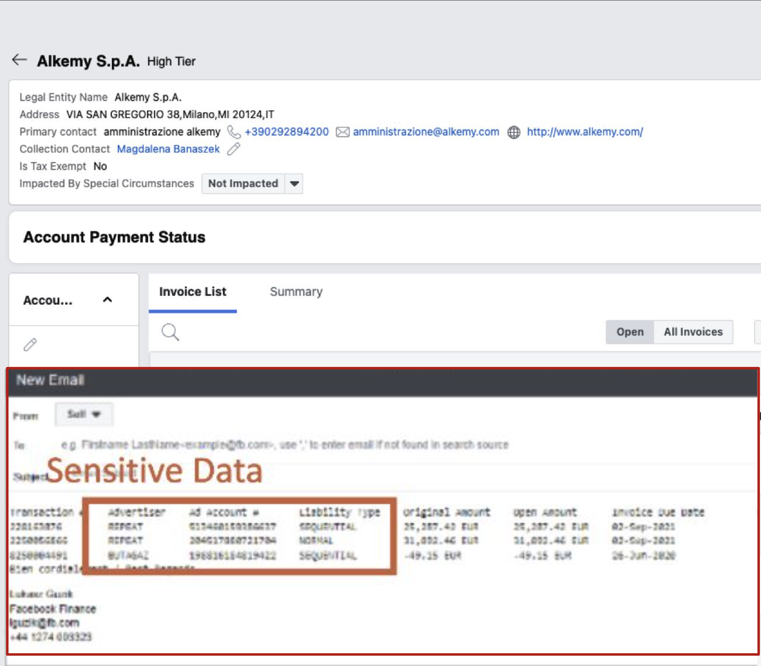
Research findings
Emails can be drafted, but this is only a popover here. All emails actually lived in another tool called Cases, or their outlook account. Sensitive data had to be manually deleted when invoices were auto-pasted.
Research findings
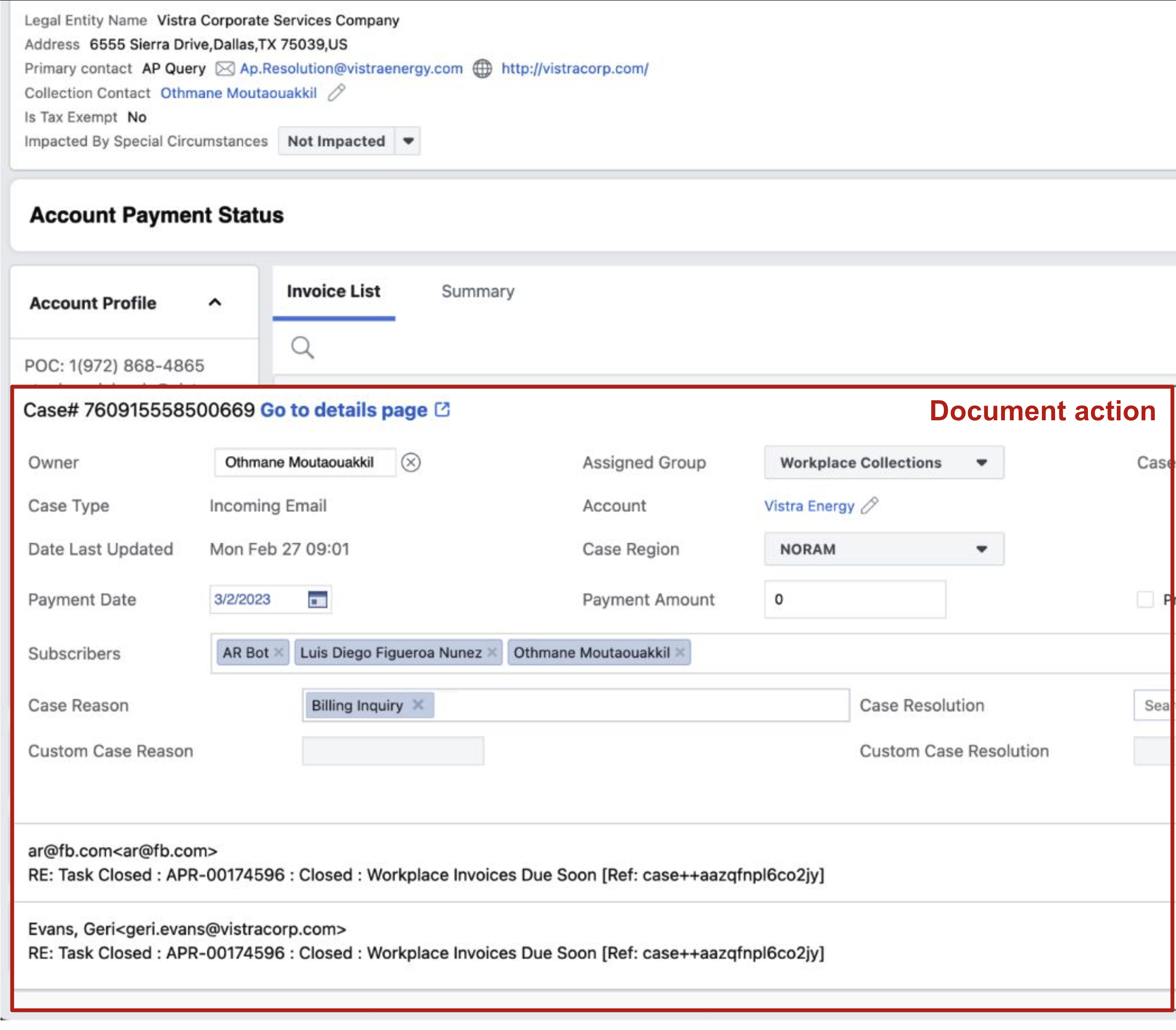
Agents had to record their actions in the Cases tool which showed up as a popover on the accounts detail page of Collect. This was also manual effort that took a lot of time.
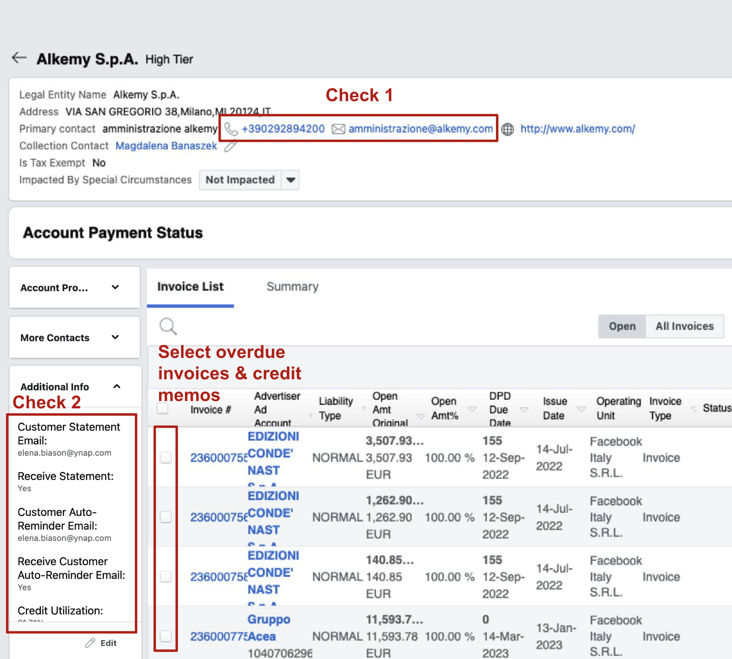
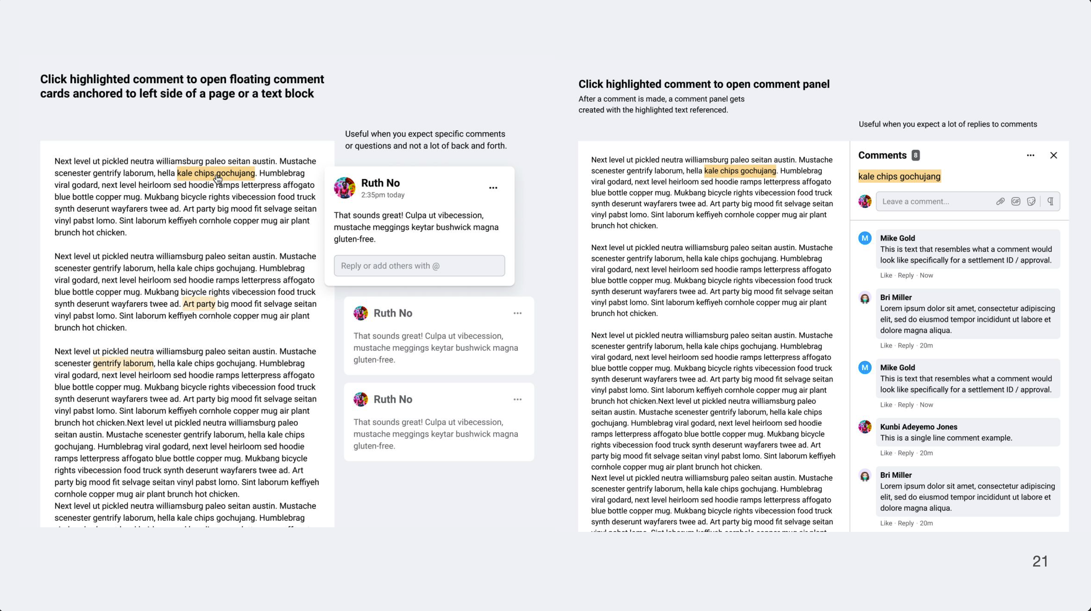
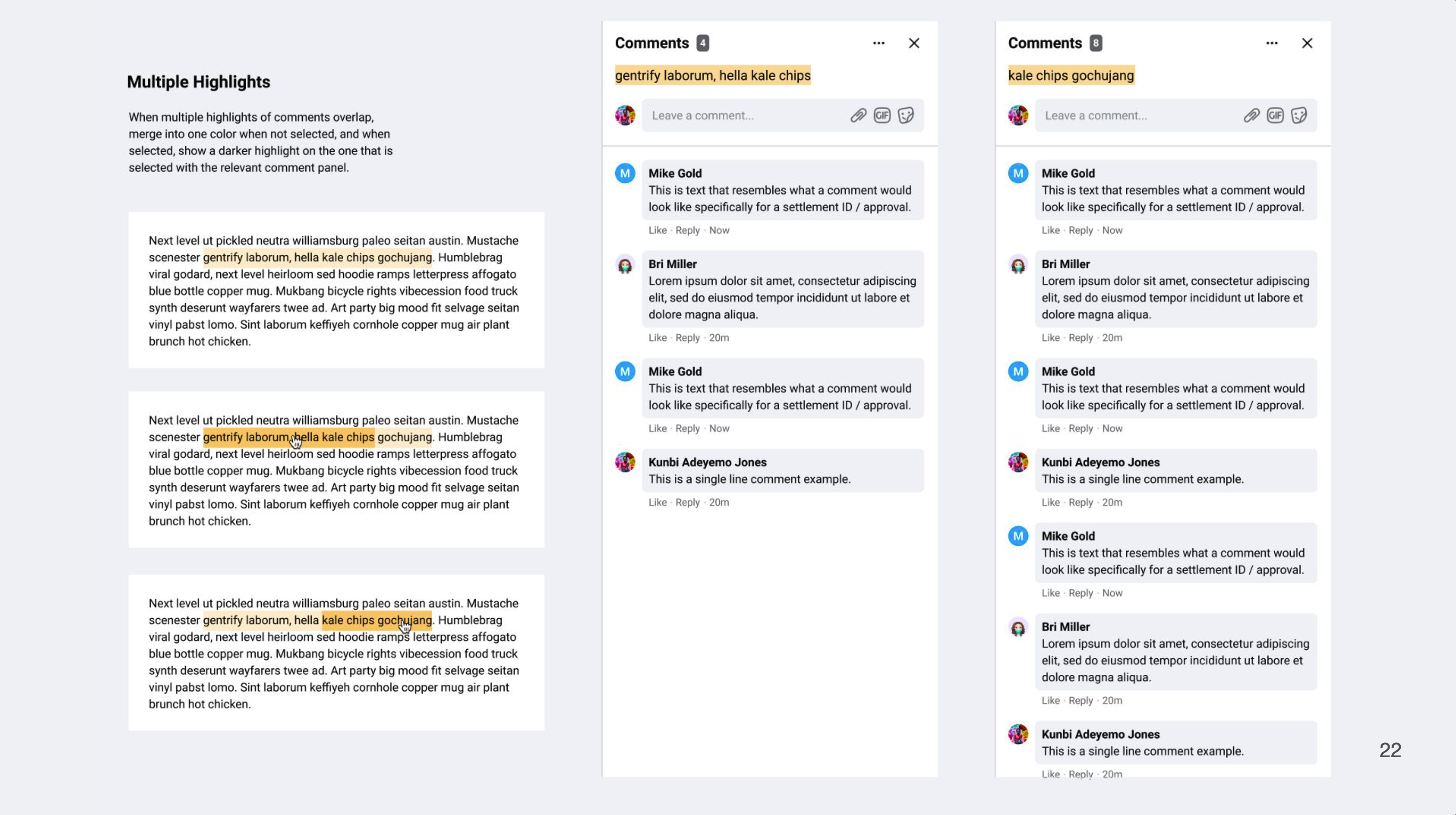
It was hard for users to know which accounts were in good standing or needed to be flagged for suspension. We created a status indicator system that was consistent across the tool to help agents quickly triage accounts.
Users were going back and forth between three different tools to manage collections efforts. We consolidated the most important workflows into Collect to reduce context switching and save time.
Agents voiced some concerns whether the tool would change a lot, causing more confusion. We kept the overall layout and structure of the tool familiar, while improving the visual hierarchy and adding new features.
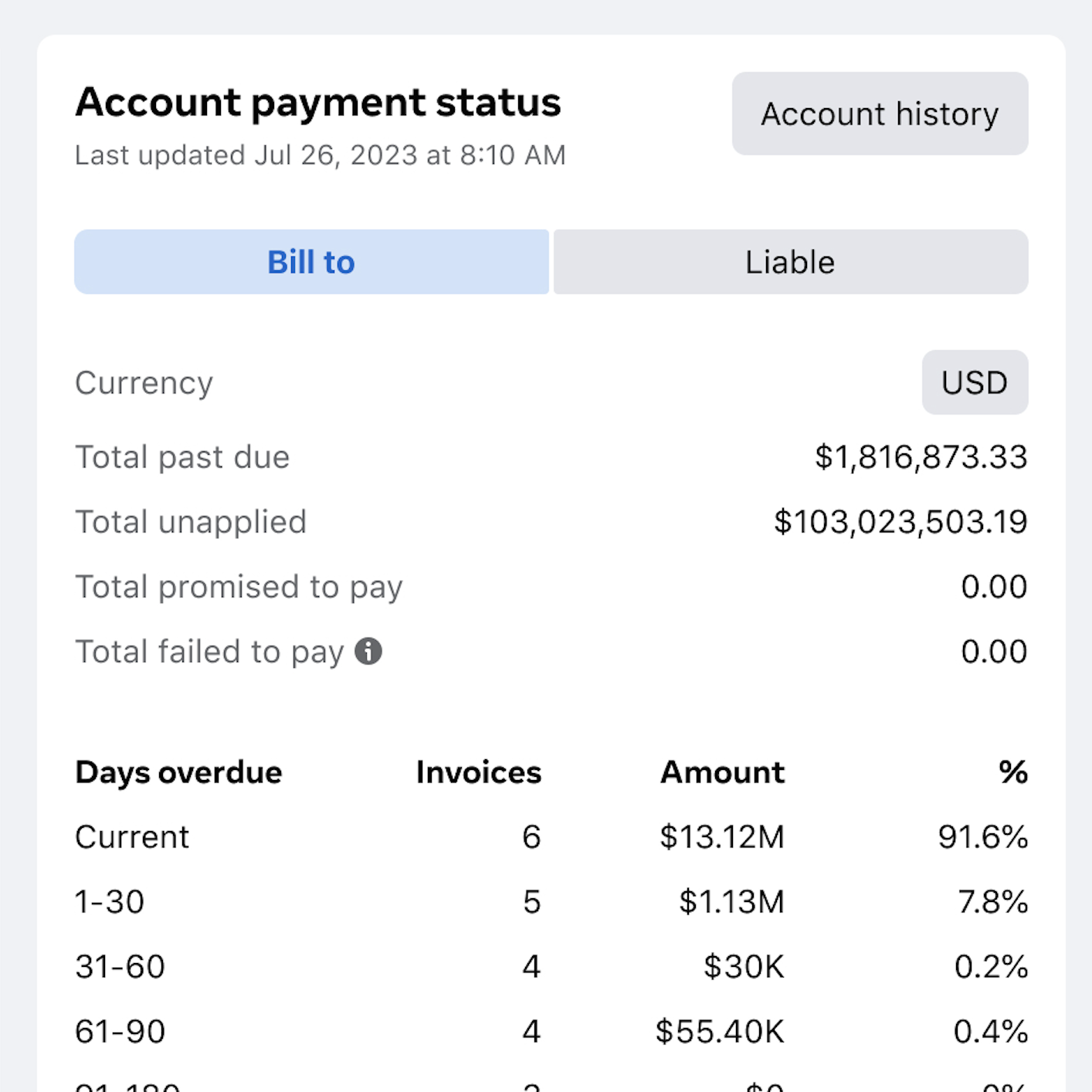
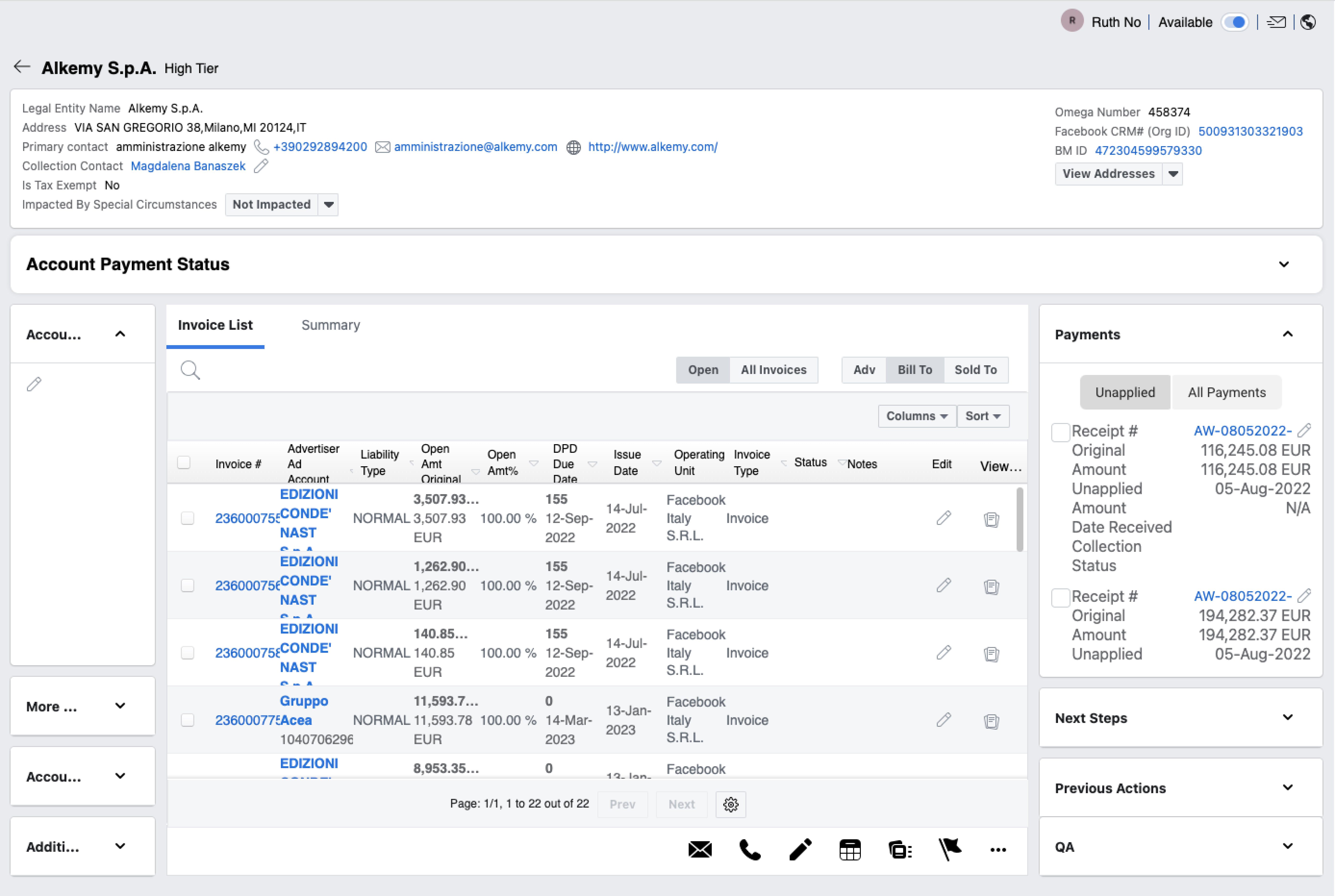
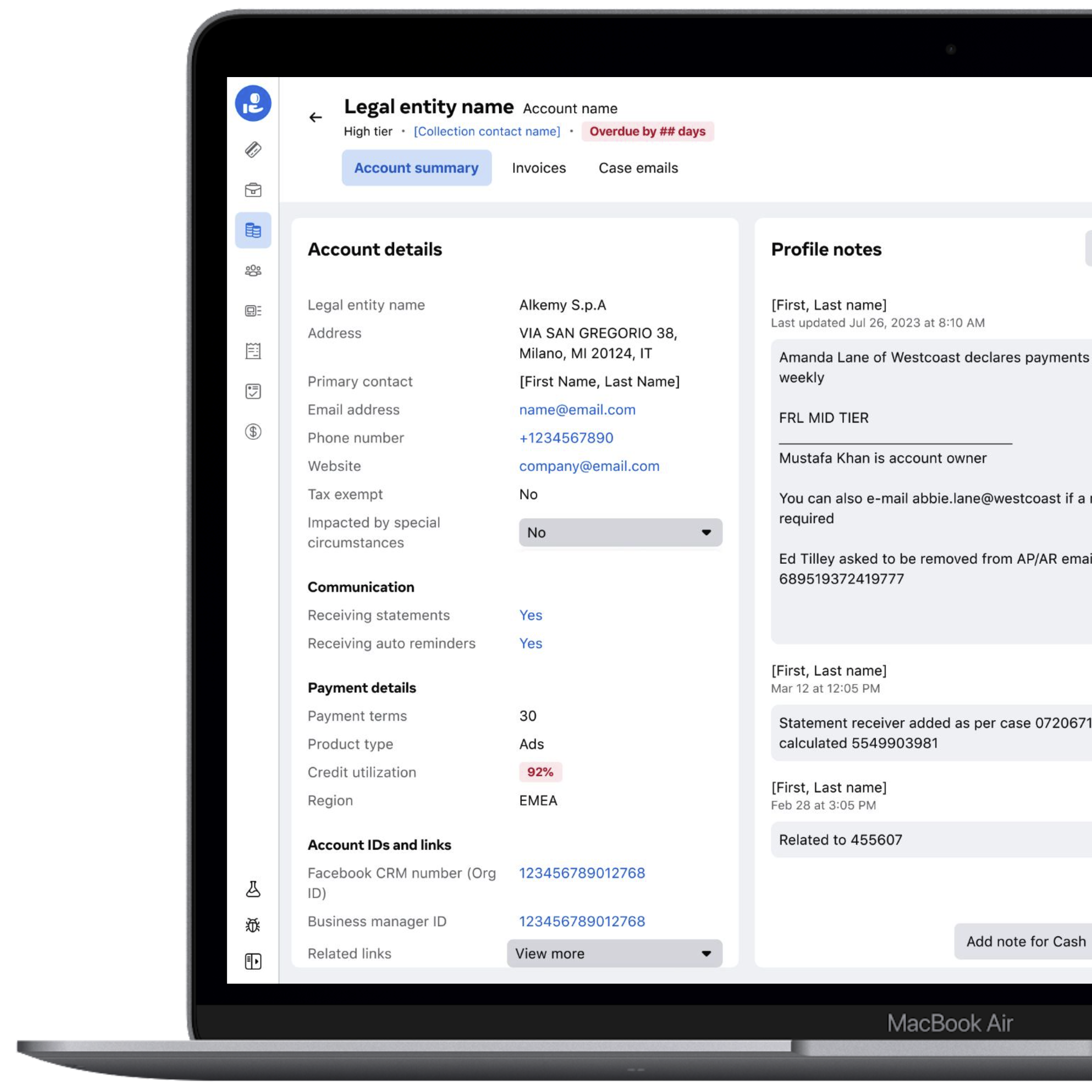
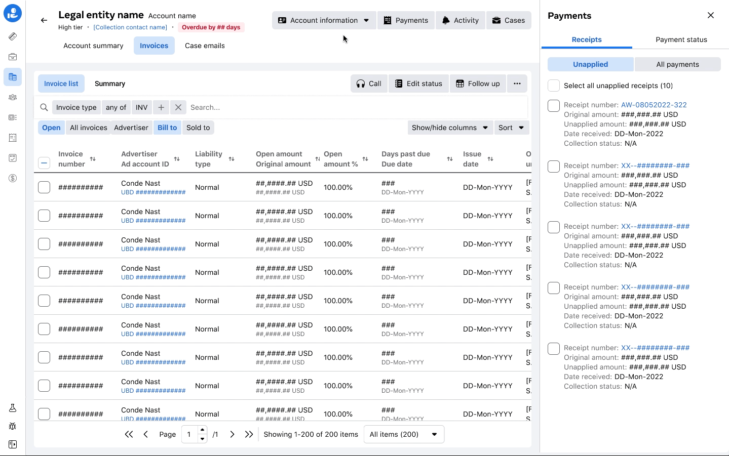
Account summary
A new account summary section flagged important information like days overdue, credit usage, notes and payments helped agents quickly determine the status of the customer and identify next steps.
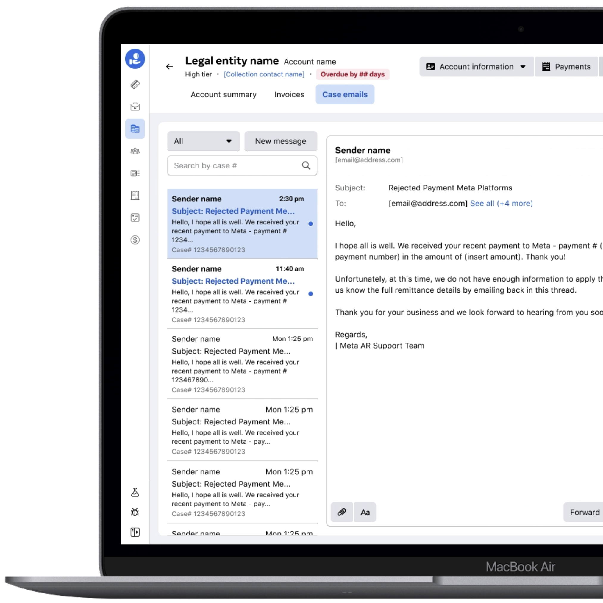
Case emails
Email communication lived in a separate tool called Cases where agents were manually searching based on case number. Moving this helped agents see all emails of related cases for that specific legal entity, saving a lot of back and forth and search time.
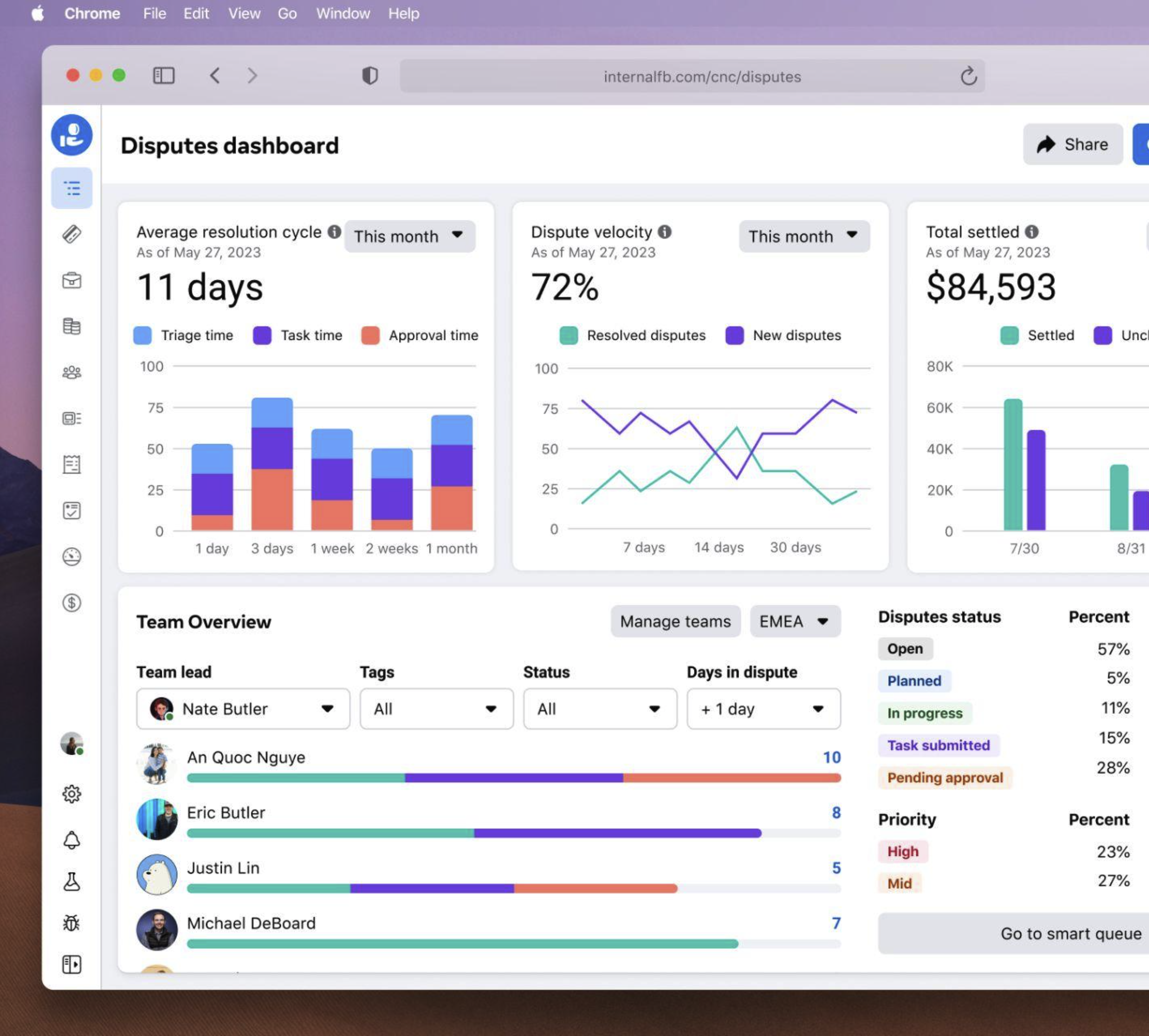
Future north star
I led a design sprint around disputes, a subset of Collect. One of the outcomes of those ideas was to create a metrics-driven dashboard for leads with insights to track the overall resolution cycle and take action where needed.
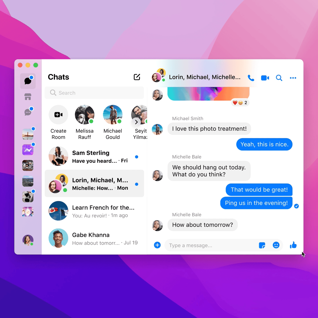
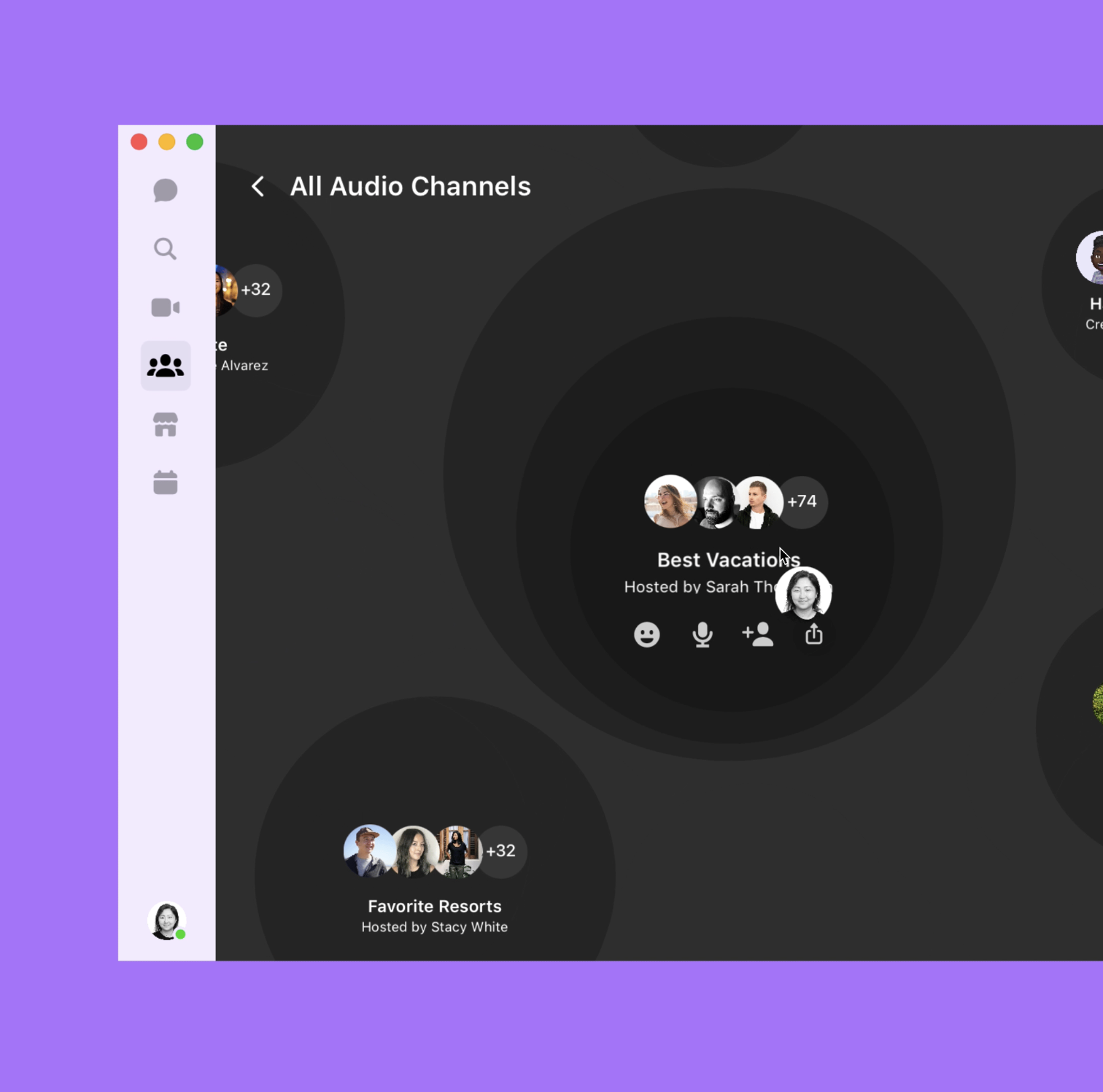
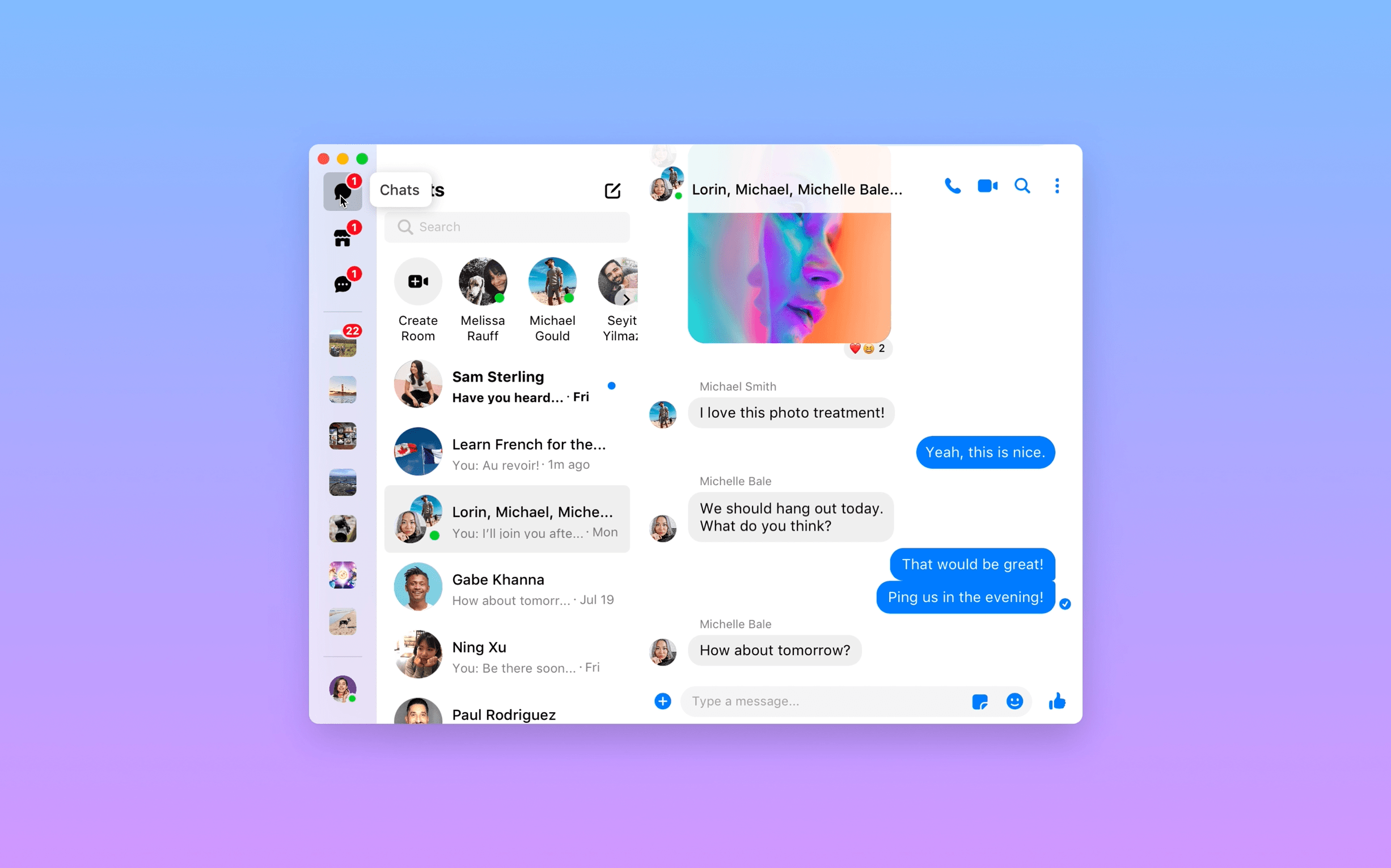
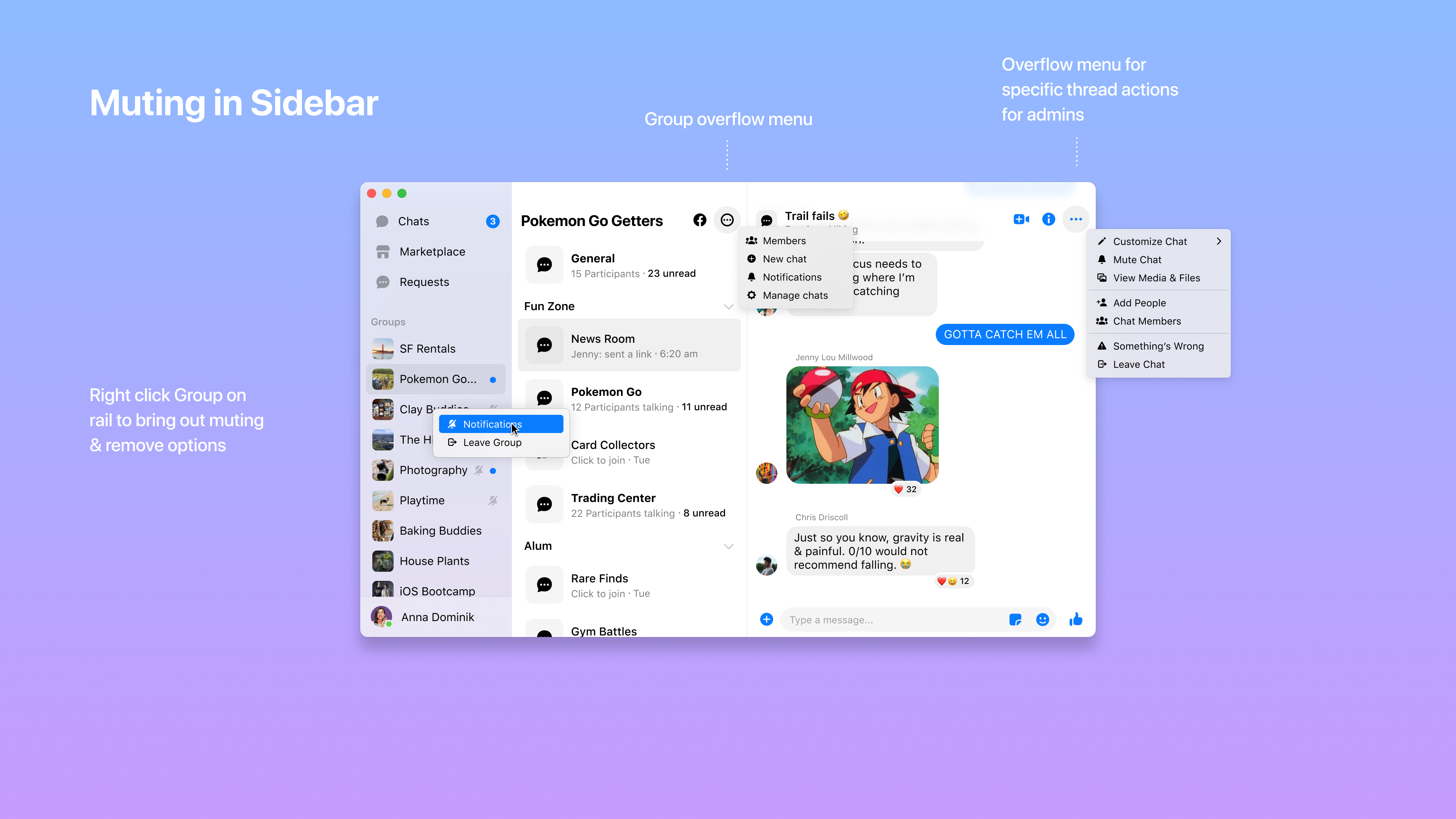
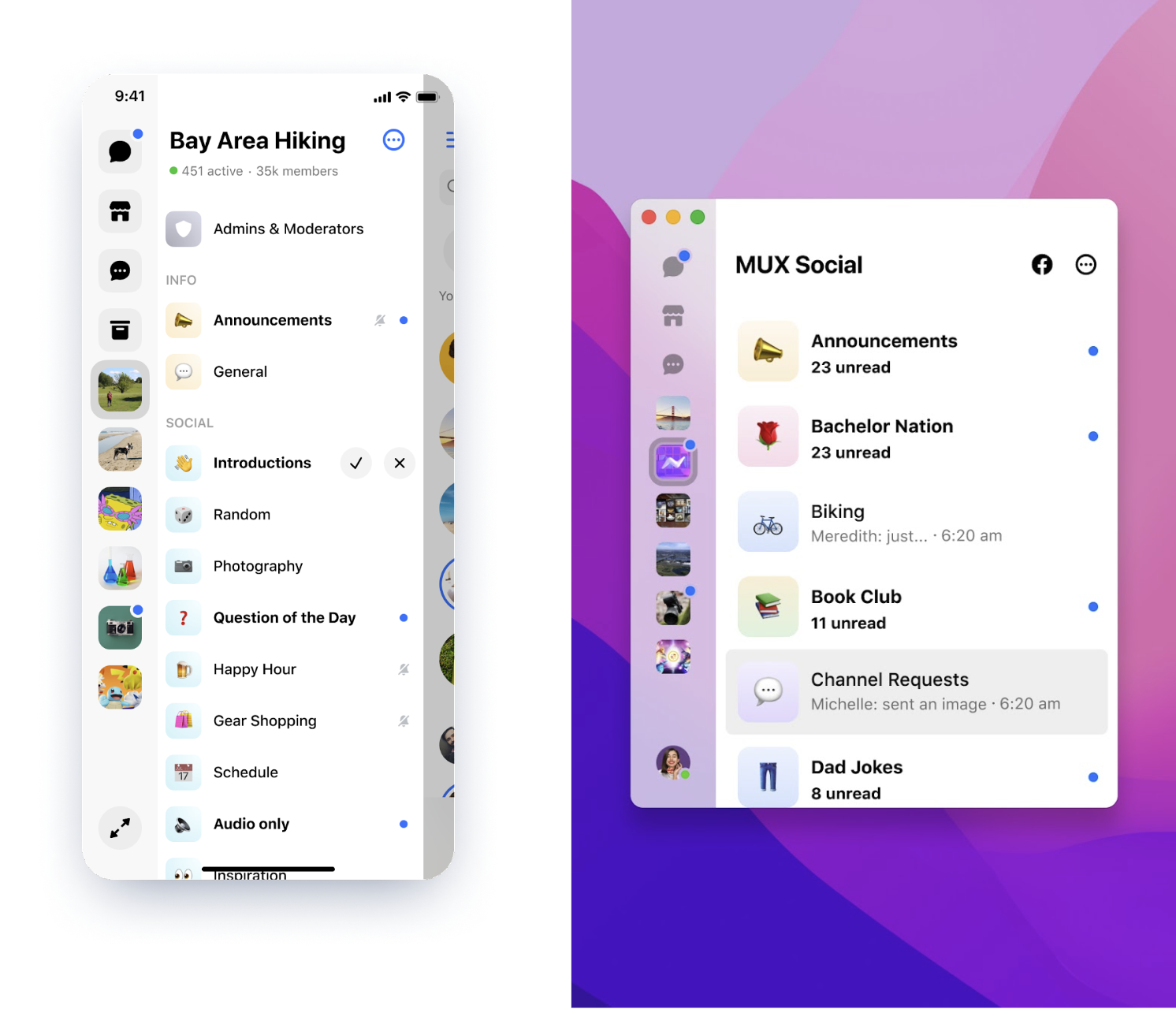
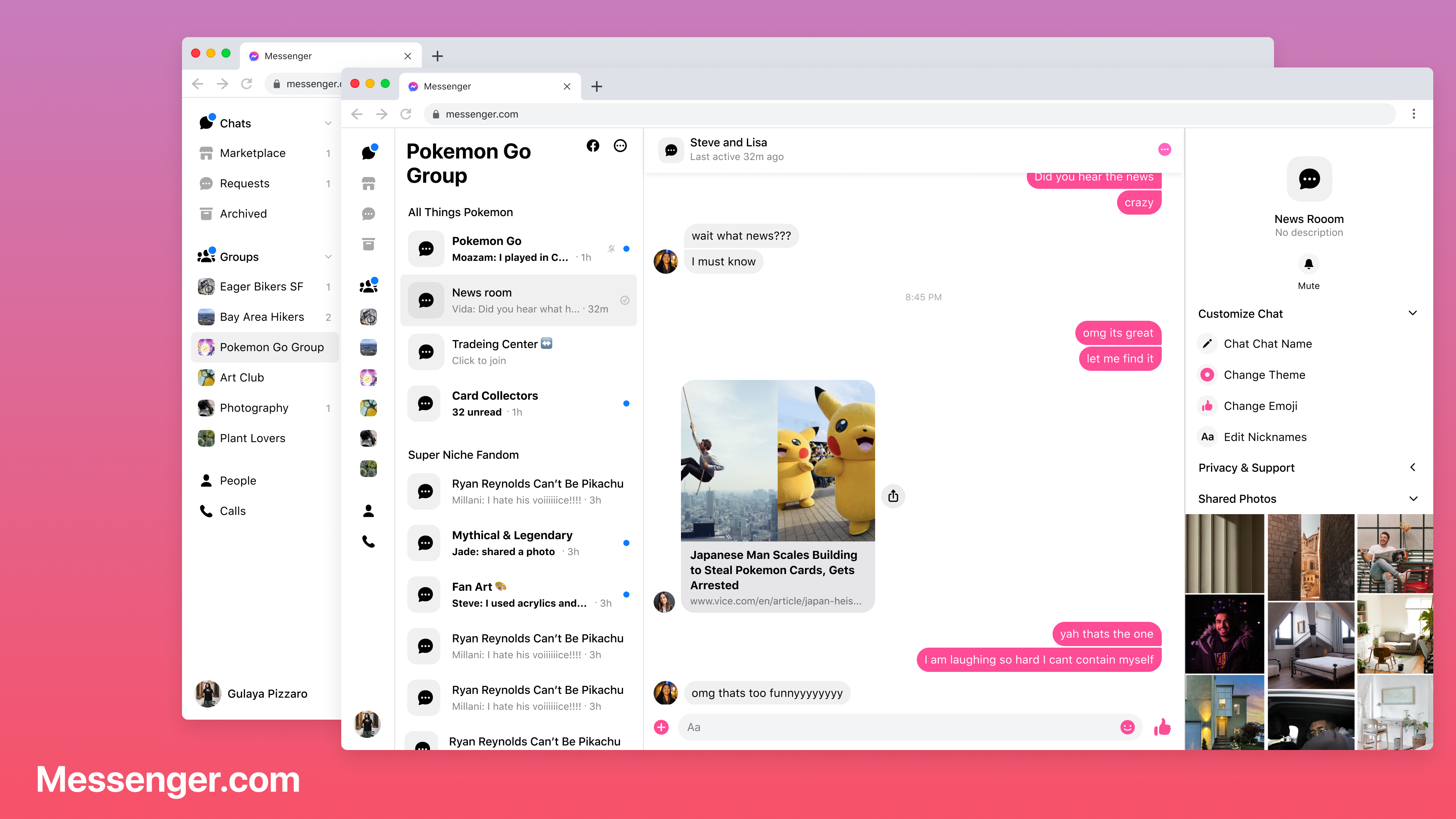
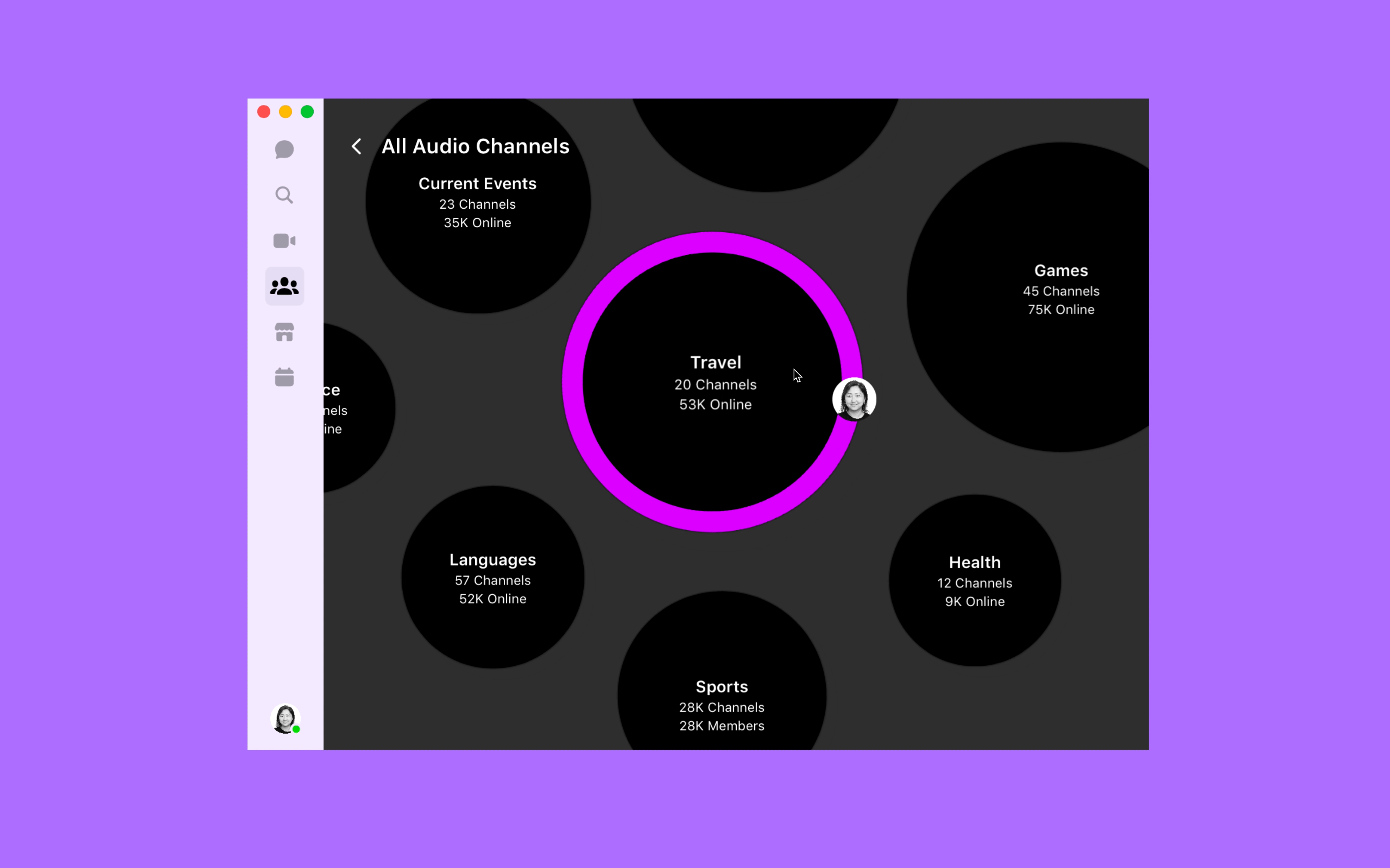
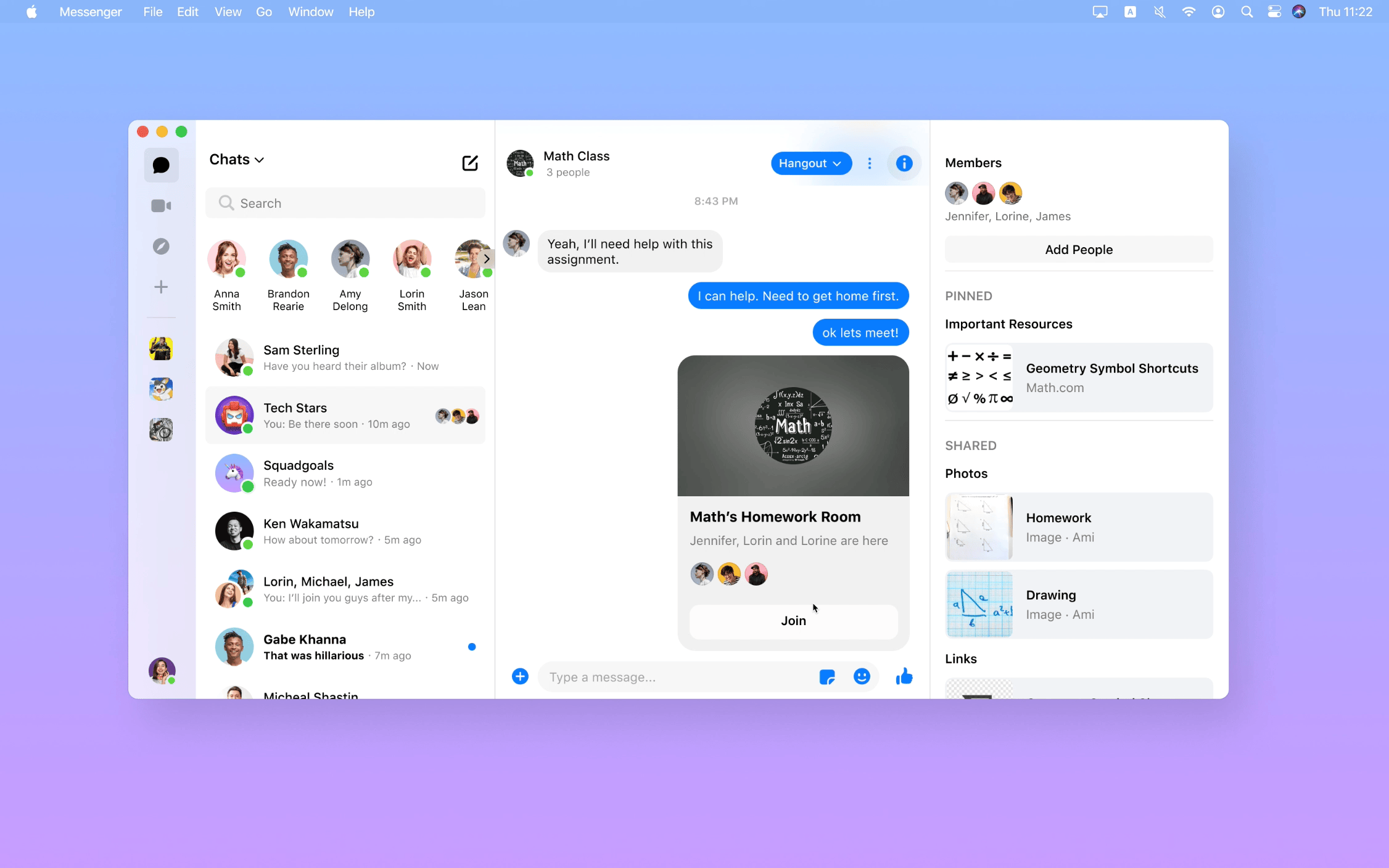
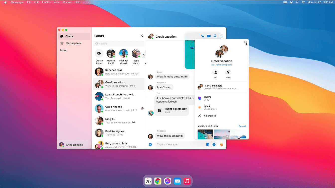
Led the information architecture and navigation redesign to scale community chats on Messenger desktop. Achieved a 38% month-over-month increase in daily active users and expanded usable screen real estate by 40%.
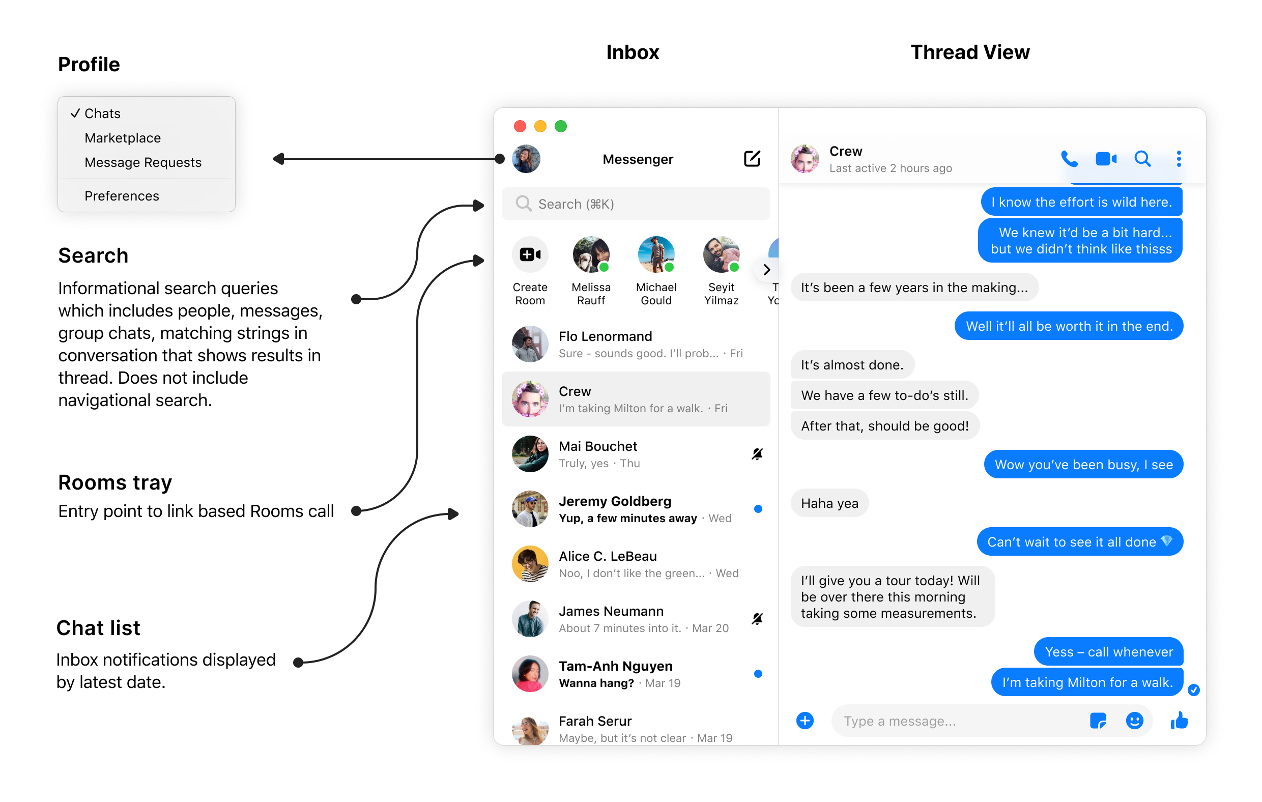
Version 1
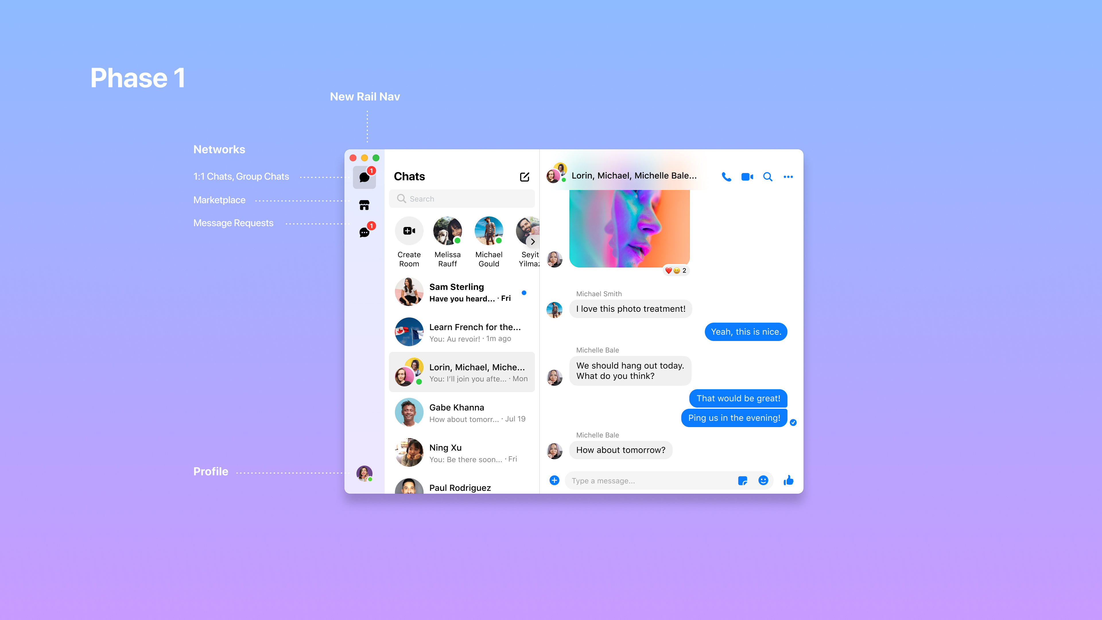
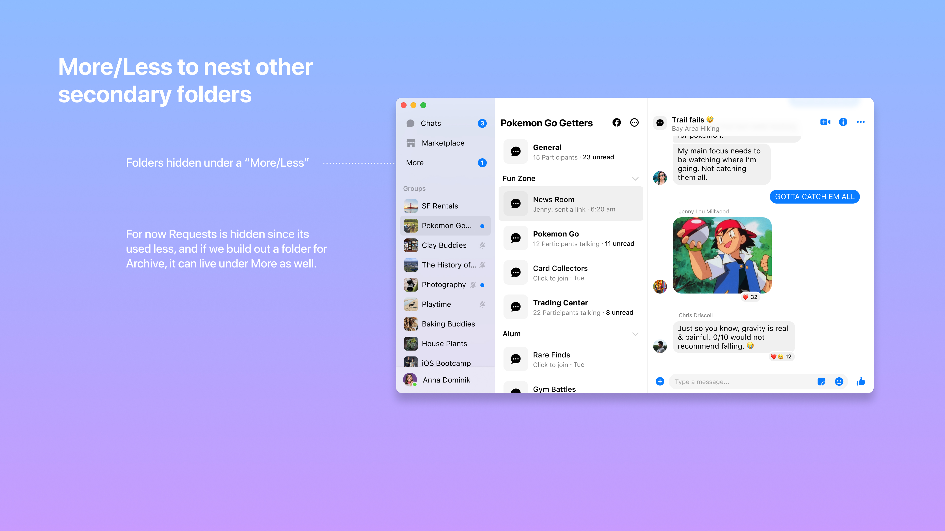
Problem: Users struggled to discover nested chat folders such as Marketplace and Message Requests, leading to missed conversations and fragmented experiences. Solution: We introduced a sidebar rail that surfaced all chat networks, including community chats, increasing awareness and accessibility.
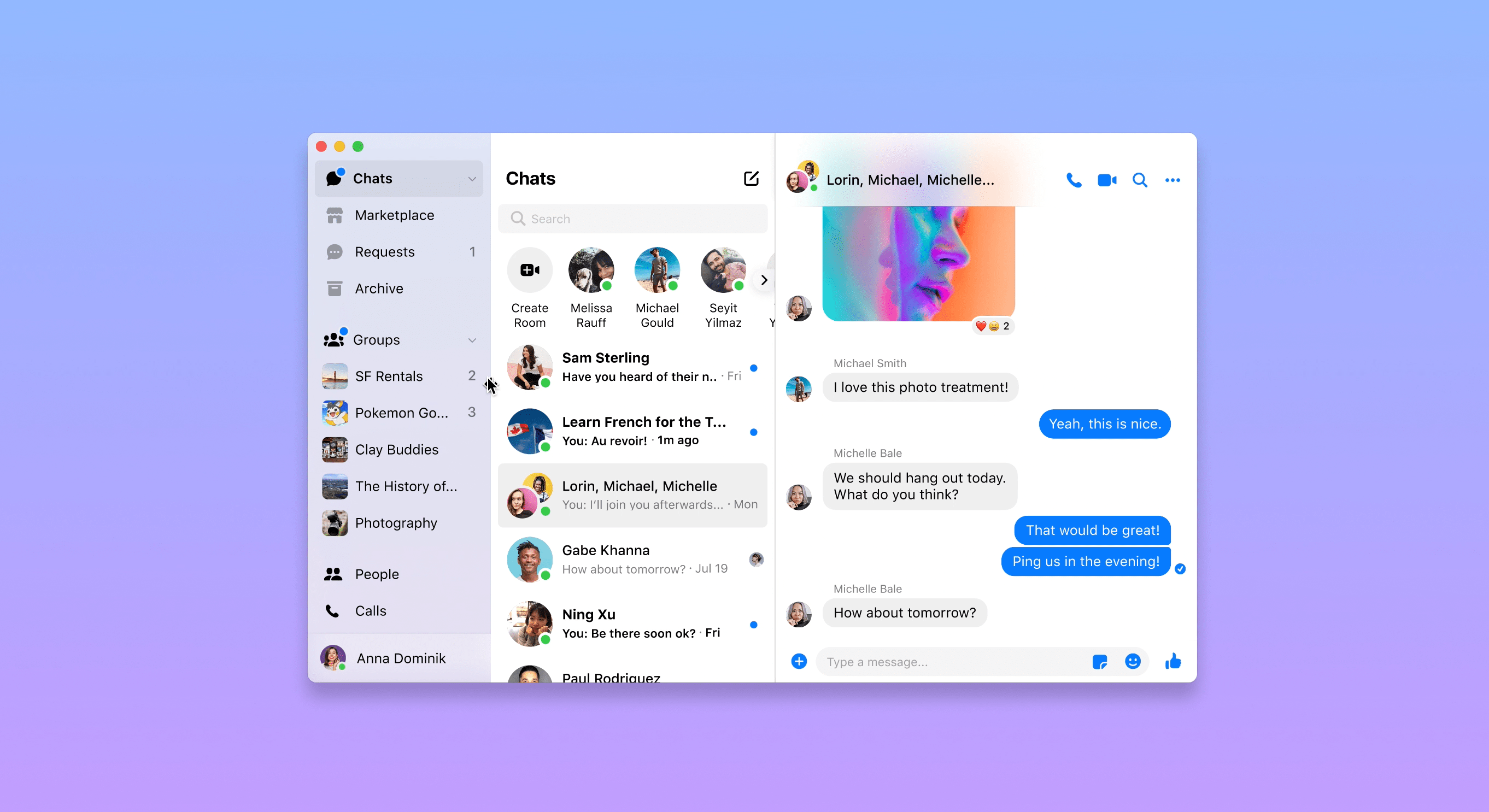
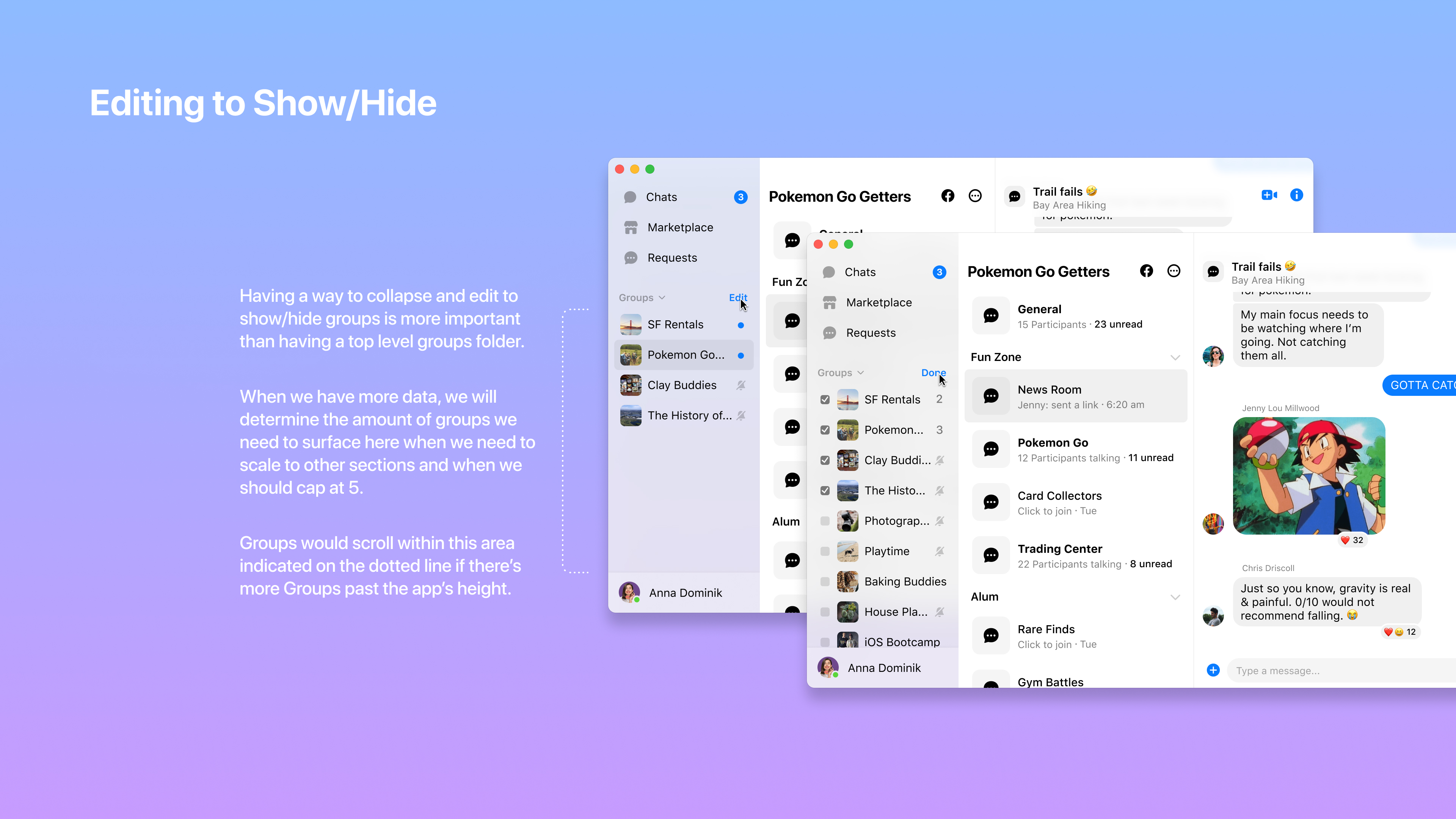
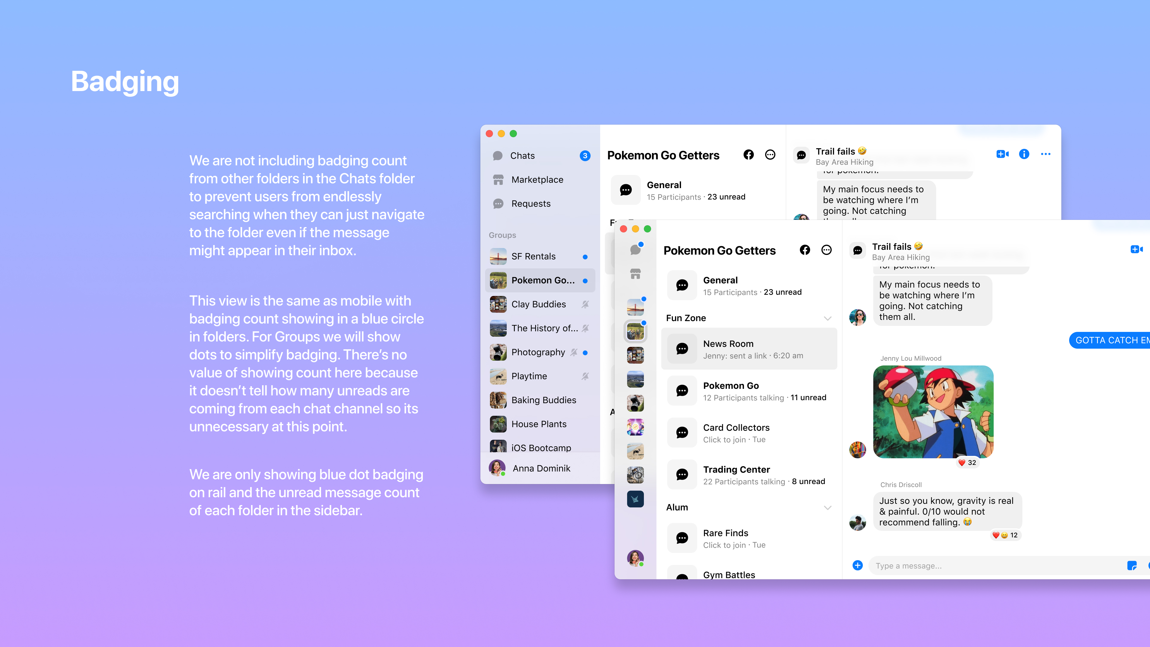
Version 2
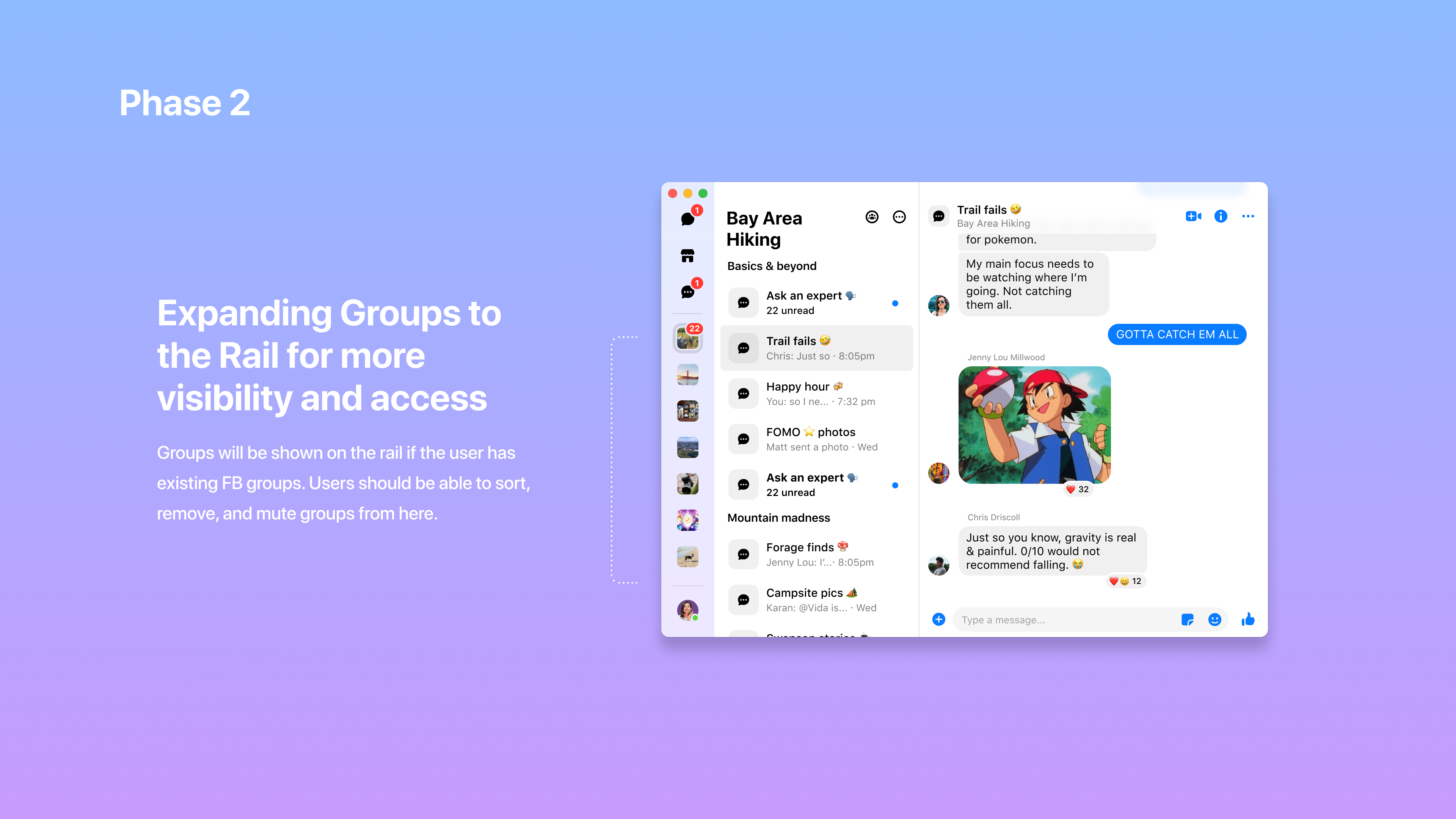
We reimagined the desktop experience as the central hub for communities. By enabling nesting and collapsing of the sidebar, and scaling chat and community folders, we reduced visual clutter and improved navigation. User feedback led to a more focused badging system, minimizing distractions.
Communities collaboration
Collaborated closely with pillar leads to ensure a consistent and high-quality launch across desktop, web, and mobile platforms.
Refinement
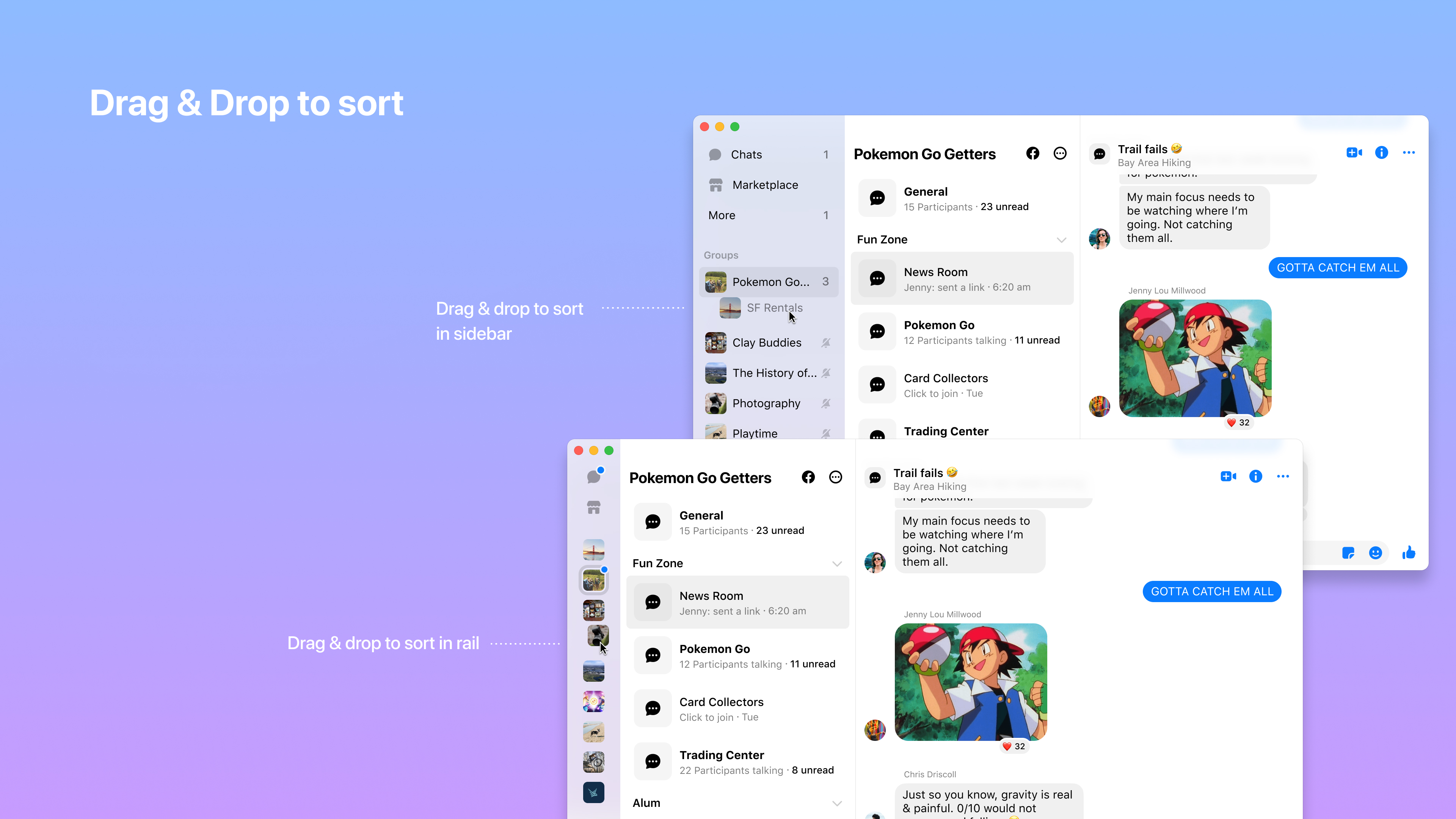
Introduced resizable app windows, empowering users to multitask and customize their workspace.
Creating an educational and social platform for the sober community.
✅ 800+ monthly members joined for membership post launch.
✅ 30% of new members additionally signed up for 1:1 coaching.
✅ A self service system managed ongoing content by the care team.
Sober and sober curious (female, ages 30-60) folks that took the current sobriety school wanted continuous recovery and support beyond 8 weeks.
Engagement in content dropped off after 4 weeks in the school, but many folks stayed for our lab calls because it helped with accountability.
Survey showed that folks wanted to keep their recovery journey private, and facebook wasn’t the best place where they can do that and stay anonymous.
I hosted a workshop with the stakeholders and our founder to map out ideal experience of someone who enrolled as a Tempest member and how they would continue beyond the current 8 week offering. We identified current pain points the new program design could address, such as creating a separate experience for alumni members who may have been sober for many years, versus someone who is newly sober in relevant content and community spaces.
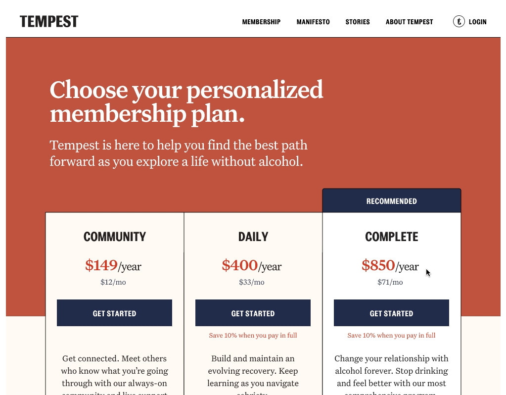
Tiered memberships
After discovering our different user types and what they preferred, three different membership types were provided, with different ways to pay (split installments vs annual).
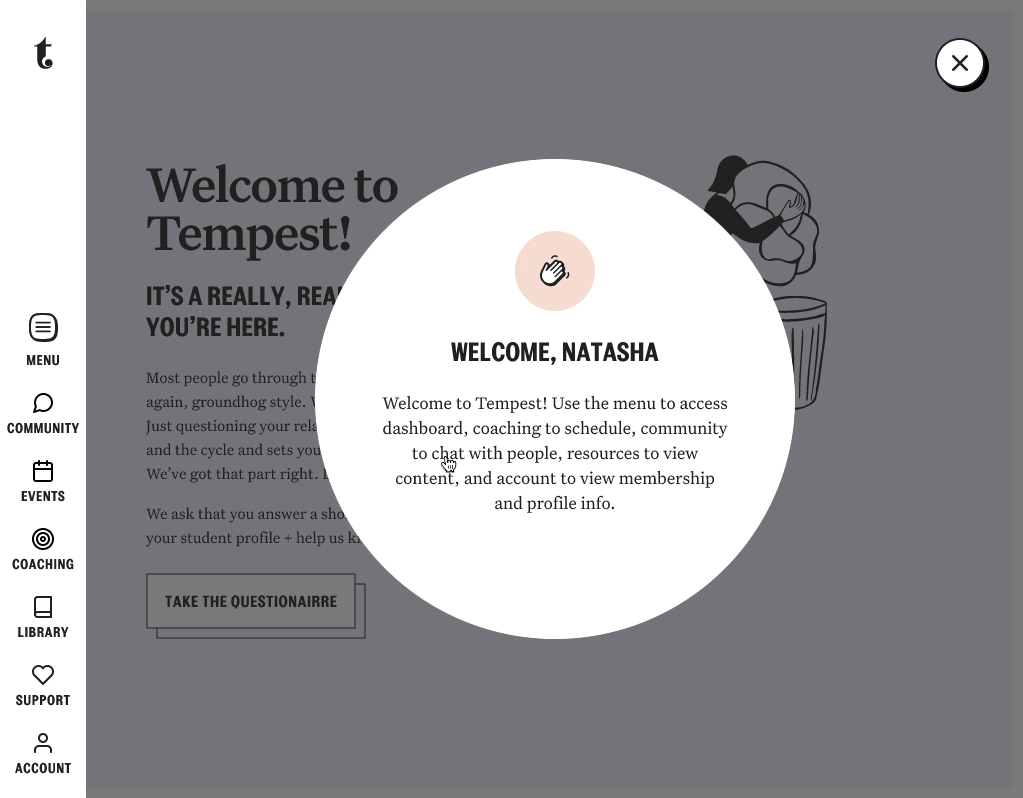
Continuous programming
This is where members saw relevant content course week and interacted with their community group cohort based on the month that they joined.
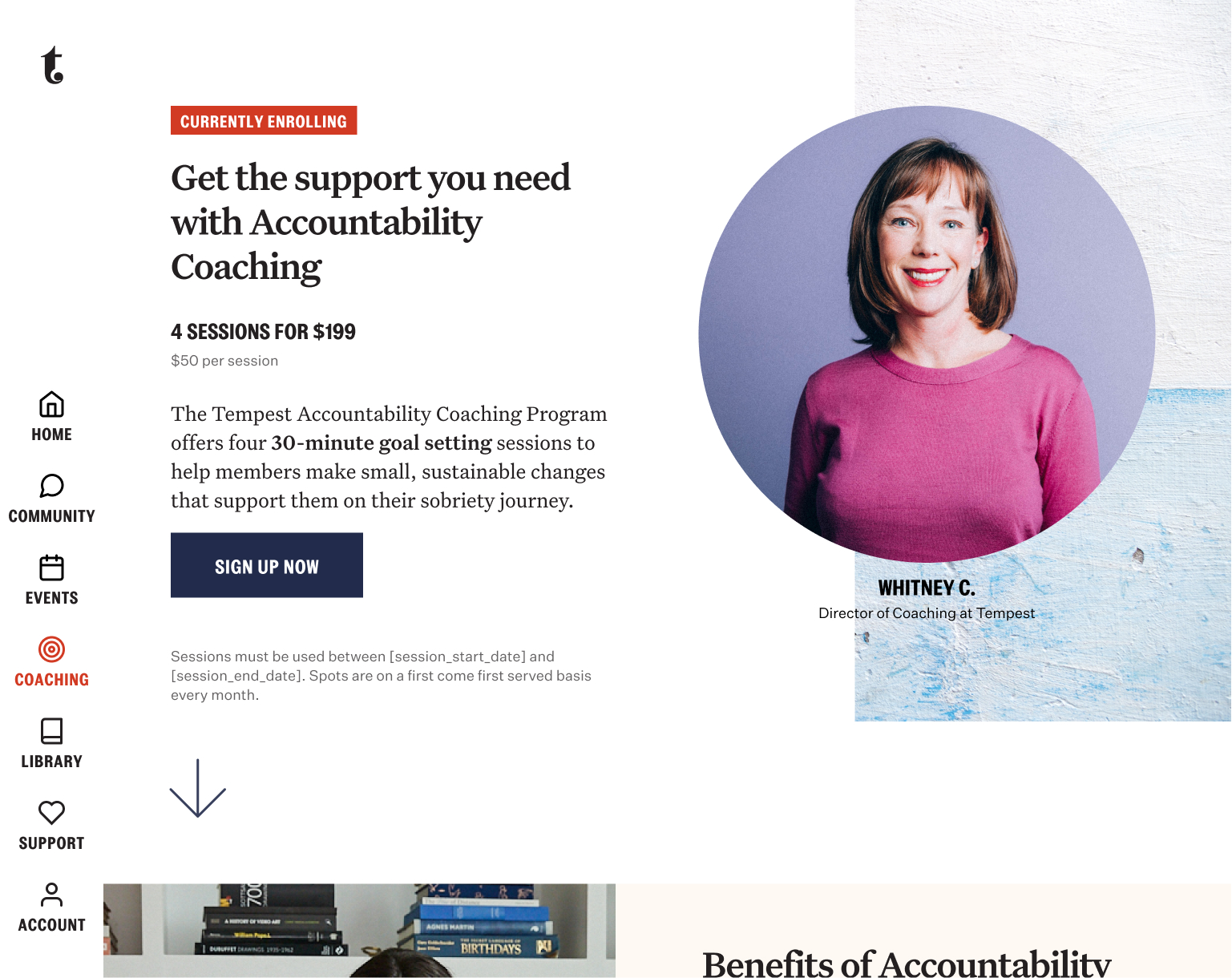
Add-ons
In a survey, users said the hardest thing was staying accountable and wanted even more private one on one time with a care member. So we launched coaching as an add-on post purchase.
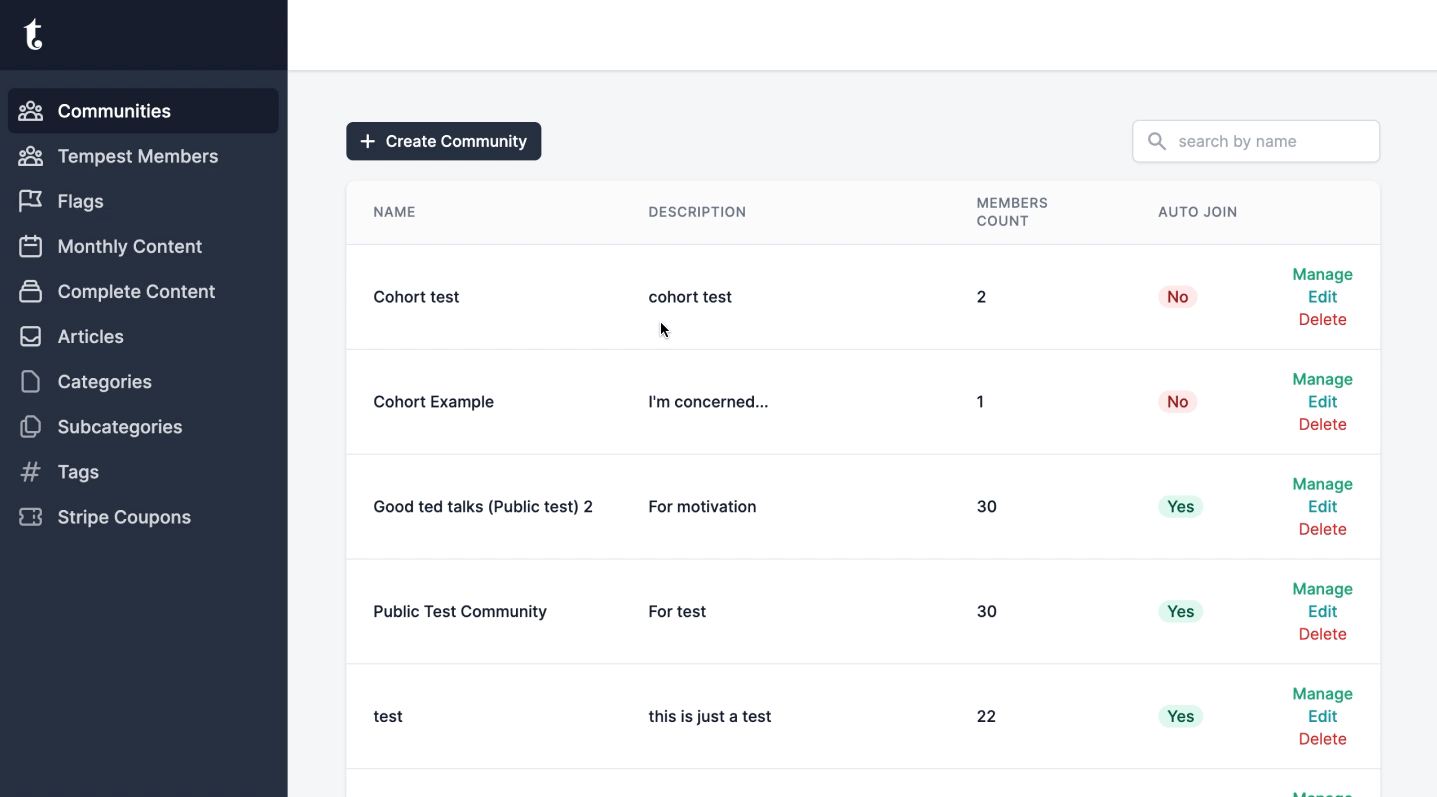
This self-serve tool empowered the care team to efficiently create and manage content and community spaces, directly controlling the user-facing membership dashboard. Integrated with Salesforce, it enabled tailored content and support for different membership types, ensuring that access and care were appropriately gated and streamlined through
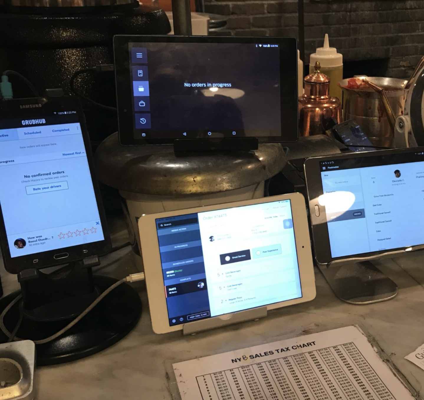
An app for our shop owners.
✅ 93% engagement shown from 2800 restaurant partners.
✅ 700~ successful logins in day 1 showed high interest.
✅ Raised NPS score through increase in order confirmation speed.
Busy pizzeria owners, men in their late 40s-60s, not technically savvy, established family run business handed down for multi-generations. Proud of their unique pizza recipes.
Our goal was to provide a business tool that owners needed to manage their operations. They didn’t want to call or deal with the account sales reps every time they had to make a change.
We believed that if we catered to the specific needs of pizzerias and the owners, they will be more willing to have stronger brand value of Slice as their preferred ordering platform partner.
How might we create a mobile app experience that helps restaurant owners manage their online orders and operations more efficiently, while also providing them with valuable insights and metrics to help them grow their business, especially in this crowded market?
Core learnings
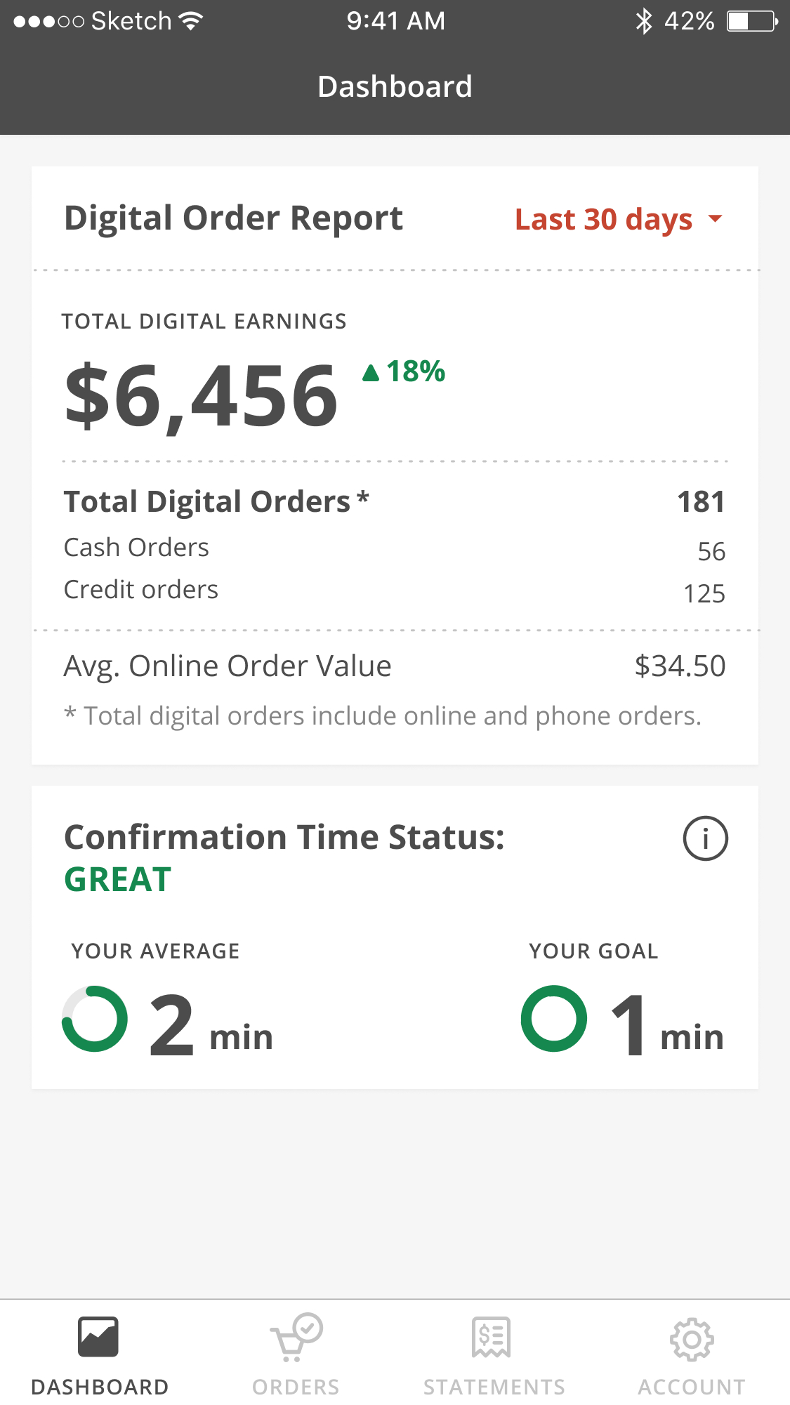
Total sales volume: Owners wanted to see how much revenue they were generating from online orders to understand how much business Slice was bringing them.
Recent order activity: Owners wanted to see recent orders that came in so they can confirm and prepare for delivery.
Core learnings
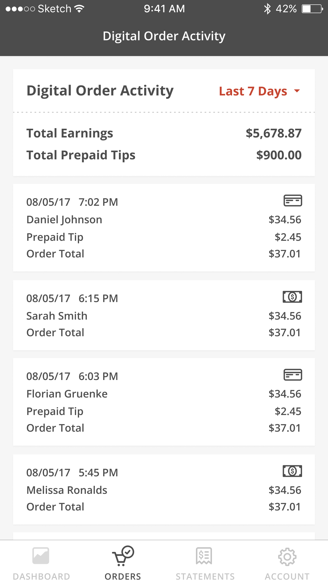
Prepaid tips: Shop owners wanted to see how much tips were prepaid so they can plan for their staff payouts.
Multi-shops, one login: Managing multiple shops or related chains easily was important for owners to save time.
Confirmation time: We also started to add a metric around confirmation time to encourage the use for us to track order accuracy and speed. This was a key metric that measured customer satisfaction.
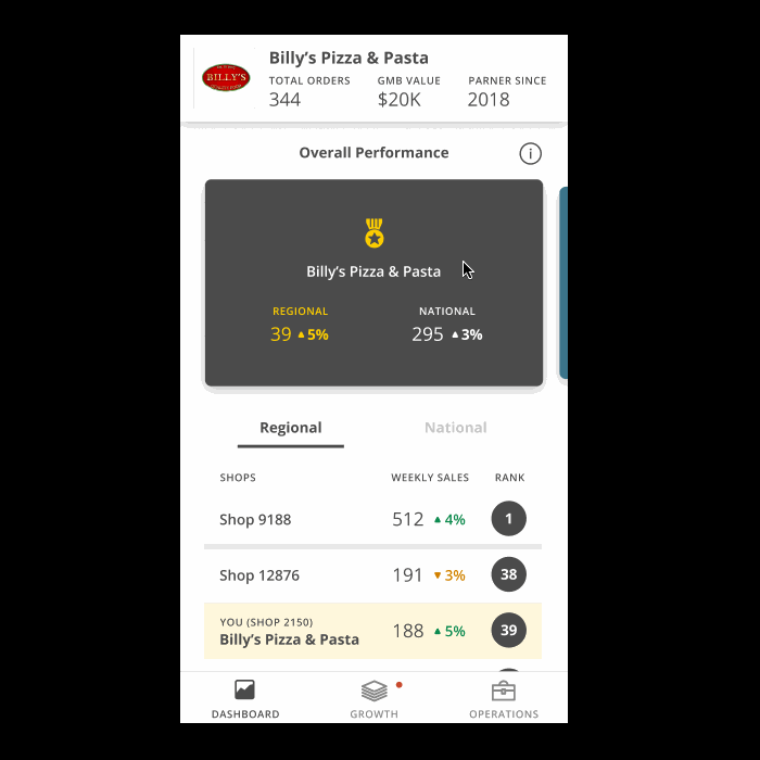
For the future we wanted to create more value for our customers by providing insights and ideas on how to grow their business. Some of the ideas included a gamified ranking by sales volume of shops by regions, how to improve sales by adding coupons and deals or expanding delivery zones, managing holiday hours and inventory. Using this prototype to research with owners helped us identify which features to prioritize for future development.
Prototypes created from sprints, classes, & reviews.
Enterprise pattern library contribution
✅ Successful co-collaboration and alignment of multiple teams.
✅ Received additional research support and dedicated resources.
✅ Contribution to our enterprise component library.
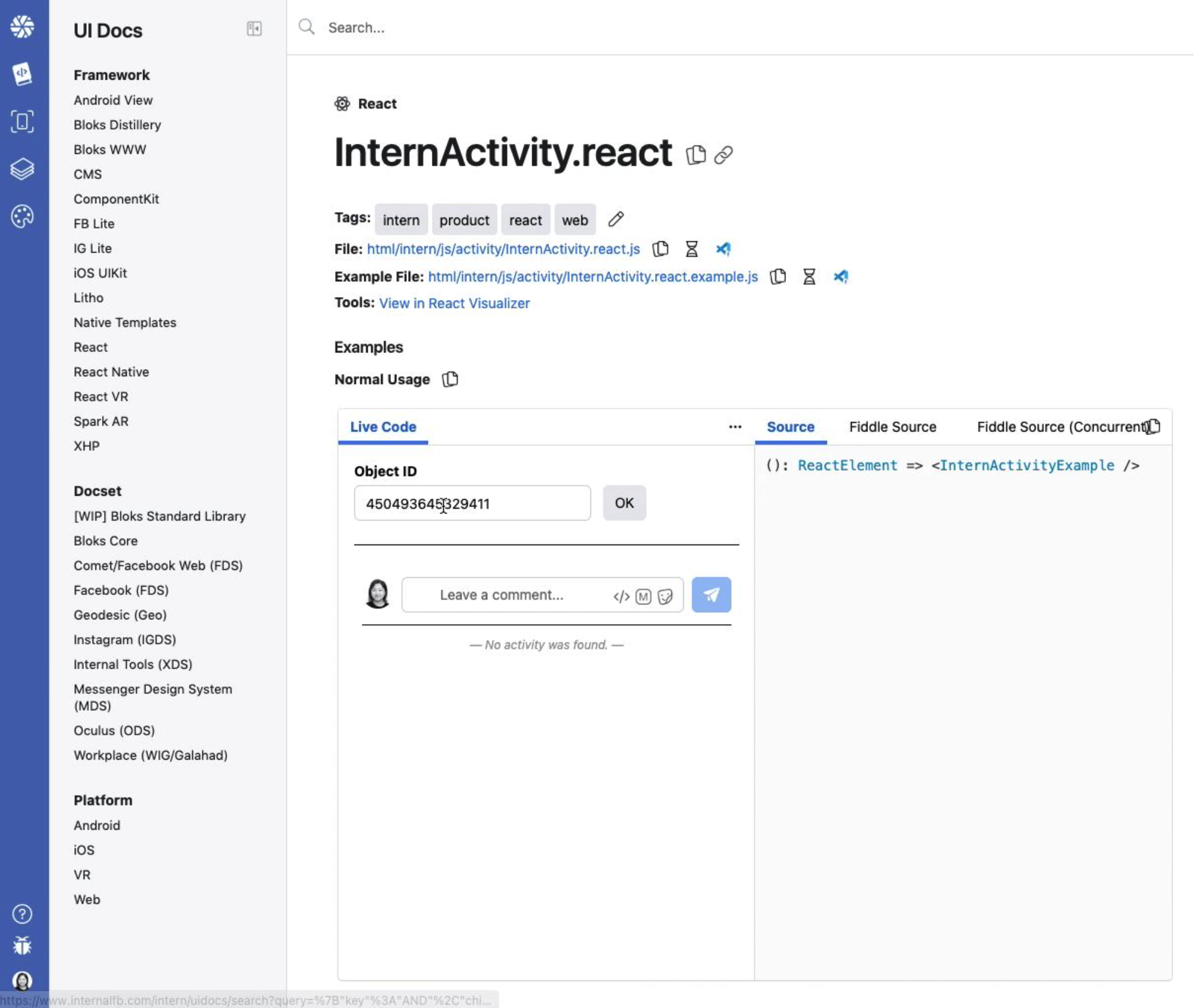
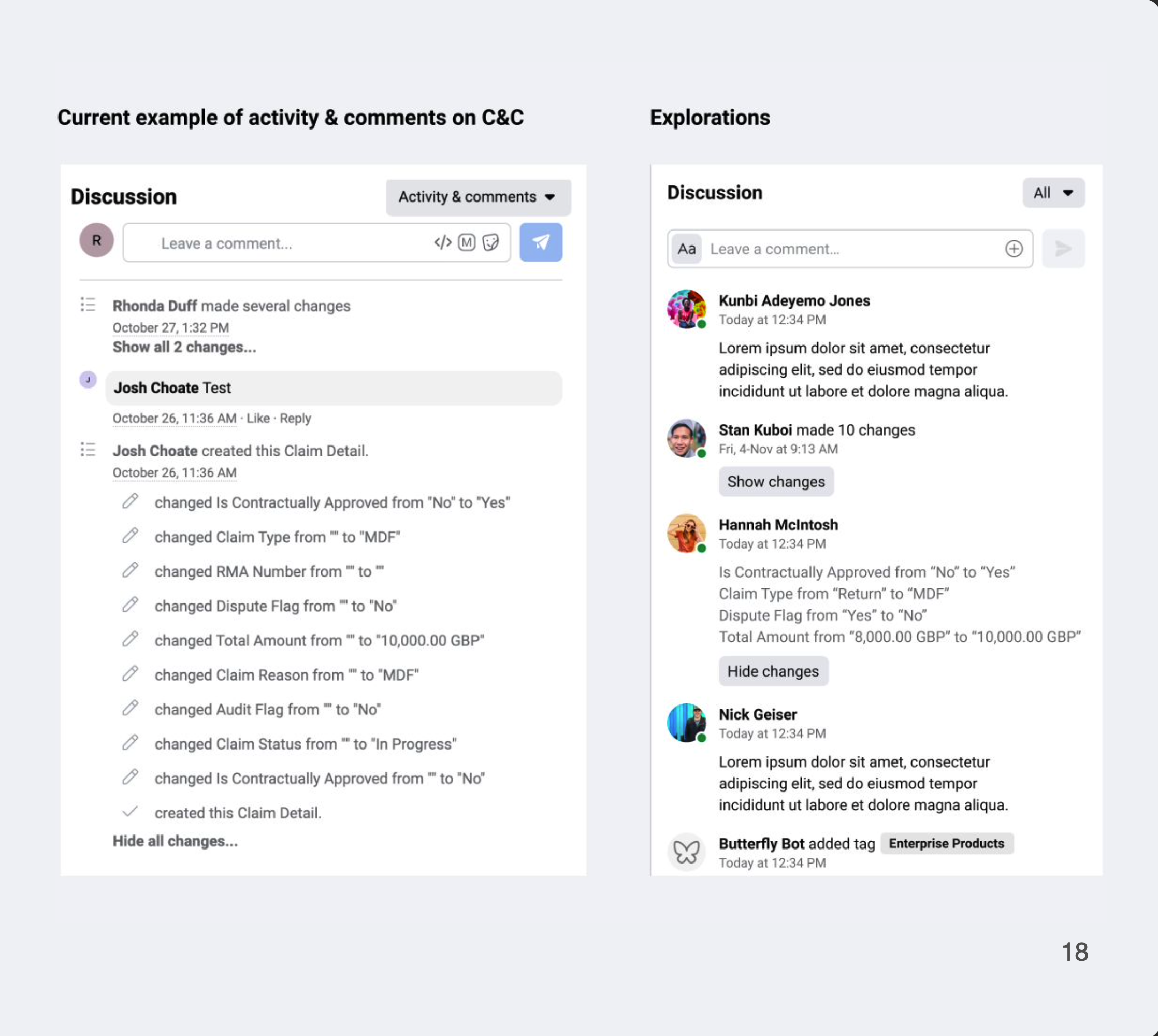
In the Claims tool, a “Discussion” panel in a detail page shows a historical trail and logs of activities and comments during a claims process and approval. This is used by Meta FTEs and Accenture agents to record progress and identify blockers.
Other variations of this is also called "Intern activity", "Comments", and "Feedback"
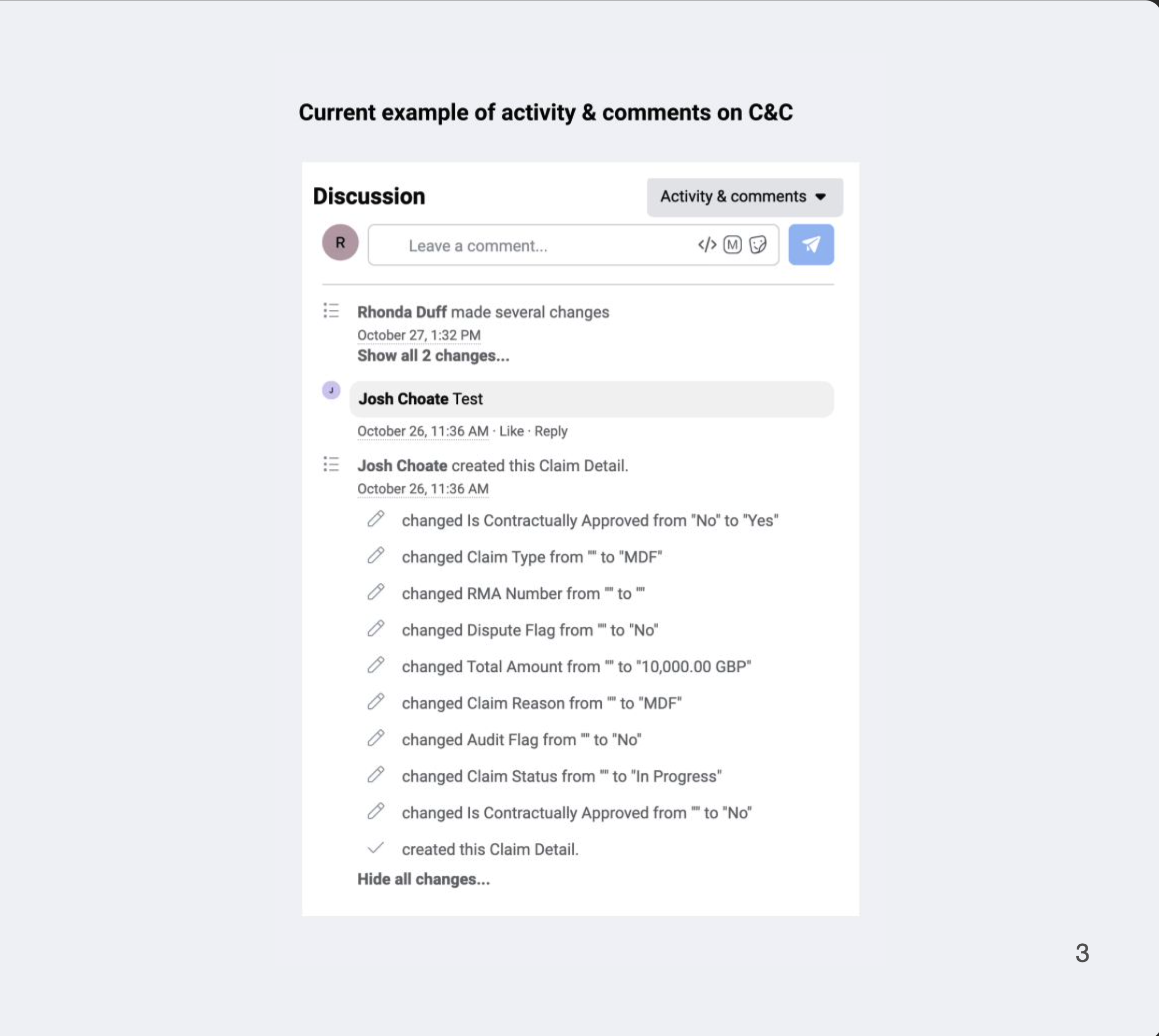
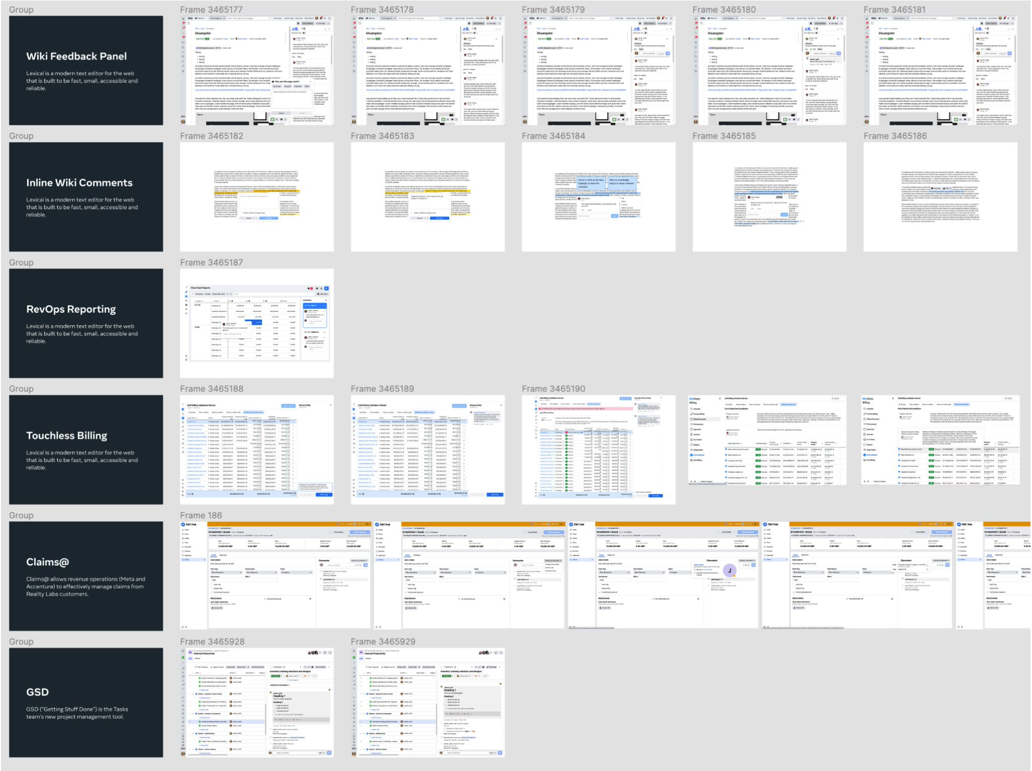
There are multiple internal tools that use this pattern, including our Wiki, RevOps Reporting, Billing, and Claims. Our data also shows 420 ancestors and 7 decendants related to this component from our react visualizer tool. Each tool has different variations of this pattern, but the core functionality and purpose remains the same.
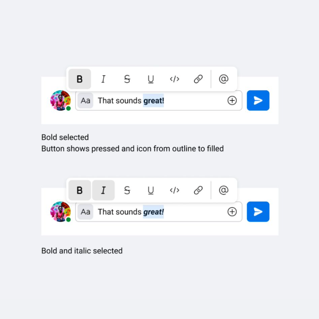
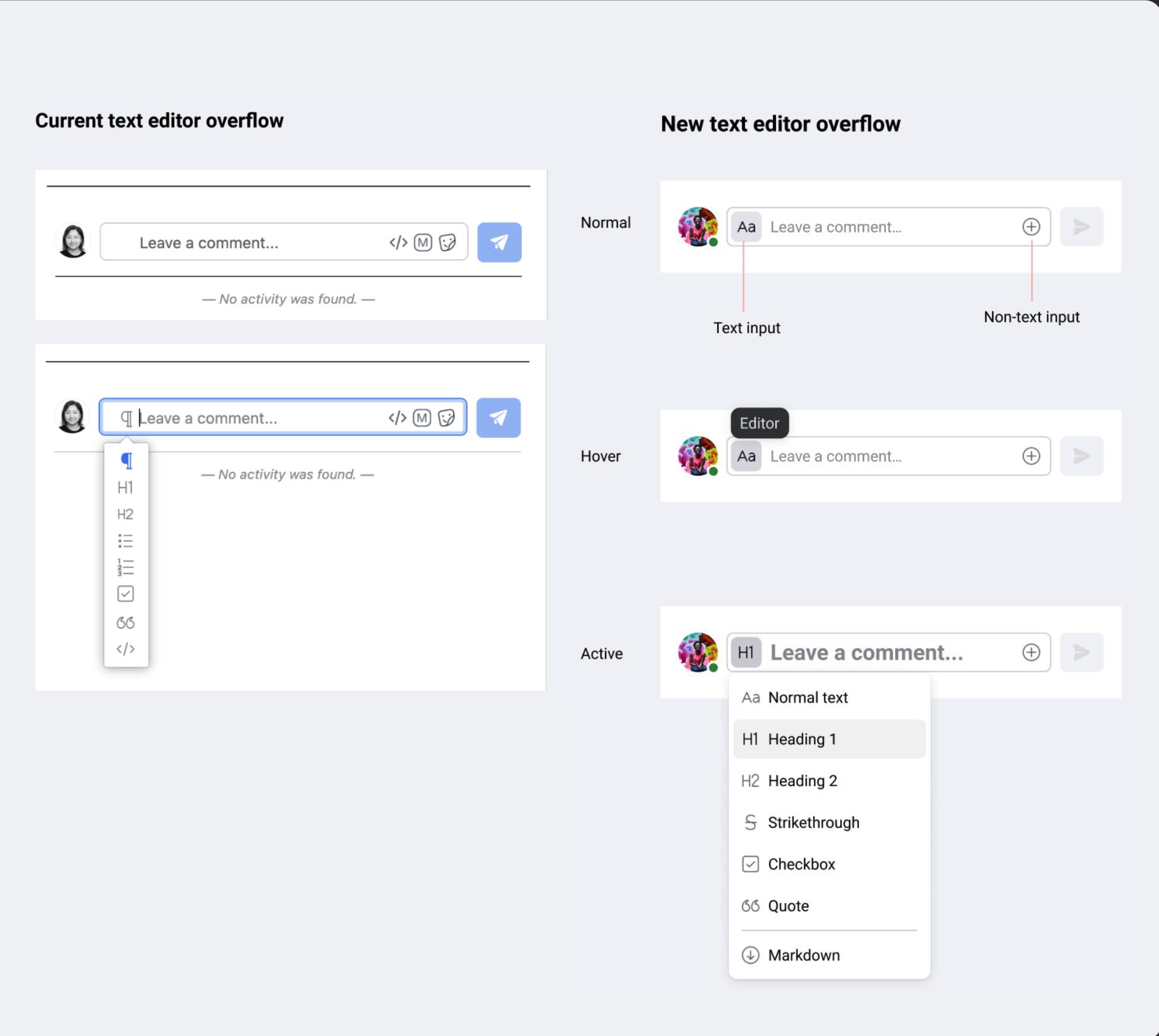
Visual bugs: The “P” for paragraph is not visible until text is entered in the input field.
Limited use case: “Format with a Markdown” depends on use case and belongs under text formatting.
Vague language: “Insert a macro” is a vague terminology and icon that opens gifs.
Make design updates (PD + CD) to the dated base component internactivity.react as a starting point.
Coming up with specific guidelines and pattern usage when there is a lack of general research or context to all its use cases or reviewing content deep dive.
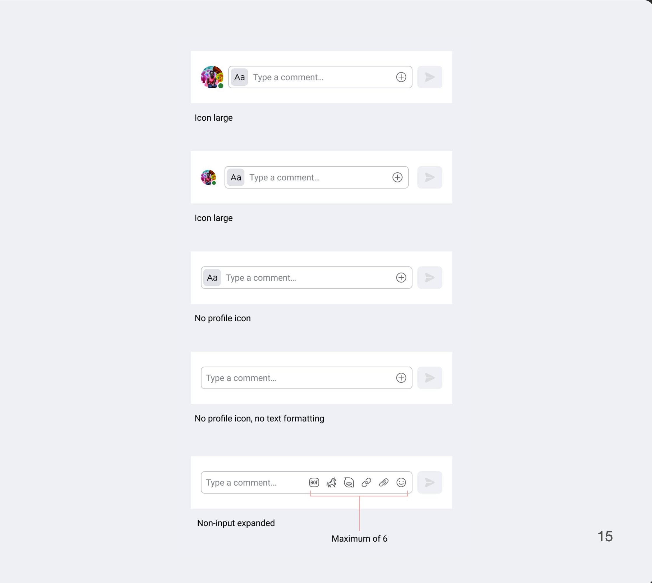
We are proposing to replace the “P” icon for Paragraph with “Aa” icon as the affordance for the text editor overflow menu. We also want to update the send button icon to what is standard for XDS.
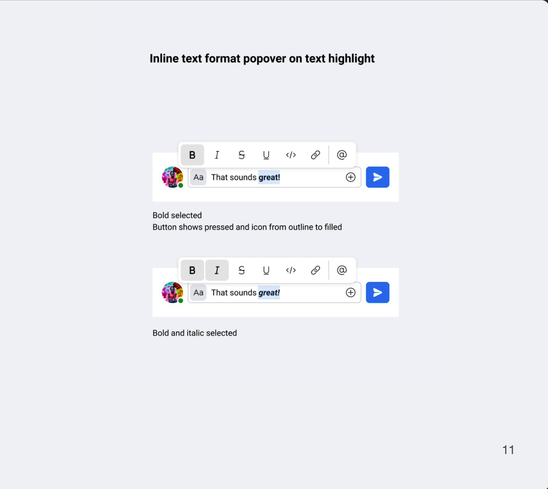
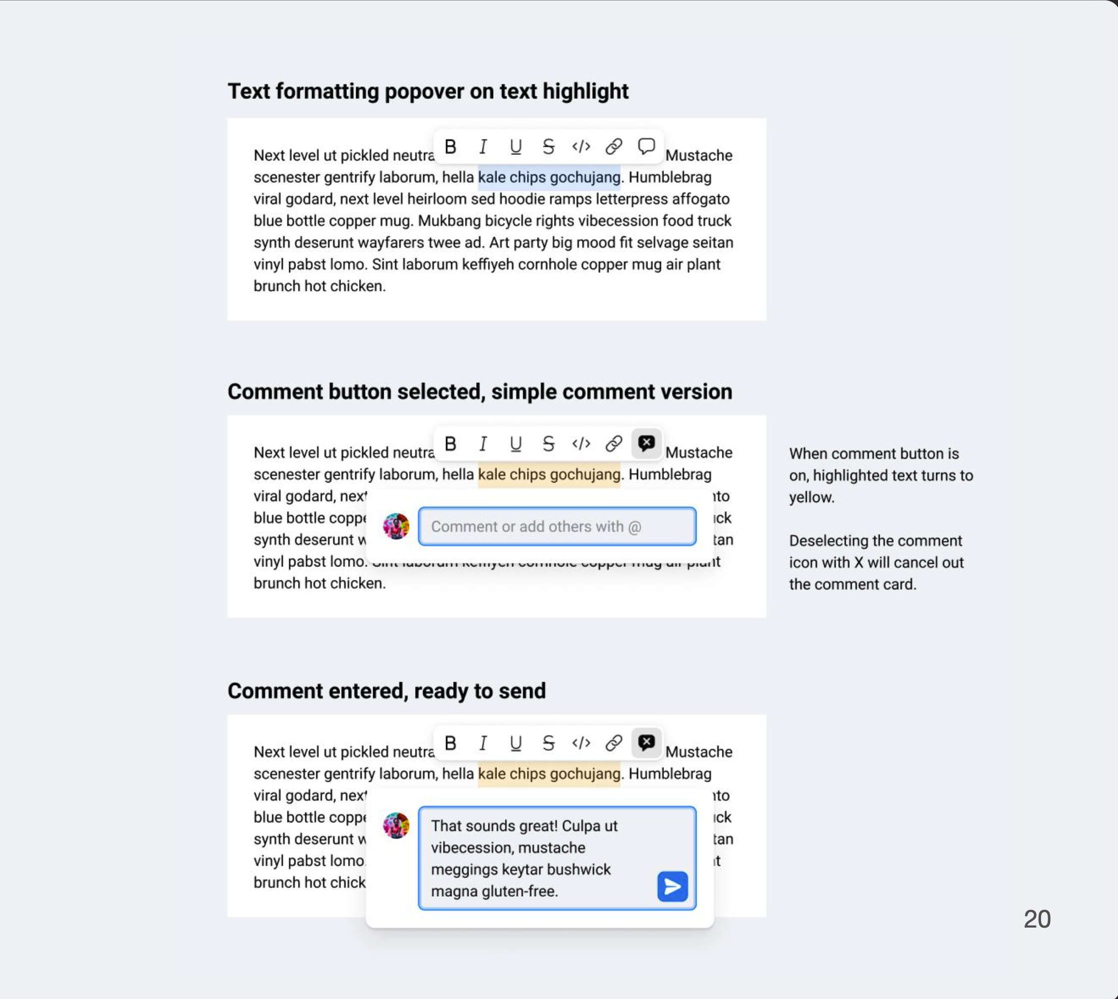
In addition to this, we would like to add the inline text formatting popover tool on text highlight.
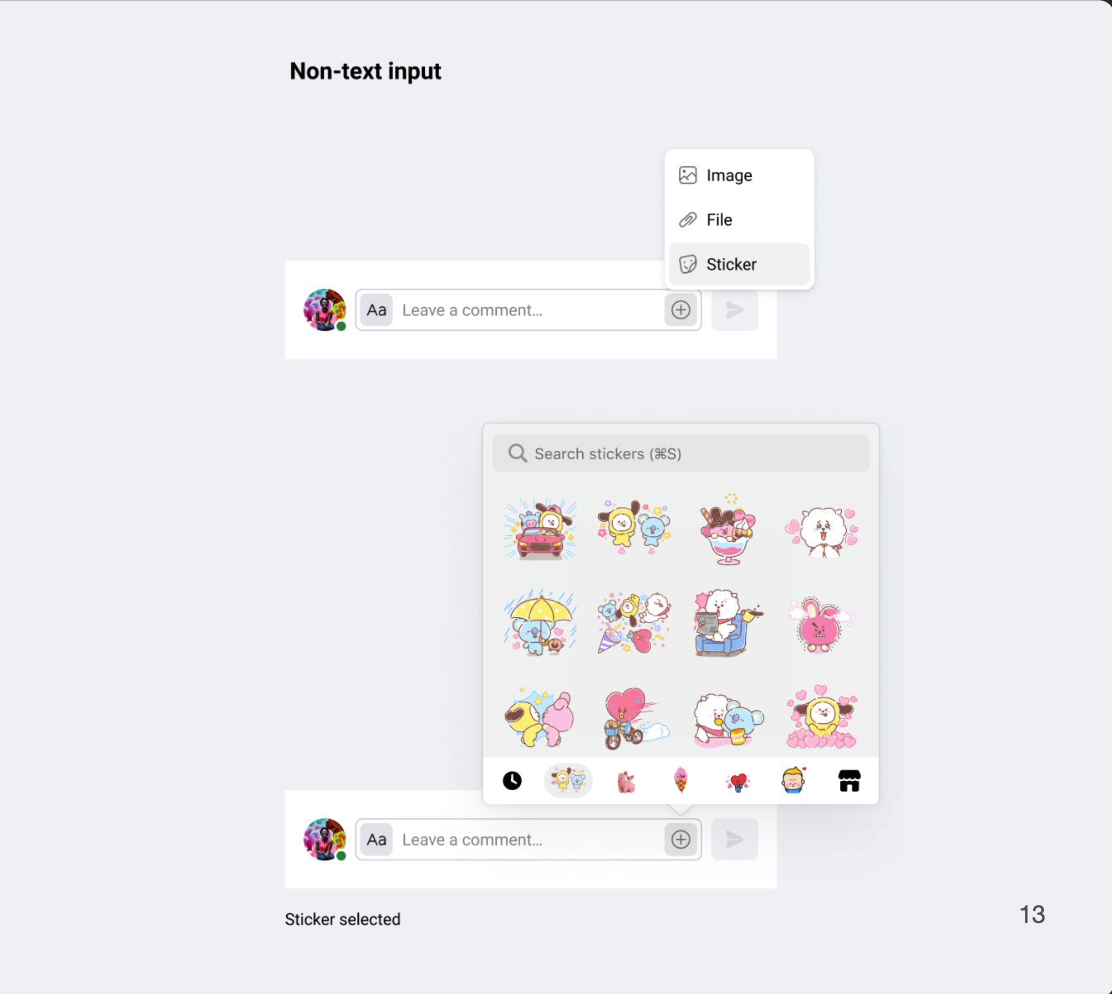
Non-text inputs such as image, file, sticker attachments are separately grouped to the right (+) overflow icon that will open the menu popover for sticker selection or the separate finder window to attach recent files.
These variations can provides flexibility across our diverse set of tools.
Activity and comments: When should it be together vs separate?
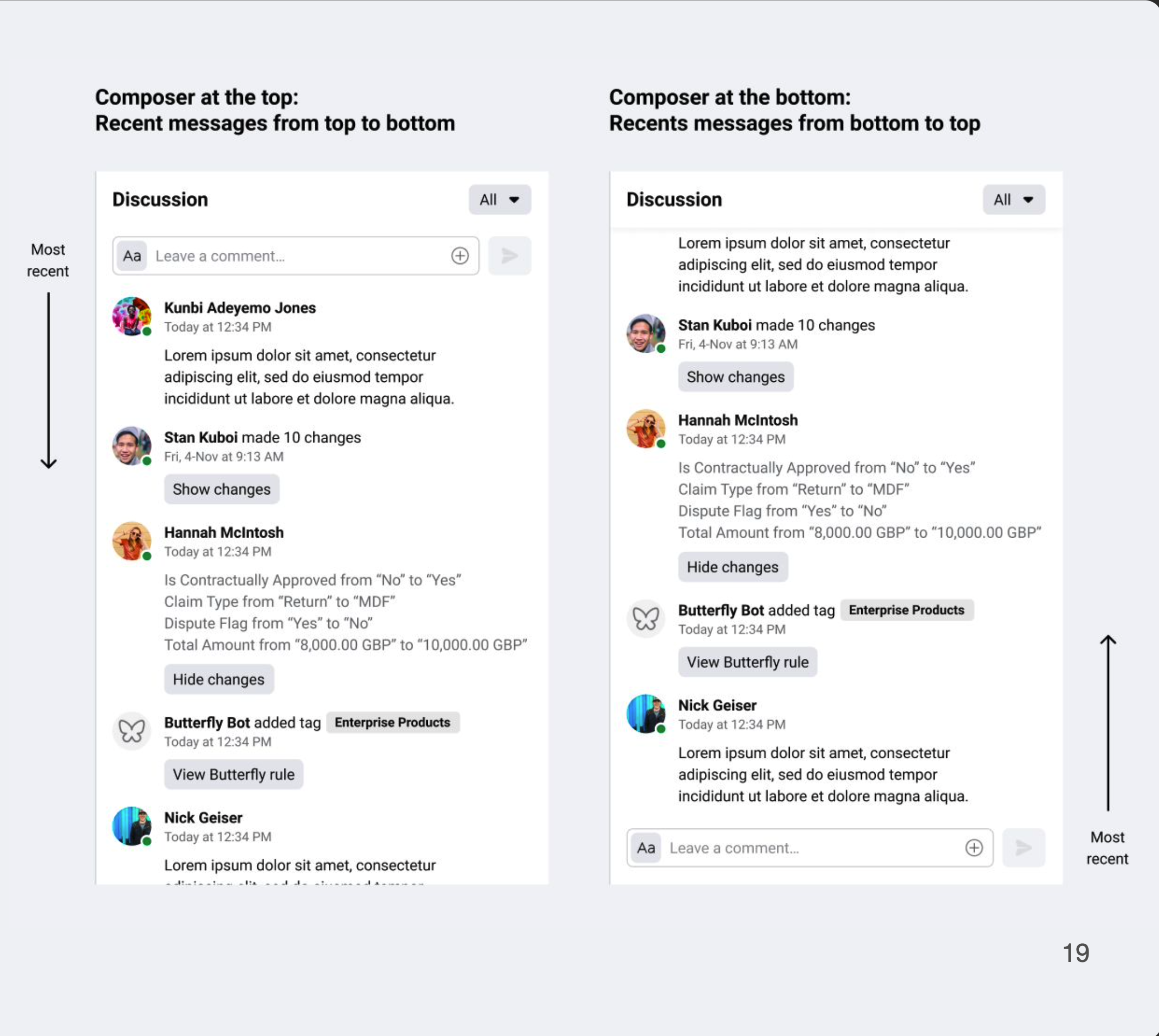
Placement for the compose field: Top or bottom? Or either?
What does inline text editing, formatting, and commenting look like?
When does it make sense to have both “Activities and Comments” together and when does it not? Does the existing terminology make sense? Why is it grouped under “Discussion”?
When does it make sense to have compose field at the top vs the bottom? In chat, composer is at the bottom, close to the keyboard in mobile patterns. In posts and forums, messages are read from top to bottom as you scroll down a web page.
Can groups of activities be aggregated to show actionable steps and monitor risks in finance?
If we wanted to create a successful pattern, we needed more dedicated resources and research support.
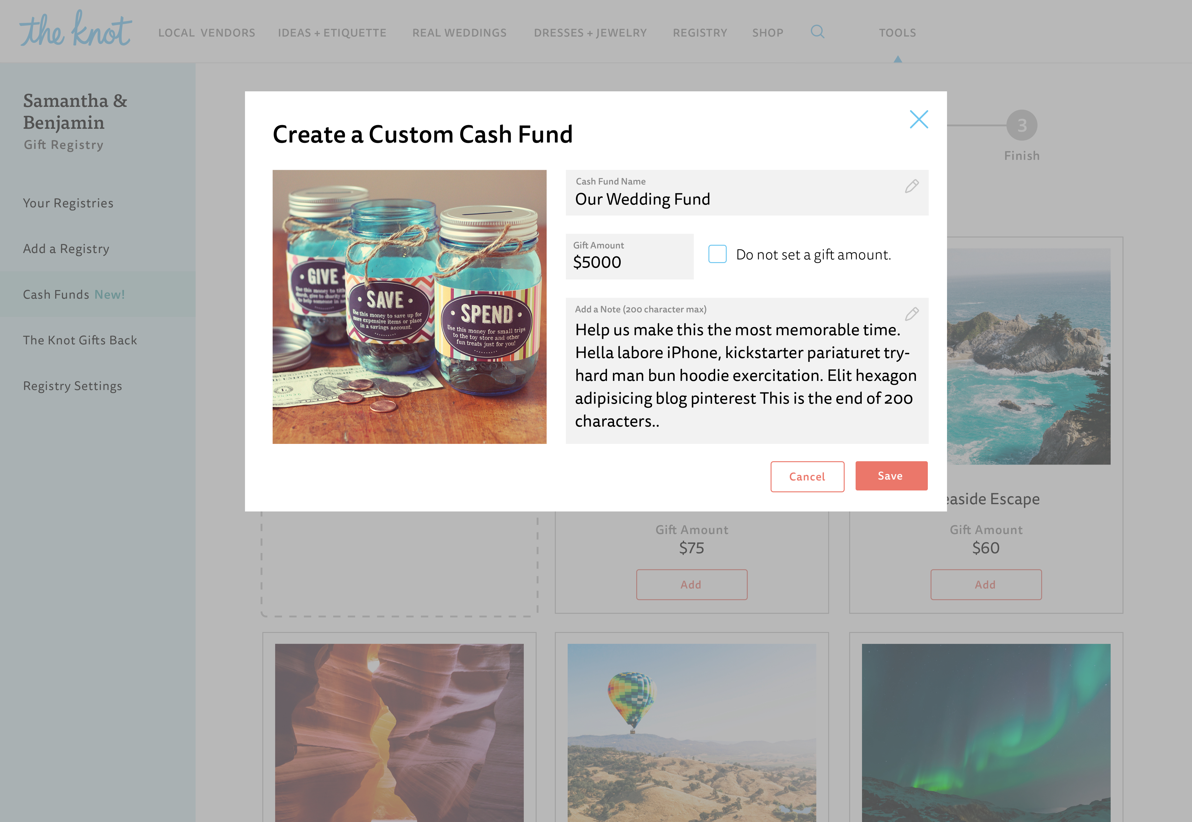
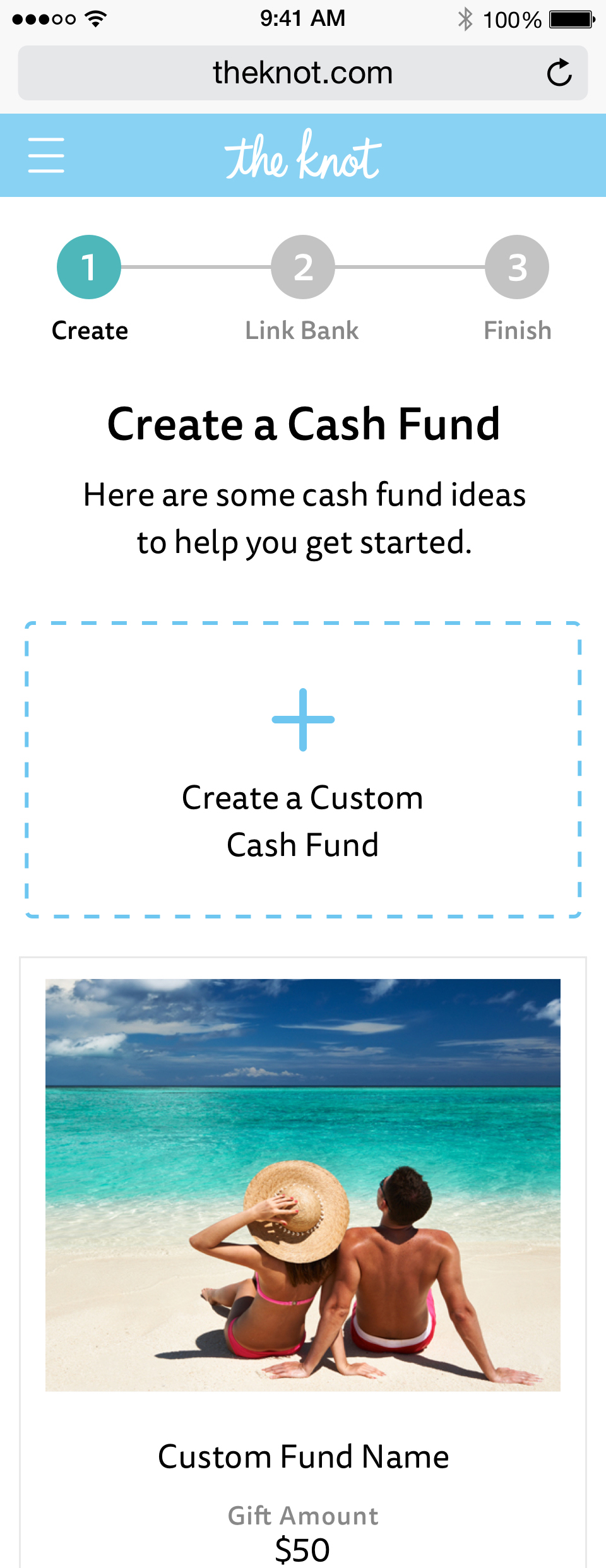
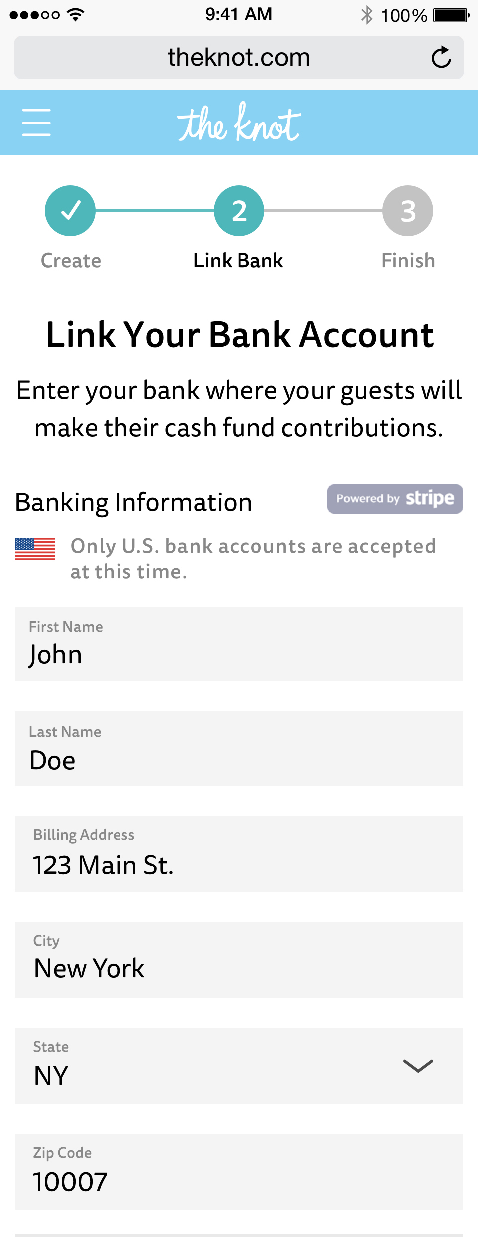
Cash Registry for Engaged Couples
Couples who create registeries with the Knot on average add at least two registries, so having this popular cash registry meant creating a stronger value and reason to choose the Knot as the place to create their wedding registry and this helped the company compete in this landscape.
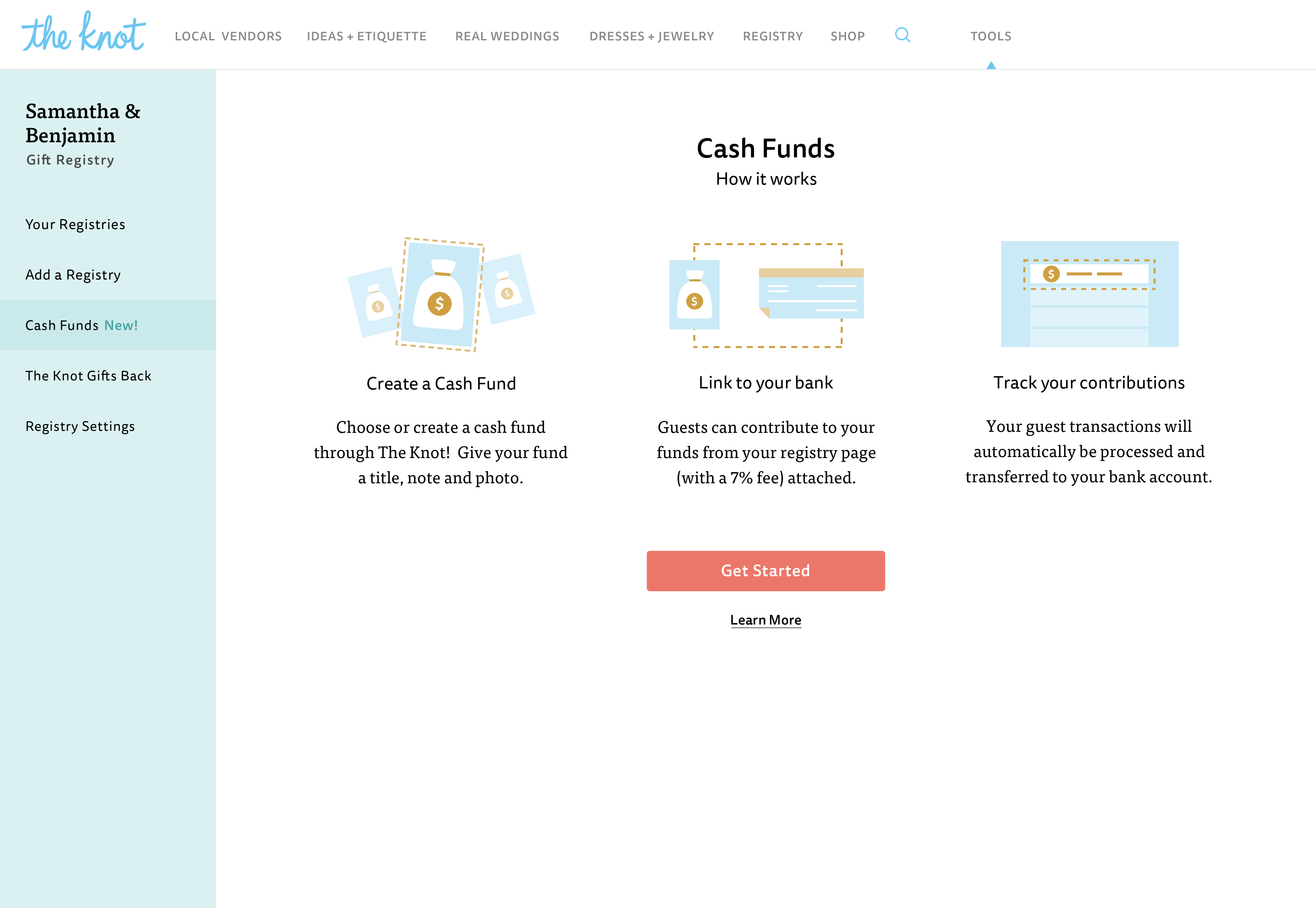
Provide the ability for couples to create this cash fund account.
Create a flow for couples to create, edit, and manage their account and surface this option for their guests on their wedding website.
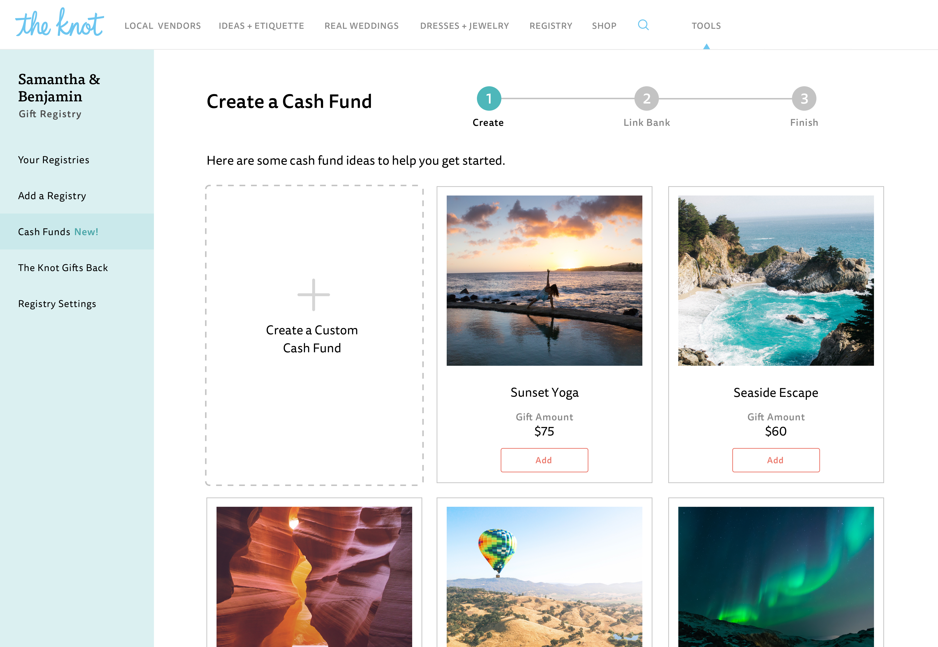
Our KPIs numbers were # of cash registry accounts created, dollar amounts of cash items added, and overall value of cash registries created.
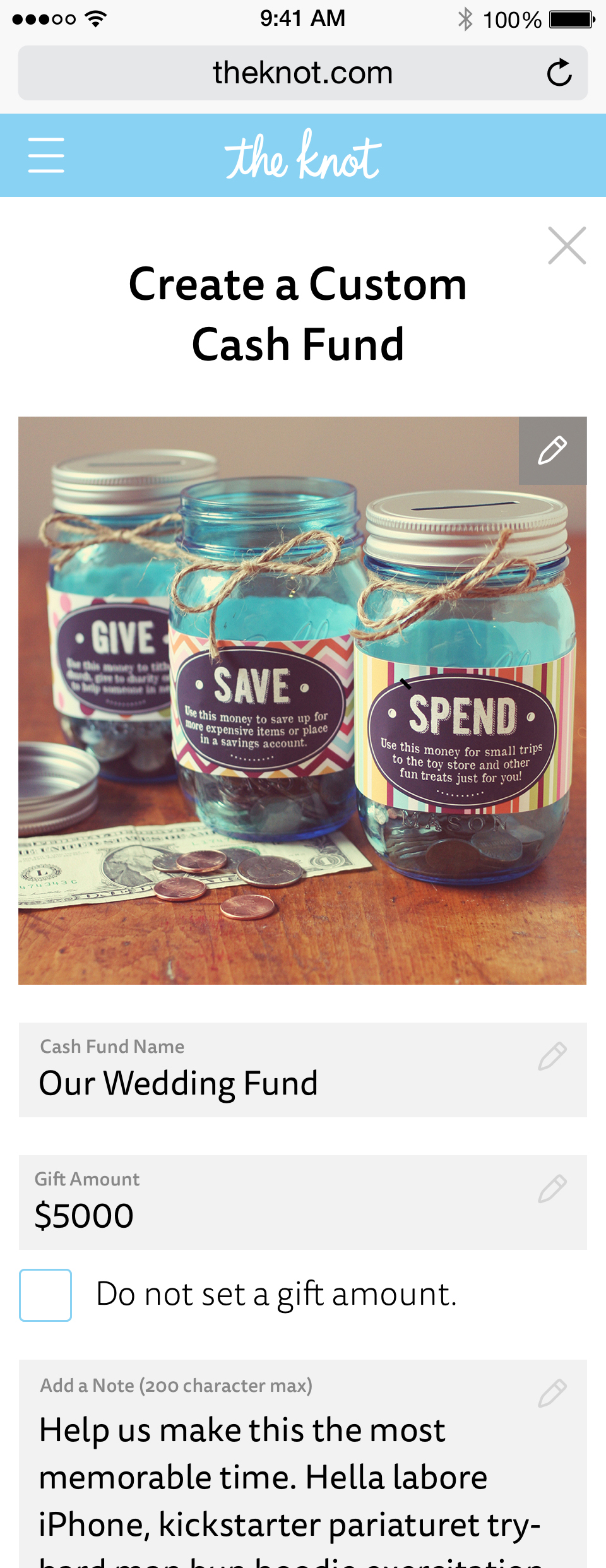
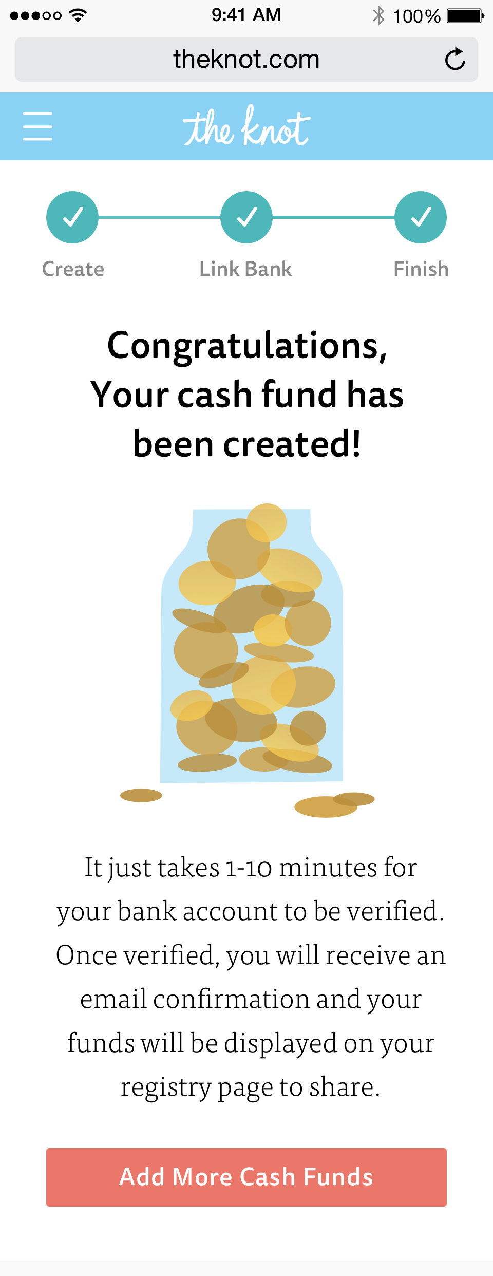
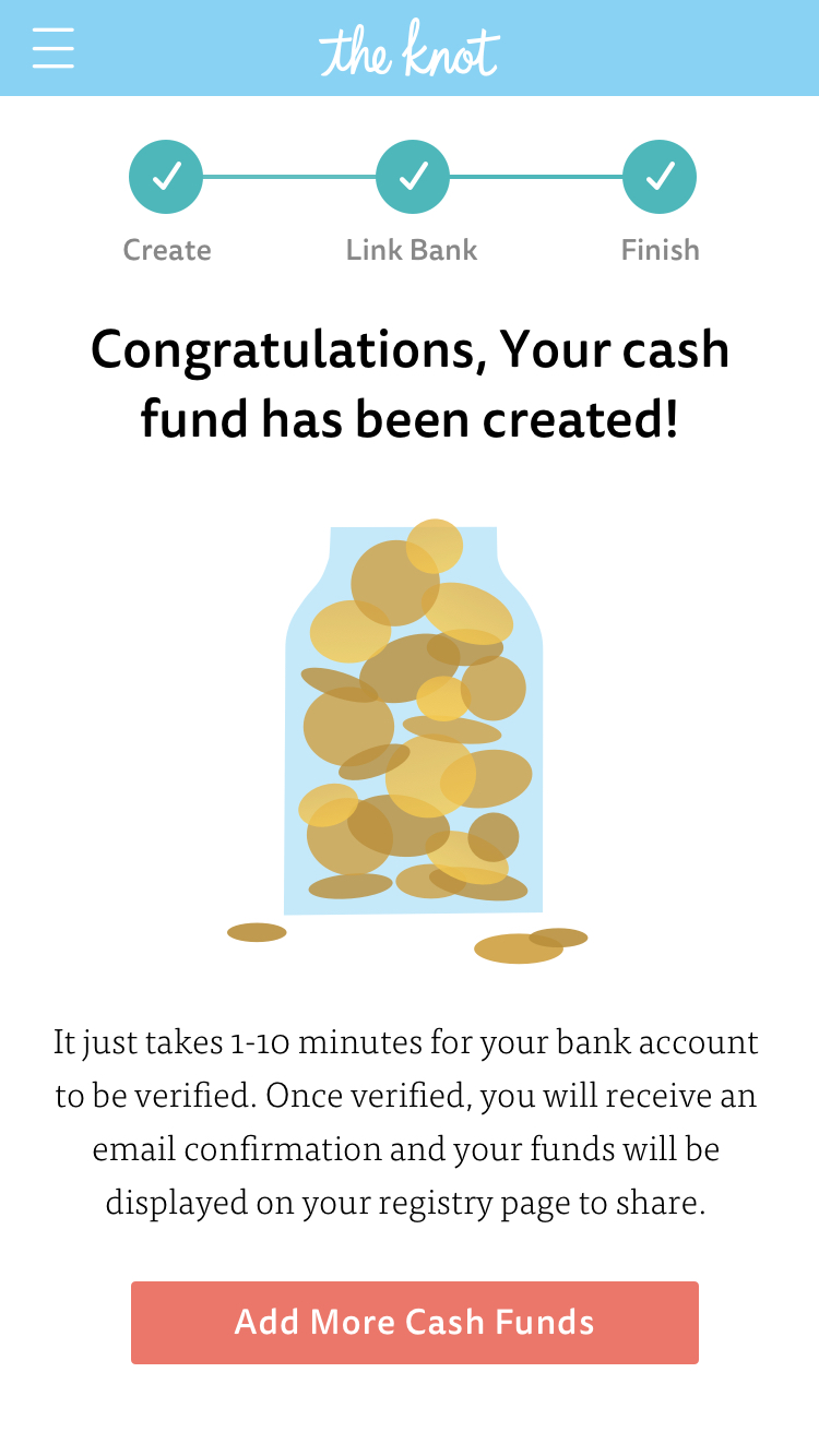
This cash jar animation was created as a delightful element at the end when a bride completes the flow to create a cash fund registry for their wedding. Download Framer Project.
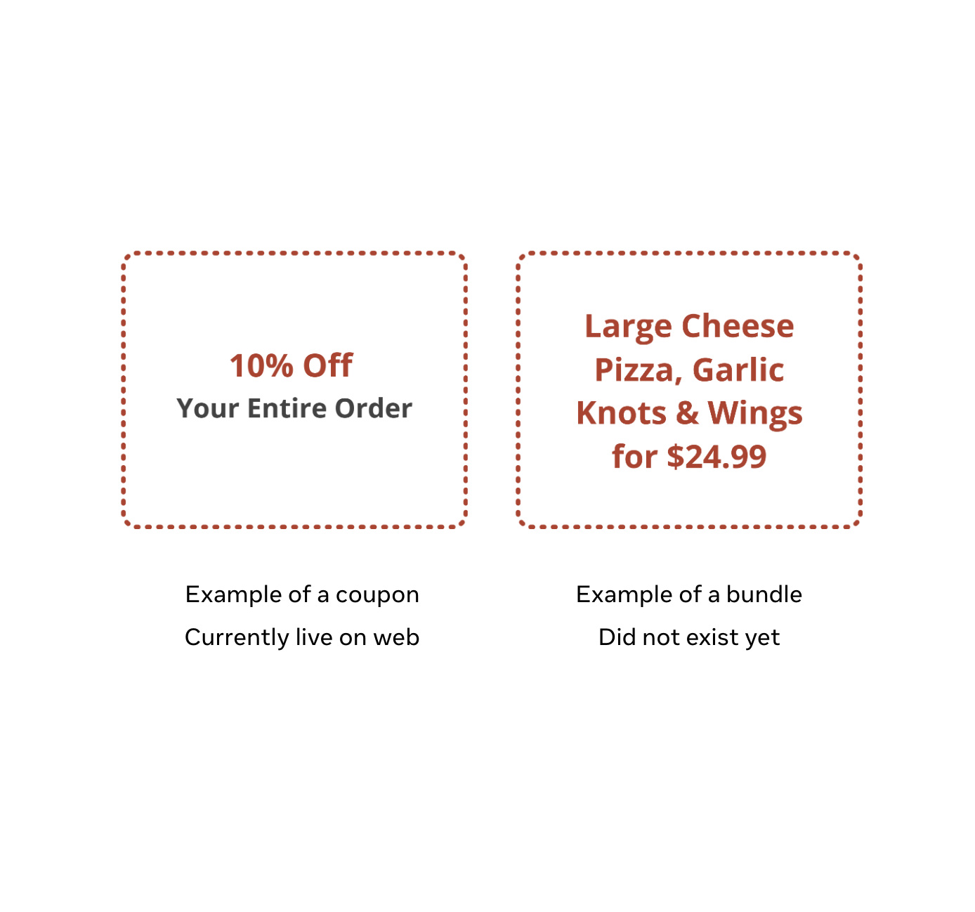
Improved coupon and bundles discovery to reduce decision friction and increase repeat orders
✅ Improved retention by 8-12% across all platforms.
✅ Decreased in call volumes around specials.
✅ Providing real value deals were important for building trust.
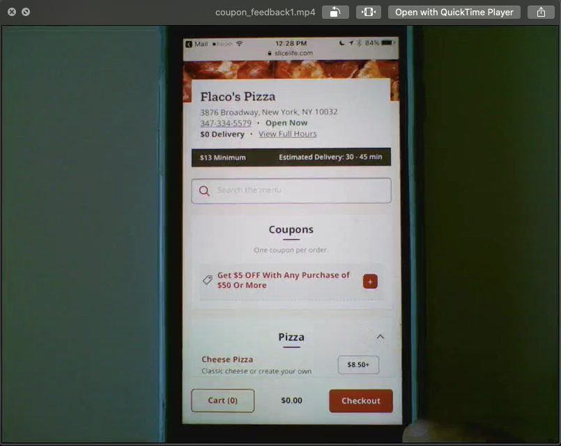
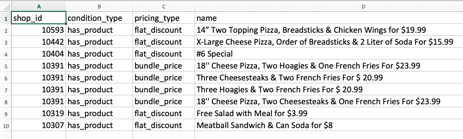
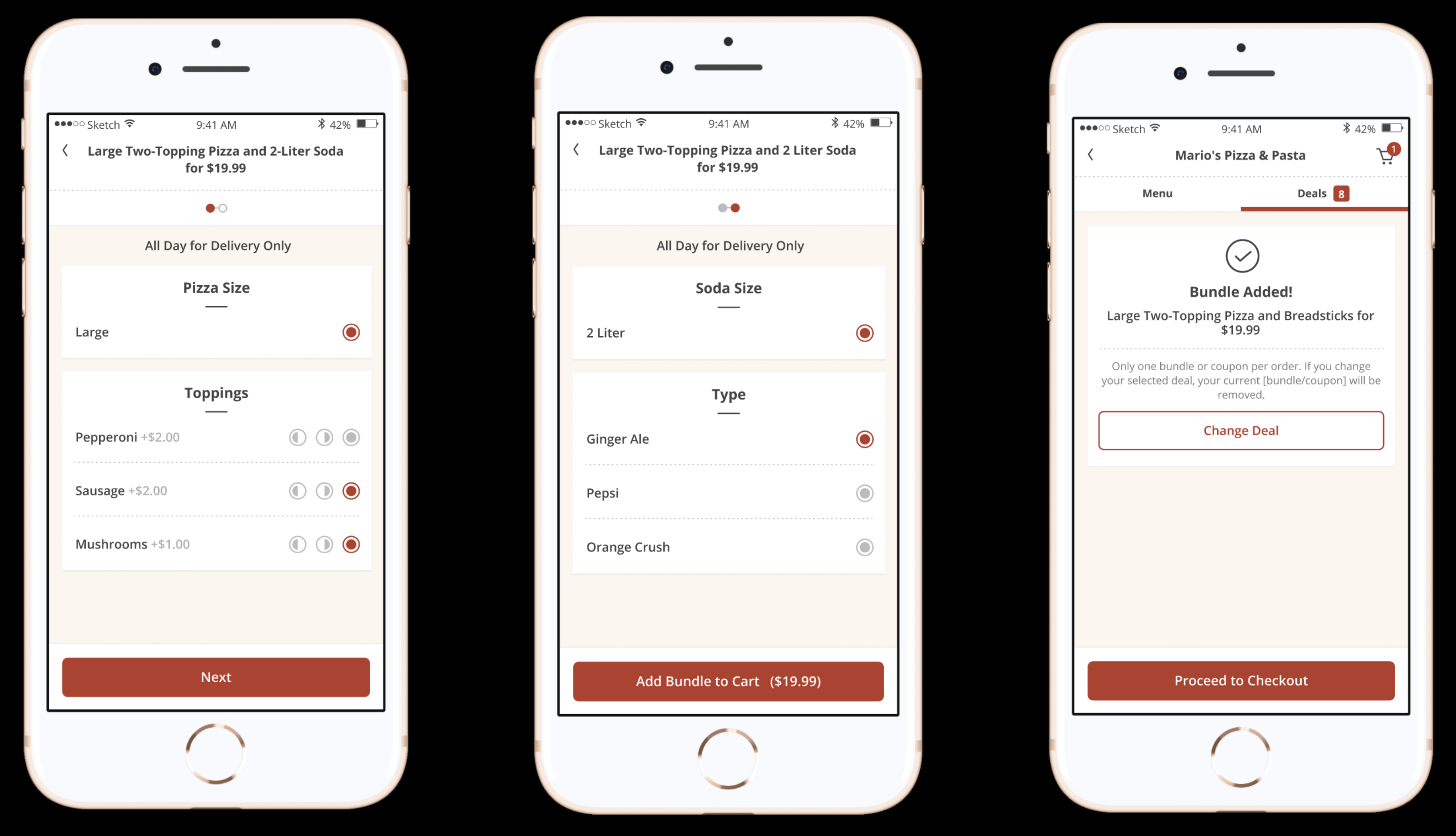
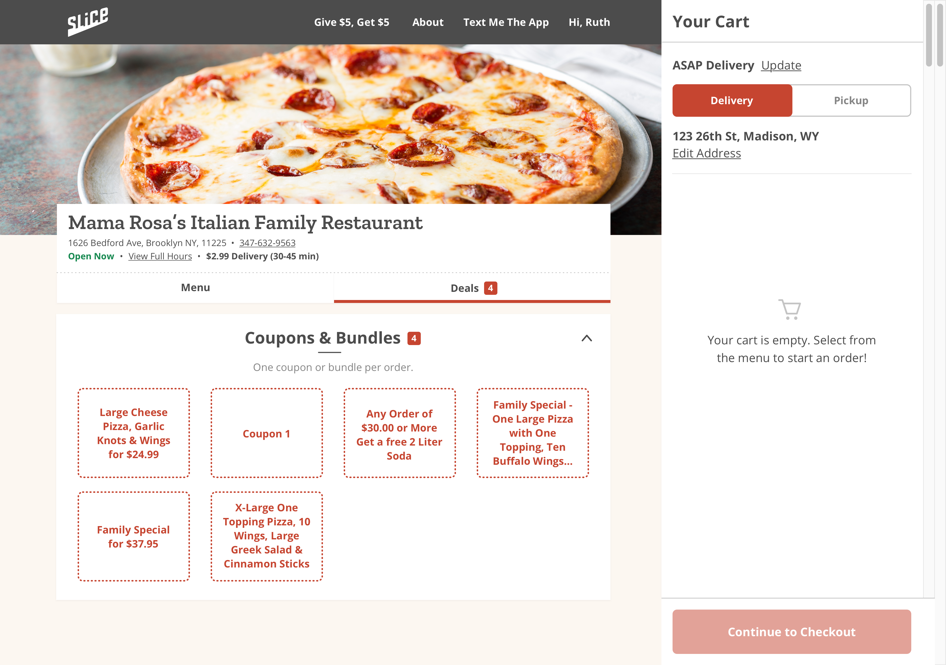
Our goal was to improve retention by 8-12% across all platforms (Web, iOS, Android) by improving the coupon experience. Coupon discounts existed, but were hard to find and apply. We also wanted to add another coupon type called “Bundles” which allowed users to save money and time by adding grouped items to cart.
Usability testing showed users were unsure when a coupon was applied and coupons crowded the menu, causing friction and extra scrolling.
Long names: truncate with ellipses and consider concise naming guidelines.
Vague names: recommend sales/trainings and optional imagery on offers.
Inconsistent descriptions: include descriptions in the product detail view.
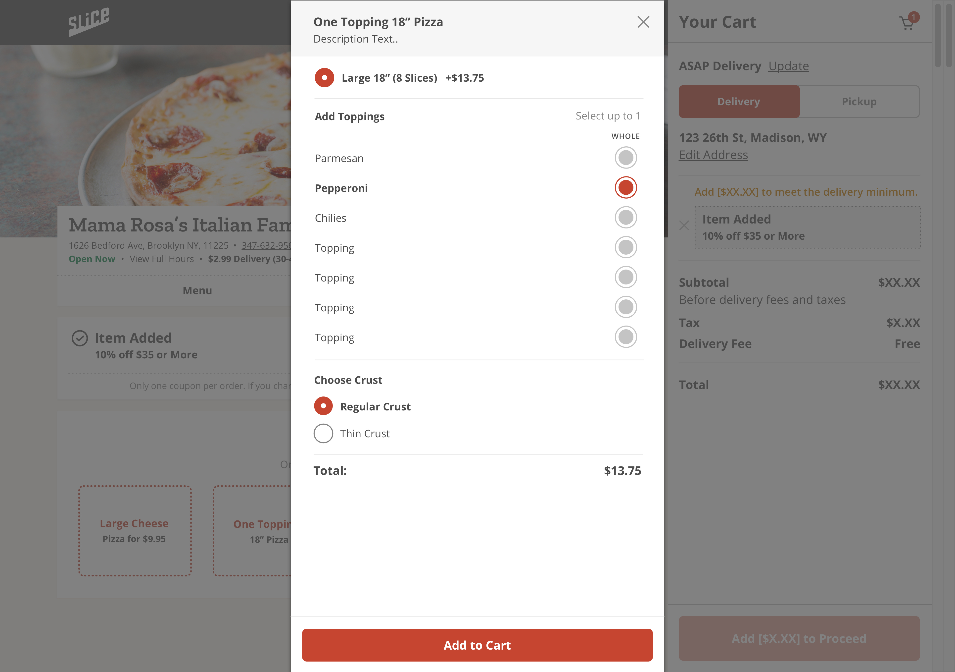
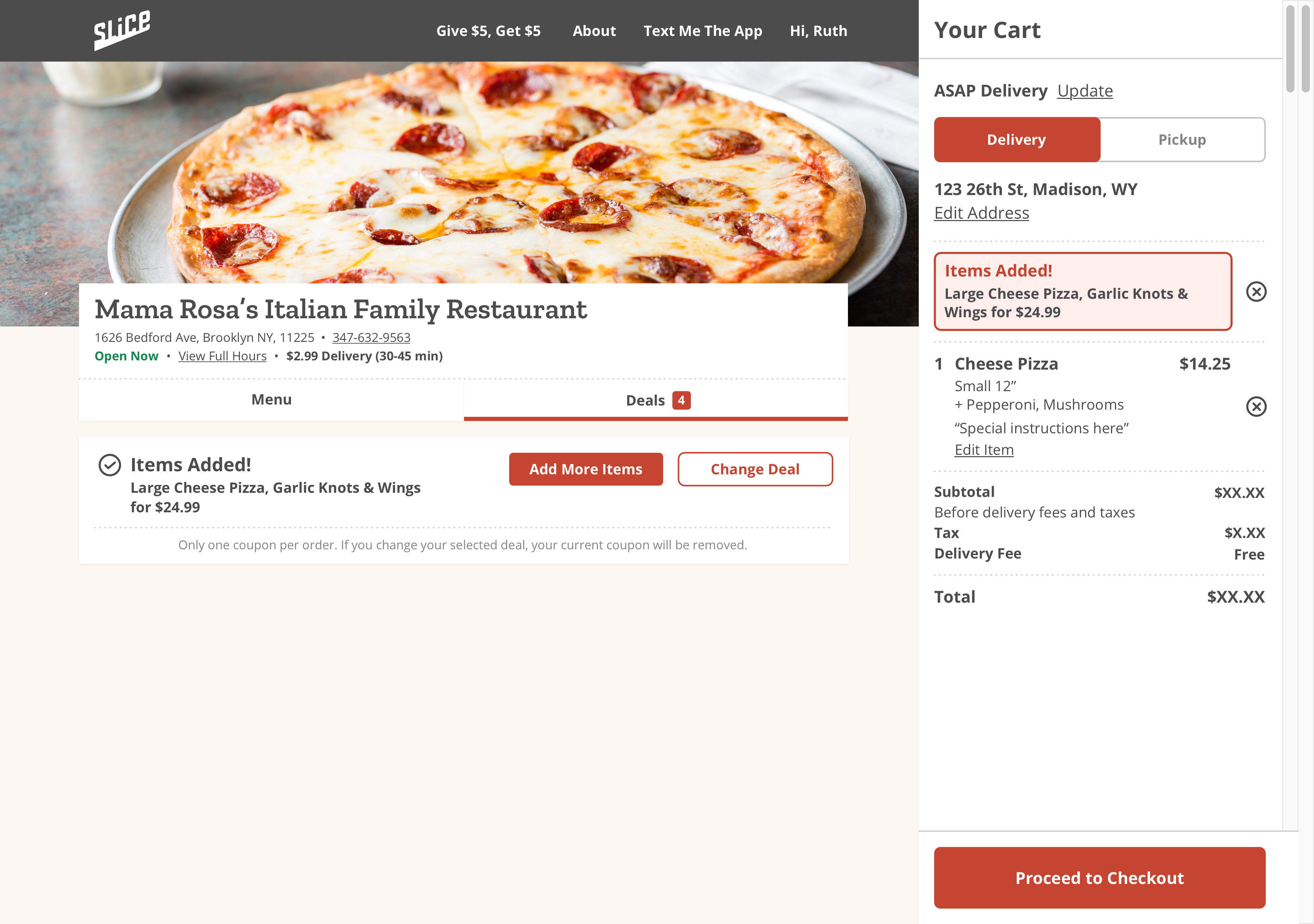
We tested multiple entry points including a dedicated tab, a banner, and a flagged menu item. The dedicated tab was the clear winner providing the most visibility.
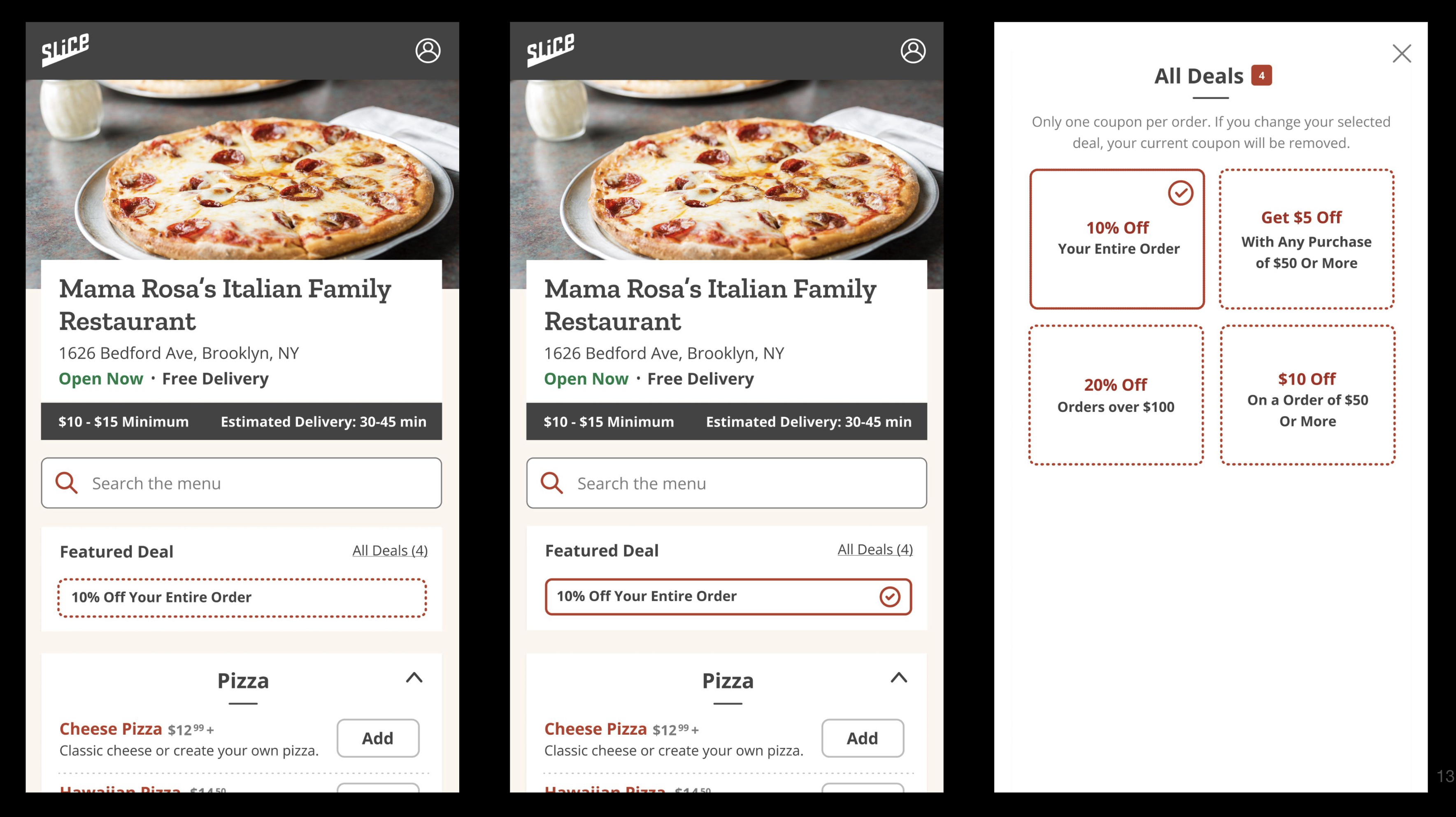
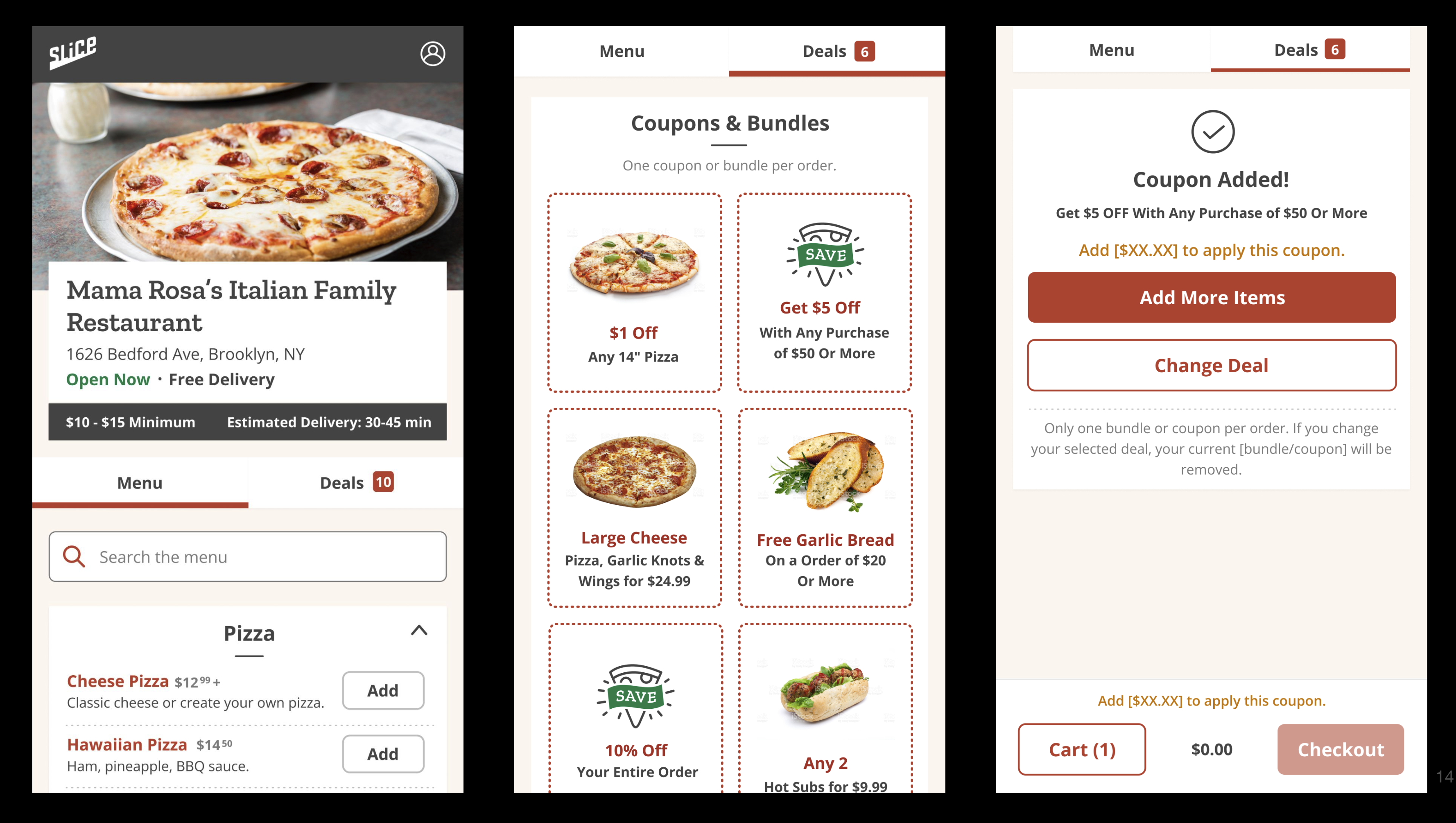
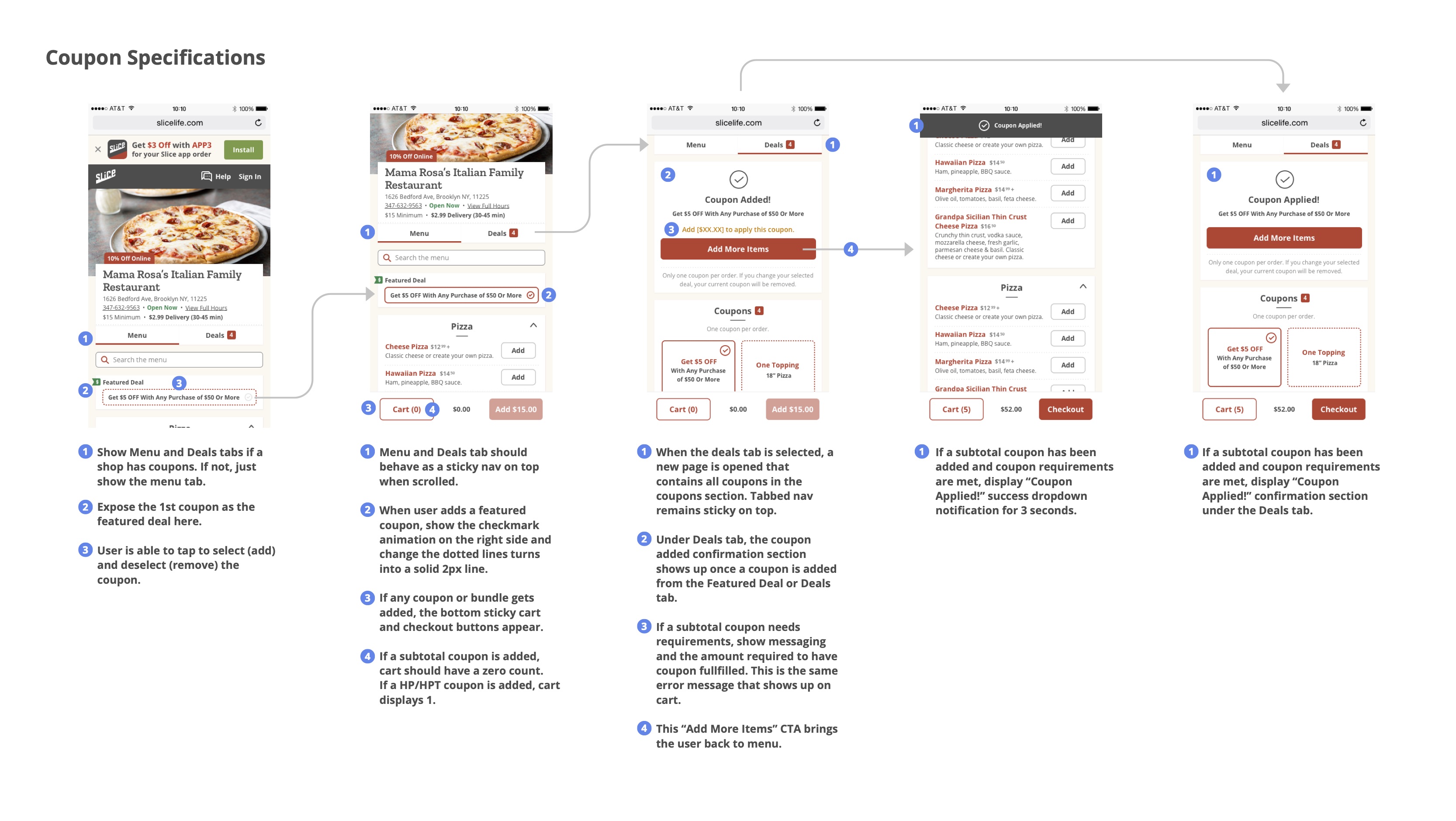
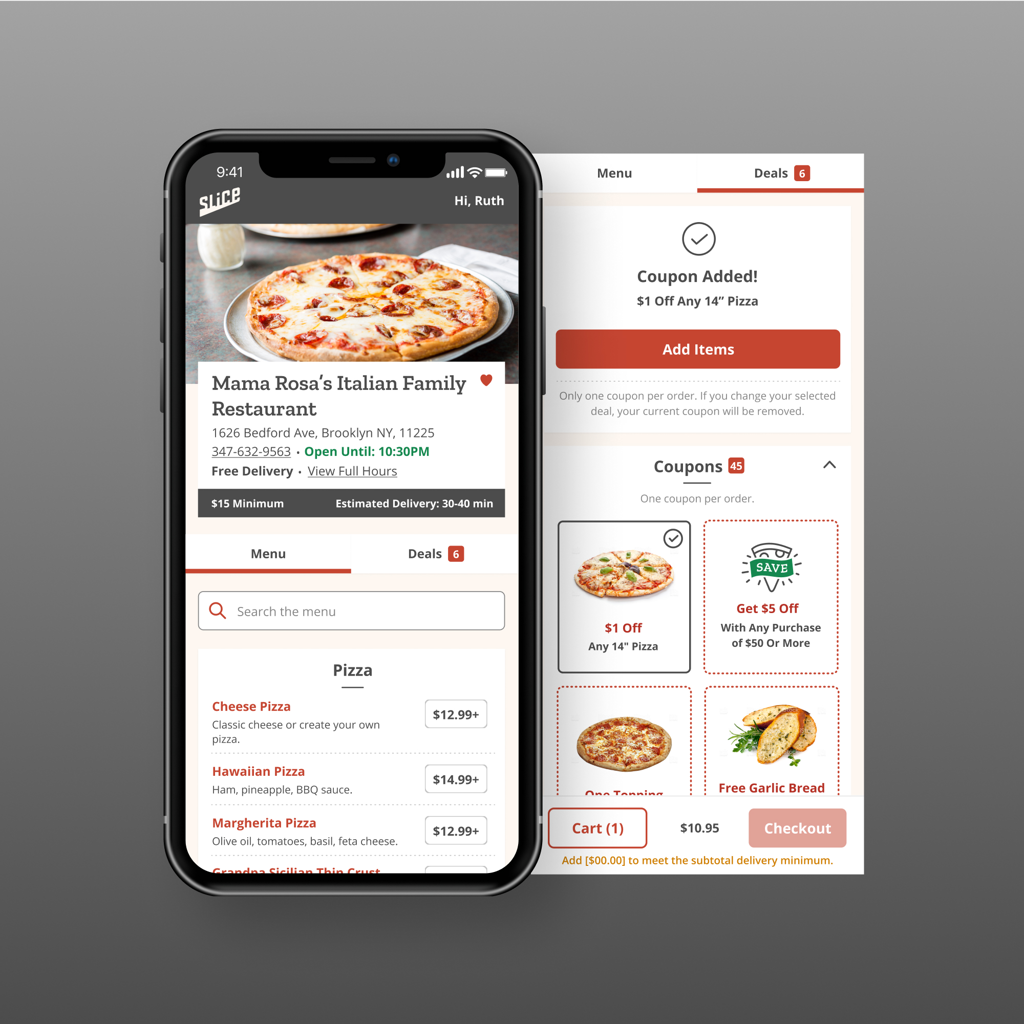
I designed this so that users now had a dedicated "Deals" tab with a counter badge showing how many deals were offered, and a clear apply-confirmation (check animation) once a coupon was selected. The coupon or bundle selection also acted as an item added to the cart, revealing their progress in the sticky bottom bar.
Adding a bundle worked similarly to applying a coupon, but with more details around what items were included. Users went through each item in the bundle set to choose available options, and choose to add all items to their cart with one click to checkout.
😌 Customer retention was up by 10%. 📞 Call volume around specials decreased by 15%, freeing up customer service resources for shops. 🤔 Customers wanted to know if they were getting real deals. Providing real value was important to build customer trust 🤔 Deals Hero Imagery: Research showed that if we provided more imagery, users would be able to find what they're looking for more quickly. Our next steps was building a database of menu images for the next iteration.
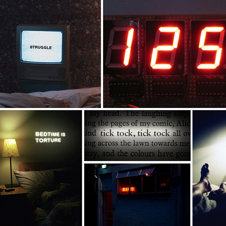
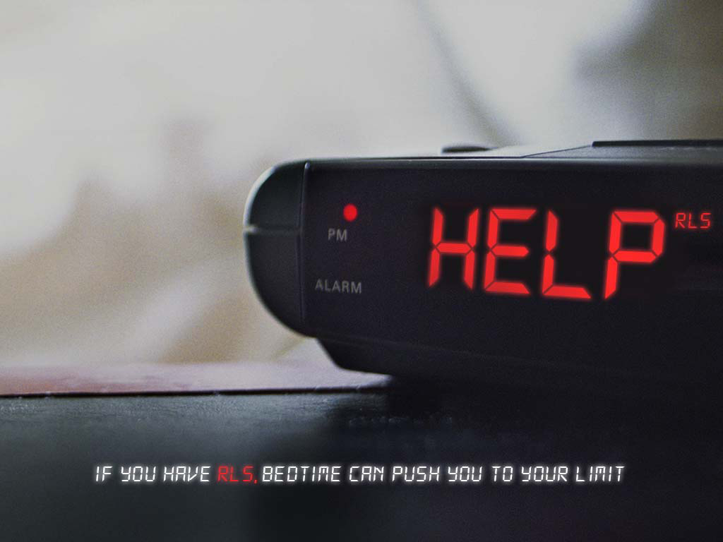
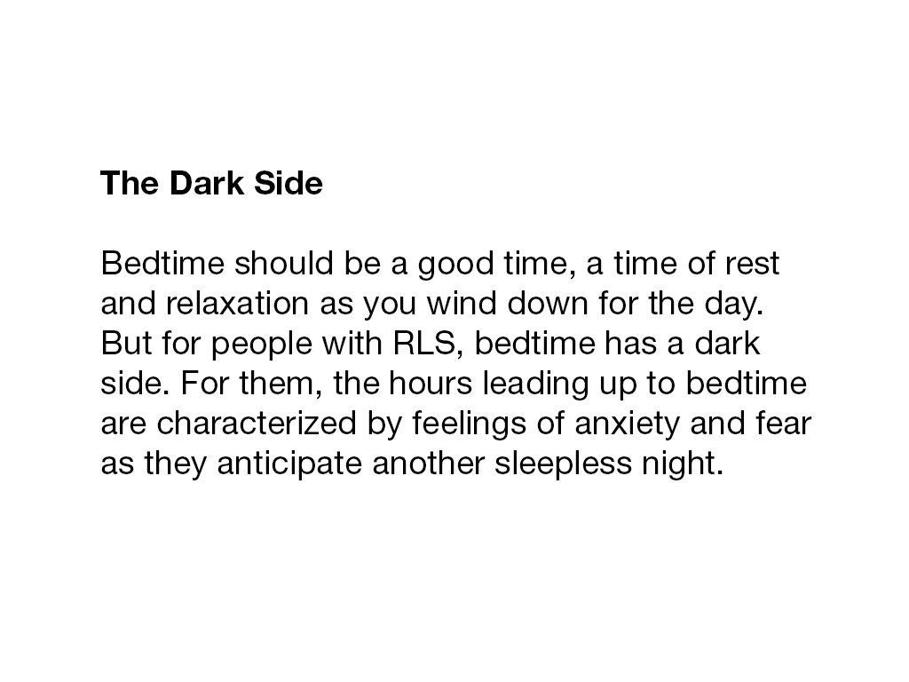
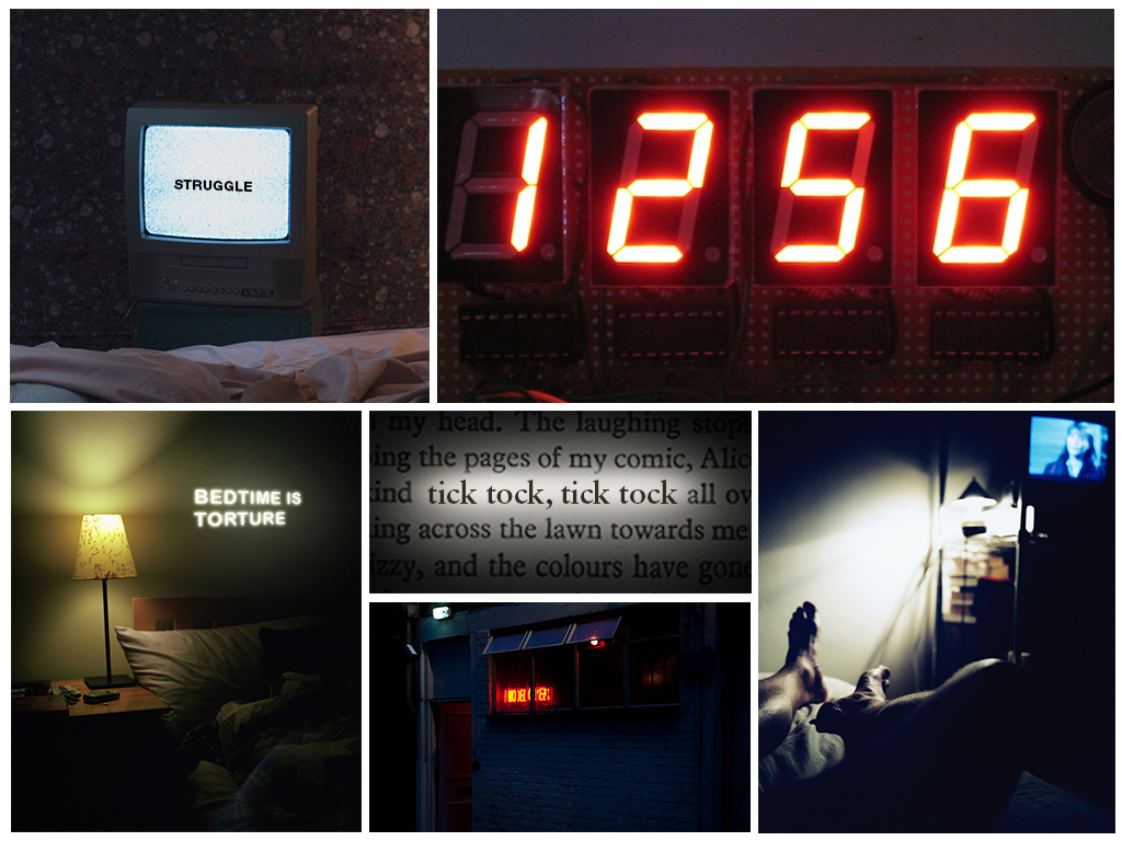
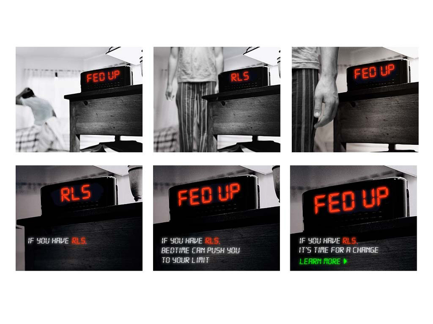
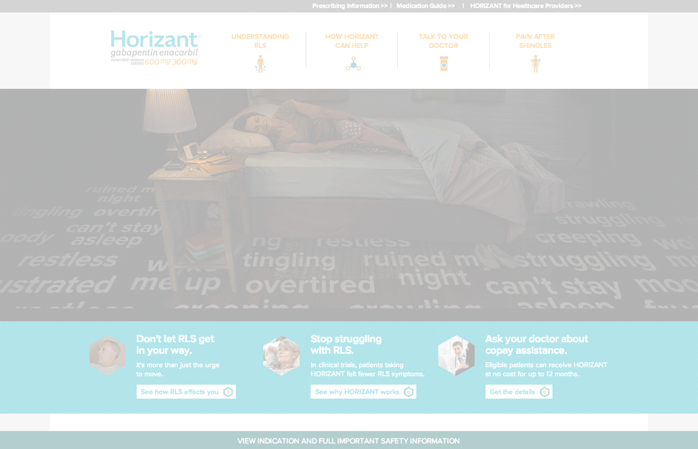
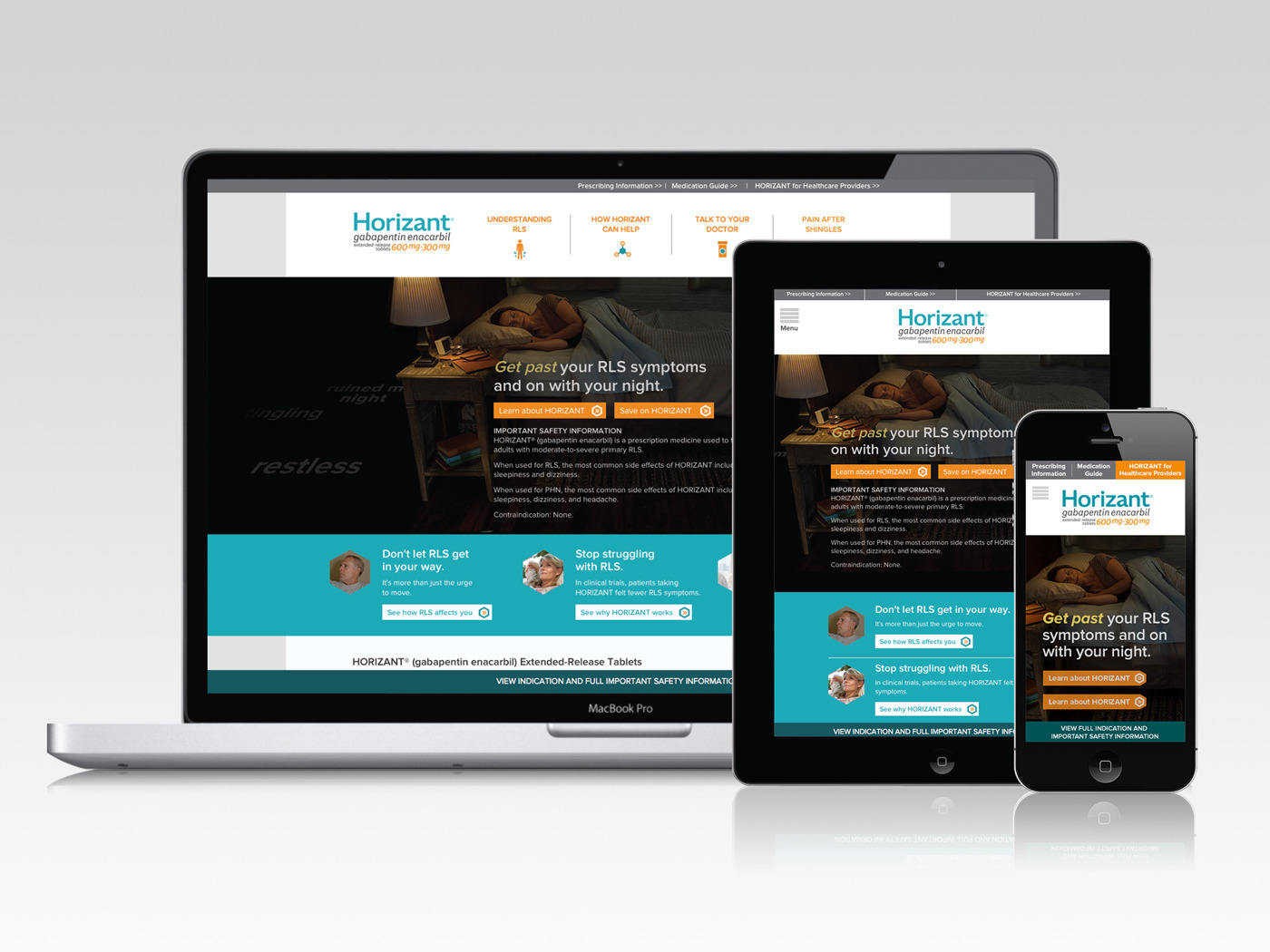
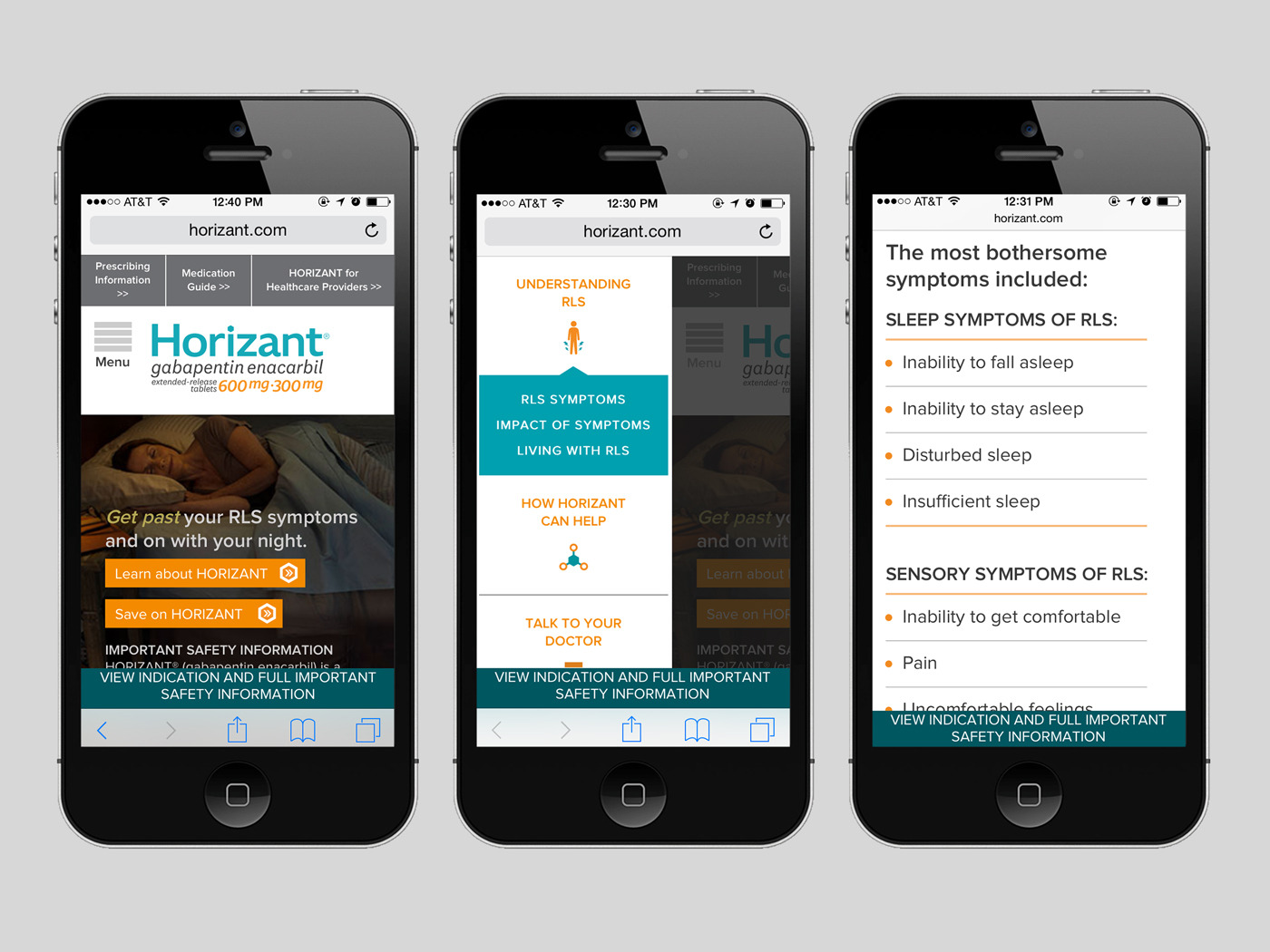
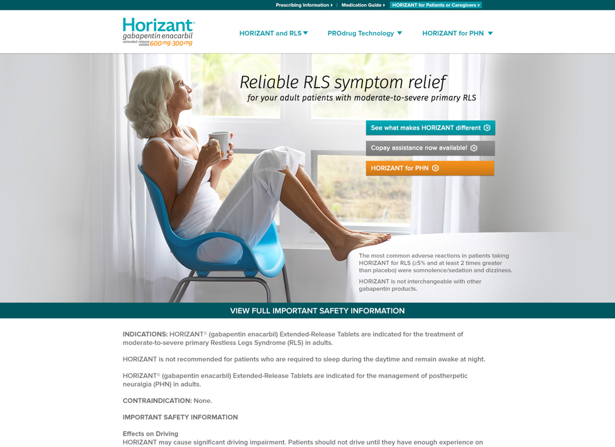
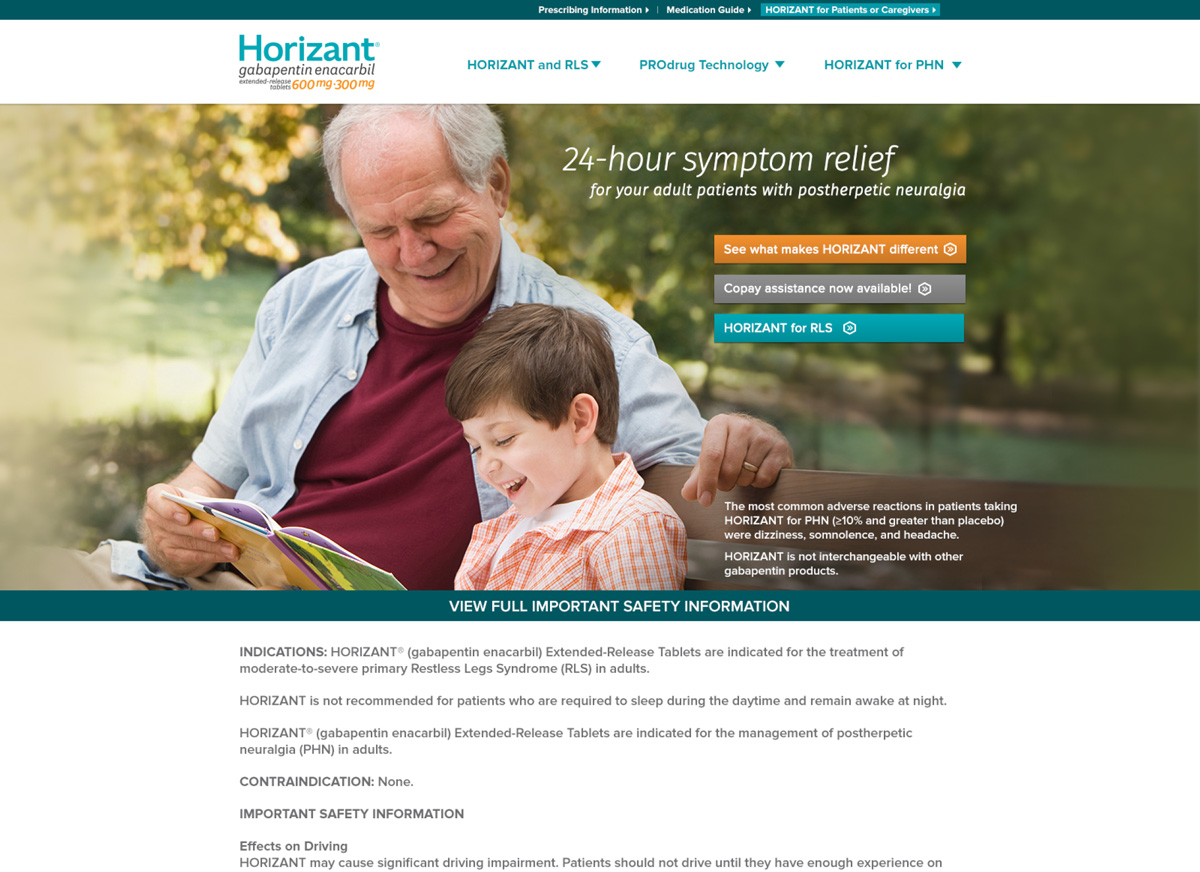
After learning that patients with RLS (Restless Leg Syndrome) dread the coming hours of bedtime, we created an online ad campaign calling attention around this idea. The ads ran after the usual bedtime hours and created a 12% growth in traffic for our client's consumer site that had more education and ways around treatment and relief. We also developed the branding for Horizant which was a new treatment coming into the market at the time.

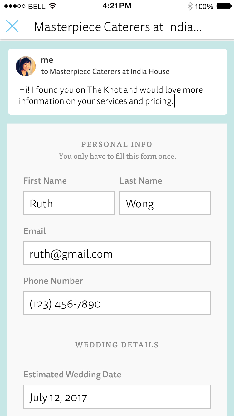
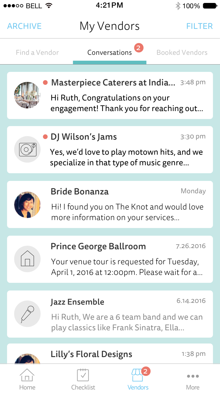
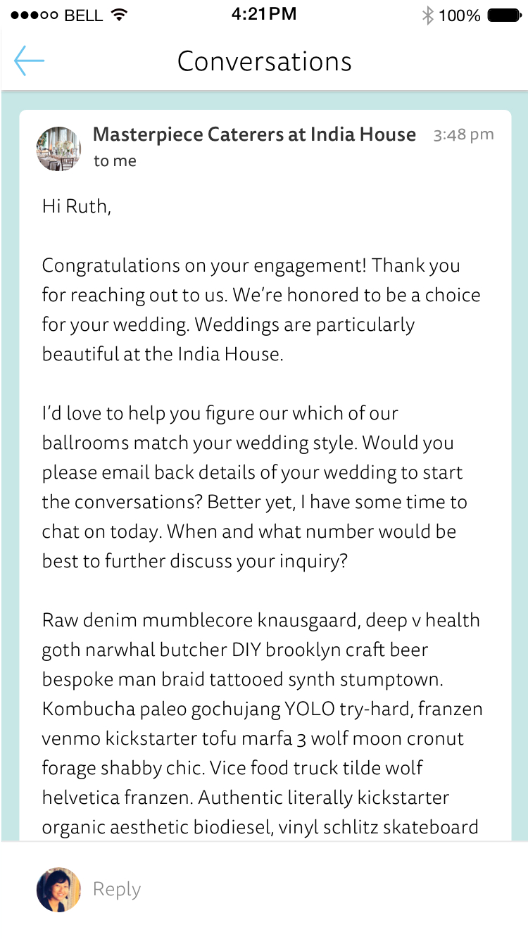
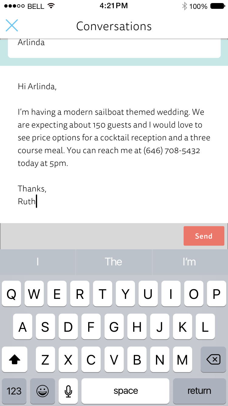
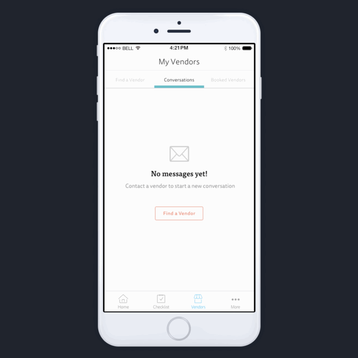
iOS App Feature
This was a new feature created for a iOS wedding planner app that behaves like a messaging system. Now brides can contact their vendors and communicate ideas more easily. The more important aspect of this feature was to increase the amount of venue tour bookings through the app. There's around an average of 10,000 weekly vendor contacts after a few weeks of this release. Download The App.
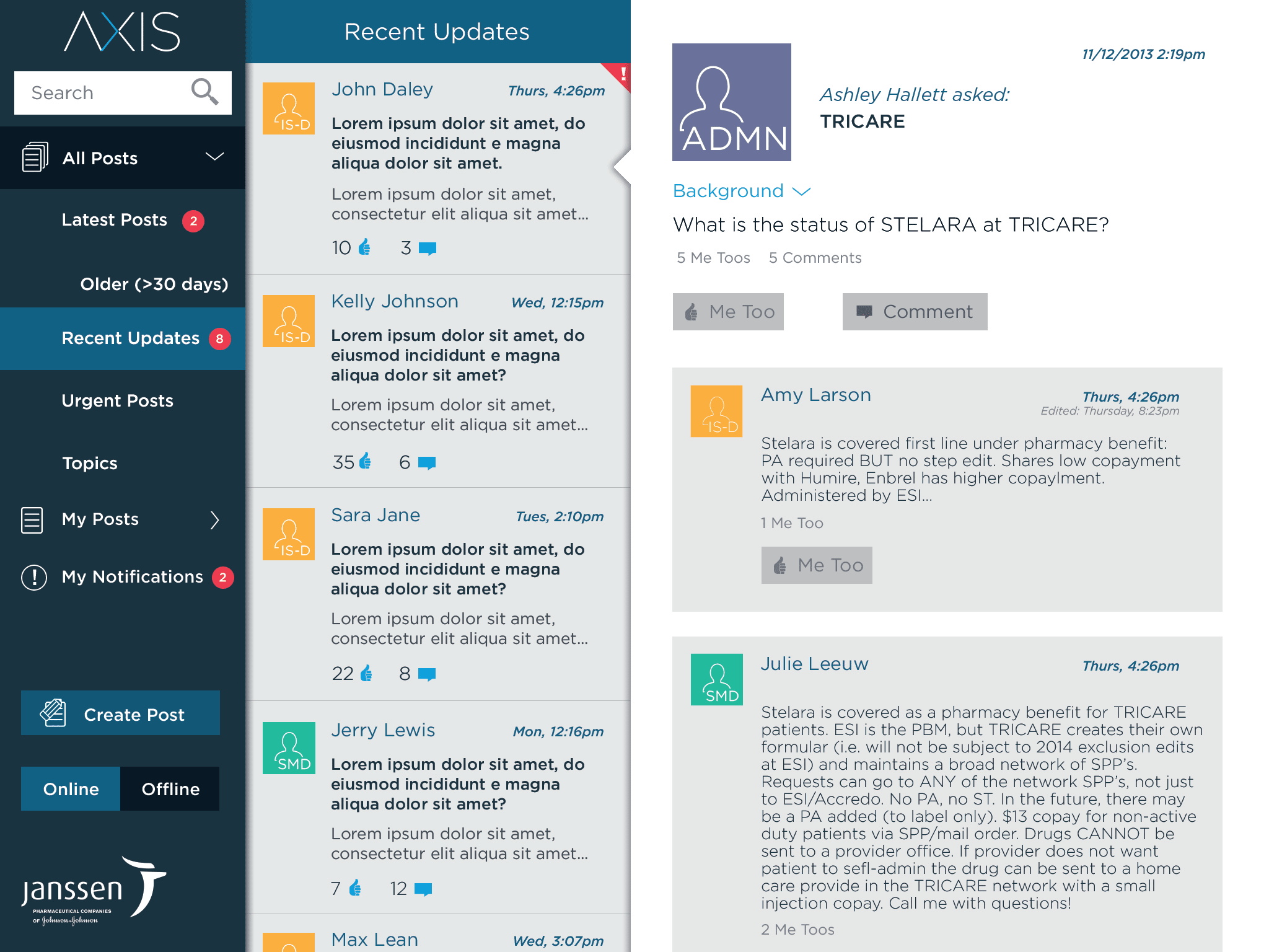
iOS App Feature
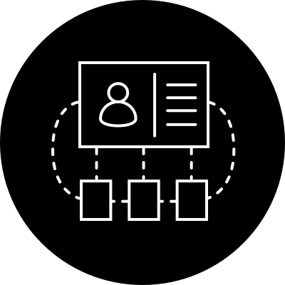
This iPad application was created for the Stelara sales team across the U.S. to have an information and communication tool that helps them get better access to the Stelara medication for their patients.
This styleguide was created to define how design patterns were used amongst all the designers across various platforms from the web platform, native iOS and Android apps, and shop tablets. This helped us evaluate where the patterns were different, where it was okay, and where it was better to maintain consistency.


